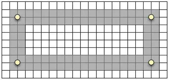
Simply put, I am working on a responsive web layout with columns and rows. Each column width is set relevant to a predefined total width:
column width / total width = width %
and the height is fixed.
Now the problem is, I want the content width to be fluid but the margin and padding to be of fixed width as below.


The code looks something like this:
HTML
<body>
   <div id="left">Left</div>
   <div id="middle">Middle</div>
   <div id="right">Right</div>
</body>
CSS
div {
   float: left;
   padding: 0.5em;
   box-sizing: border-box;
   width: 33.3333333333333%; height 5em; line-height: 5em; text-align: center;
}

#left {
   background-color: red;
}

#middle {
   background-color: green;
}

#right {
   background-color: blue;
}
http://jsfiddle.net/langoon/Zxn8E/2/
I have thought of some solutions but none of them seem to do what I am looking for :
- Set 'box-sizing' to 'margin-box'. Not supported in most browsers.
- Instead of margins, use borders. I might want that border and style it differently later.
- Nest each box in an outer 'div'. I prefer to keep the number of elements for the DOM to process at a minimum.
- Set negative margins as suggested here Fluid column layout with fixed pixel margins between them?. Seems to require an wrapping 'div' for each row and that might pose problems for me.
- JavaScript. No thanks.
Am I trying to have my cake and eat it at the same time or is there a way to do this without the drawbacks?
