I am plotting speed/distance data from racing events, using Matplotlib, for example distance vs. time, with time being horizontal axis and distance being the vertical one.
My inputs are two vectors, one containing the time values in "seconds from event start", and the other containing "distance travelled so far". There can be many athletes in the same plot, so I can compare them.
The problem is, if I plot pure time, I get X axis in number of seconds, which is not natural to read:

I can plot the data according to actual date and time of day, and I get readable results, but that is in absolute time, not elapsed time since event start (this one started around 6:00 am):
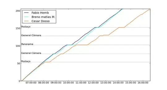
What I would like would be a way to get elapsed time in HMS format (the same as the second graphic, but with time relative to event start), and possibly with "awareness" of zoom level (switches to hours:minutes, then to days:hours when zoomlevel changes, so as not to clog the labels too close together with scale-irrelevant data).
Thanks for any help!