As of now (January 31st 2015) there is a way to do that without using canvas, with pure CSS, and with only 2 lines of code.
The trick is using the css filter and -webkit-filter properties to draw two drop shadows with no blur, one for the positive axis and one for the negative, which will wrap around the image, which will provide the (hopefully) desired effect.
Note: css filters are not at all supported in IE (let's hope Spartan does better), here is a compatibility table.
This first snippet (fiddle) will apply the simplest border possible.
img {
  -webkit-filter: drop-shadow(1px 1px 0 black)
                  drop-shadow(-1px -1px 0 black);
  filter: drop-shadow(1px 1px 0 black)
          drop-shadow(-1px -1px 0 black);
}

body {
  background-color: lightcoral;
}
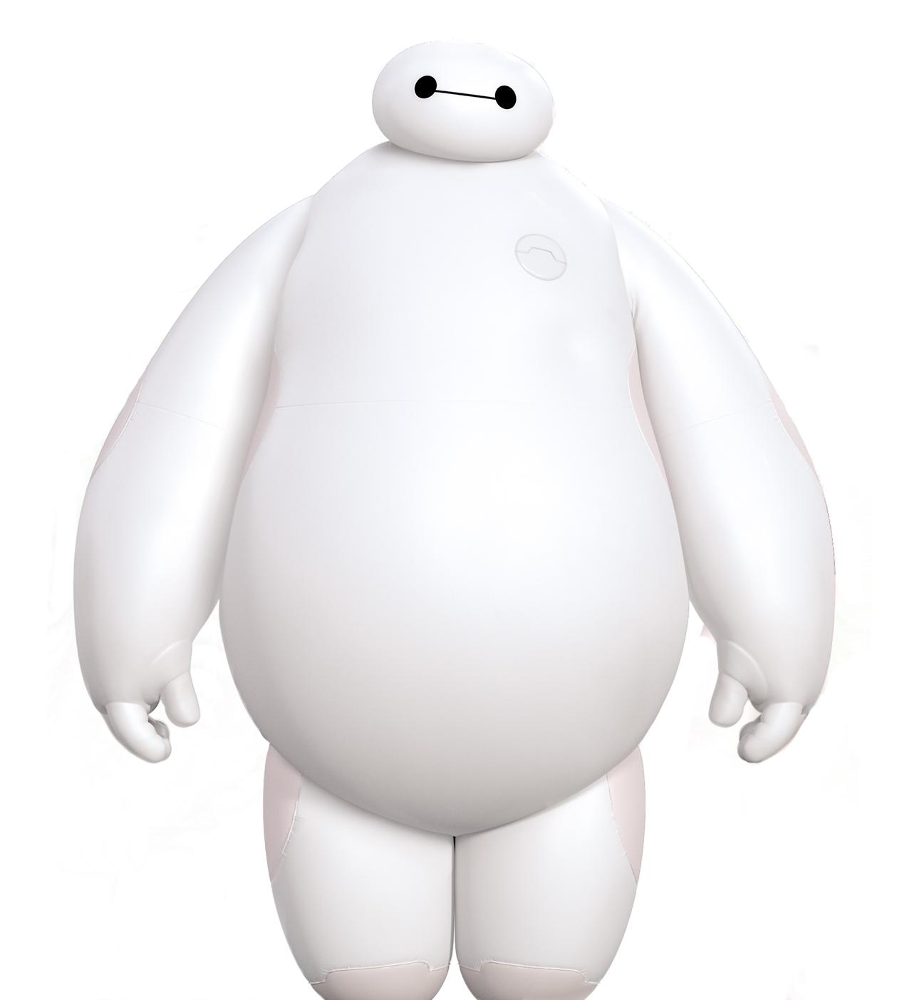
<img src="https://i.stack.imgur.com/Ju44K.jpg" width="250">
As you can see, some images (like this awesome baymax render) need a little more tweaking, you can see the right border is a little smaller than the left.
With that in mind, here is the perfected border snippet (fiddle) with just a really tiny value tweak.
img {
  -webkit-filter: drop-shadow(2px 1px 0 black)
                  drop-shadow(-1px -1px 0 black);
  filter: drop-shadow(2px 1px 0 black)
          drop-shadow(-1px -1px 0 black);
}

body {
  background-color: khaki;
}
<img src="https://i.stack.imgur.com/Ju44K.jpg" width="250">
That should cover borders pretty well, but we can still have more fun with this, look at this awesome lightness effect snippet (fiddle).
img{
    -webkit-filter: drop-shadow(1px 1px 0 black)
                    drop-shadow(-1px -1px 0 white);
    filter:drop-shadow(1px 1px 0 black)
           drop-shadow(-1px -1px 0 white);
}

body{
    background-color:lightblue;
}
<img src="https://i.stack.imgur.com/Ju44K.jpg" width="250">
Hope this helps anyone wondering about the possibility of a wrap-around border for semitransparent images!

