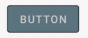
12

enter image description here

I'm trying to create a button which looks as in the image above. Initially my idea was to create a 9 patch and set it as the button background. But since, this is a plain button, i think we can somehow draw this without using any images.

The button background color is #0c0c0c The border color is #1a1a1a The text color is #cccccc

I found a similar question on SO but that creates a gradient -
Android - border for button

Community
  • 1
  • 1
coderplus
  • 5,793
  • 5
  • 34
  • 54
  • 1
    "The button background color is #0c0c0c The border color is #1a1a1a" -- that may be *one* set of colors, but you need more than that. If we assume that you want those colors to be the normal state, what are your colors for the pressed state? The disabled state? The focused state? There may be other states that the default `Button` background handles beyond those, but I'd start with them. – CommonsWare Oct 07 '12 at 18:08
  • Google have new framework, new technologies is better [Jetpack Compose](https://stackoverflow.com/questions/6054562/how-to-make-the-corners-of-a-button-round/64087445#64087445) – Ucdemir Sep 27 '20 at 10:39

4 Answers4

23

The Android Developer's Guide has a detailed guide on this: Shape Drawbables.

You could also simply remove the gradient element from the link you provided:

<shape xmlns:android="http://schemas.android.com/apk/res/android"
    android:shape="rectangle">
    <corners android:radius="3dp" />
    <stroke android:width="5px" android:color="#1a1a1a" />
</shape>
Sam
  • 86,580
  • 20
  • 181
  • 179
16
   <Button
    android:id="@+id/button1"
    android:layout_width="wrap_content"
    android:layout_height="wrap_content"
    android:layout_above="@+id/textView1"
    android:layout_alignLeft="@+id/textView1"
    android:layout_marginBottom="56dp"
    android:text="Button" 
    android:textColor="#FF0F13"
    android:background="@drawable/bbkg"/>//create bbkg.xml in drawable folder

bbkg.xml//button background

   <?xml version="1.0" encoding="utf-8"?>
  <selector xmlns:android="http://schemas.android.com/apk/res/android">
  <item android:state_pressed="true" 
    android:drawable="@drawable/pressed" />
  <item  android:state_focused="false" 
    android:drawable="@drawable/normal" />
  </selector>

normal.xml //button background normal state

  <?xml version="1.0" encoding="UTF-8"?> 
  <shape xmlns:android="http://schemas.android.com/apk/res/android"
    android:shape="rectangle"> 
  <solid android:color="#10EB0A"/>    
  <stroke android:width="3dp"
        android:color="#0FECFF" /> 
  <padding android:left="5dp"
         android:top="5dp"
         android:right="5dp"
         android:bottom="5dp"/> 
  <corners android:bottomRightRadius="7dp"
         android:bottomLeftRadius="7dp" 
         android:topLeftRadius="7dp"
         android:topRightRadius="7dp"/> 
  </shape>   

pressed.xml //button background pressed state

<?xml version="1.0" encoding="UTF-8"?> 
<shape xmlns:android="http://schemas.android.com/apk/res/android"
   android:shape="rectangle"> 
<solid android:color="#FF1A47"/>    
<stroke android:width="3dp"
        android:color="#0FECFF"/>

<corners android:bottomRightRadius="7dp"
         android:bottomLeftRadius="7dp" 
         android:topLeftRadius="7dp"
         android:topRightRadius="7dp"/> 
</shape>  
Raghunandan
  • 132,755
  • 26
  • 225
  • 256
  • 1
    You can change the border of the button as well as the button backgroud color in normal and pressed state. Just use the color codes appropriately – Raghunandan Oct 07 '12 at 18:51
3

If you want something like this

Button preview

here is the code.

1.Create a xml file in your drawable folder like mybutton.xml and paste the following markup:

<?xml version="1.0" encoding="utf-8"?>
<selector xmlns:android="http://schemas.android.com/apk/res/android" >
 <item android:state_pressed="true" >
     <shape android:shape="rectangle"  >
         <corners android:radius="3dip" />
         <stroke android:width="1dip" android:color="#5e7974" />
         <gradient android:angle="-90" android:startColor="#345953" android:endColor="#689a92"  />            
     </shape>
 </item>
<item android:state_focused="true">
     <shape android:shape="rectangle"  >
         <corners android:radius="3dip" />
         <stroke android:width="1dip" android:color="#5e7974" />
         <solid android:color="#58857e"/>       
     </shape>
 </item>  
<item >
    <shape android:shape="rectangle"  >
         <corners android:radius="3dip" />
         <stroke android:width="1dip" android:color="#5e7974" />
         <gradient android:angle="-90" android:startColor="#8dbab3" android:endColor="#58857e" />            
     </shape>
 </item>
</selector>

2.Now use this drawable for the background of your view. If the view is button then something like this:

<Button
    android:id="@+id/button1"
    android:layout_width="wrap_content"
    android:layout_height="wrap_content"
    android:padding="10dp"
    android:textColor="#ffffff"
    android:background="@drawable/mybutton"
    android:text="Buttons" />
Andriya
  • 241
  • 2
  • 14
0

Just use a MaterialButton:

       <com.google.android.material.button.MaterialButton
            android:layout_width="wrap_content"
            android:layout_height="wrap_content"
            style="@style/Widget.MaterialComponents.Button.OutlinedButton"
            android:backgroundTint="..."
            app:strokeColor="..."
            android:textColor="..."
            app:cornerRadius="xxdp"
            android:text="BUTTON"
            />

enter image description here

Gabriele Mariotti
  • 320,139
  • 94
  • 887
  • 841