3

I found some solutions but not exactly what I want. I have 5 dataframes in R and each dataframe has 4 columns:

Lets say name of the first dataframe is "Gene1"

Ind1     Ind2       Ind3      Ind4
1          3         3.2        2.5
1          3         4          2
1.5        2         2.2        1
3.4        2         1          3

and remaining dataframes are called "Gene2", "Gene3","Gene4","Gene5" and are similar.

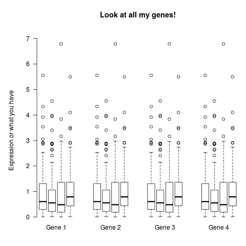
I want to plot boxplots side by side in same plot for all dataframes and for all columns. I did not find any plot like this, so I can't upload a picture but I will try to explain.

Now from above data, the plot will have 20 box plots. First 4 box plot should be close to each other and x-axis name should be "Gene1" (for all 4 box plots) and then a little space in plot and again 4 box plots with x-axis name "Gene2" and so on.

I can easily plot all the box plots in one plot but I am not able to distinguish dataframes. Meaning, it should clearly show us that first 4 box plots are from "Gene1" and next 4 box plots are from "Gene2" and so on.

Please let me know if the problem is not clear.

Community
  • 1
  • 1
Vikas
  • 327
  • 2
  • 4
  • 13

2 Answers2

11

I suspect this is what you want, and it is in fact not very complicated to do with the plotting functions in the standard graphics package. The groups are plotted as 4 separate panels, but with a shared y-axis and title plotted in the outer margin it looks like a single plot.

# Faking the data, since you didn't provide any
Gene <- data.frame(matrix(rweibull(100*4, 1), 100))
names(Gene) <- paste0("Ind", 1:4)
Gene <- rep(list(Gene), 4)

# Setup the panels
layout(t(1:4))
par(oma=c(2, 4, 4, 0), mar=rep(1, 4), cex=1)
# `mar` controls the space around each boxplot group

# Calculating the range so that the panels are comparable
my.ylim <- c(min(sapply(Gene, min)), max(sapply(Gene, max)))

# Plot all the boxes
for(i in 1:length(Gene)){
    boxplot(Gene[[i]], ylim=my.ylim, axes=FALSE)
    mtext(paste("Gene", i), 1, 0)
    if(i == 1){
        axis(2, las=1)
        mtext("Expression or what you have", 2, 3)
    }
}
title("Look at all my genes!", outer=TRUE)

enter image description here

By the way, I recommend storing your data frames in a list rather than mimicing a list by naming them "Gene1", "Gene2", "Gene3" and "Gene4". It is a lot easier to automate that way. If you still want to store them as separate variables, replace Gene[[i]] with get(paste0("Gene", i)) and my.ylim <- ... with min(c(min(Gene1), min(Gene2) ... etc.

Backlin
  • 14,612
  • 2
  • 49
  • 81
  • @Backlin +1 Very nice answer. How would you add text under the boxplots of each group (but above the name of the group)? Like for instance, for the group "Gene 1", A, B, C, D under each boxplot? And how would you add a legend? I tried for the last plot but half of the legend is hidden by the third plot. I can create a new question if you want. Thanks in advance. – Antoine Apr 18 '15 at 22:30
  • Glad it helped you! I would add the box labels with `axis(1, at=1:4, LETTERS[1:4], lwd=0, mgp=c(0,0,0))` and then the group labels with `mtext(paste("Gene", i), 1, 1)`. – Backlin Apr 20 '15 at 08:32
6

Here's a shot in the dark at what you want, using ggplot2 and related tools.

library(ggplot2)
library(reshape2)
library(plyr)

Gene1 <- read.table(text = "Ind1     Ind2       Ind3      Ind4
1          3         3.2        2.5
1          3         4          2
1.5        2         2.2        1
3.4        2         1          3", header = TRUE)

#Make a copy of Gene1
Gene2 <- Gene1

#A Round about way to rbind these together with an ID column
combined_data <- ldply(list(Gene1 = Gene2, Gene2 = Gene2))

#Melt into the long format needed by ggplot2
combined_data_melt <- melt(combined_data, id.vars = 1)

#Plot and use facet_wrap for each data.frame
ggplot(combined_data_melt, aes(variable, value)) +
  geom_boxplot() +
  facet_wrap(~.id, ncol = 1) +
  theme_bw()

Gives you something like this as an output:

enter image description here

This should do what you want, pretty minor change to the code. Thanks to Joran for the tip in R chat about dodge.

ggplot(combined_data_melt, aes(.id, value, dodge = variable)) +
  geom_boxplot(position = position_dodge(width = 0.8)) +
  theme_bw()

enter image description here

Community
  • 1
  • 1
Chase
  • 67,710
  • 18
  • 144
  • 161
  • Thanks for your reply. The link in my question provides somehow similar solution. But I want this in one plot. First 4 plots should be close to each other and "Gene1" label should be on x-axis (below) and then little space and then 4 plots and so on. I know its difficult to explain without a picture but please let me know if still it is unclear. – Vikas Oct 08 '12 at 15:19
  • 1
    @Vikas - so you want a graph that is 20 boxplots wide, plus some extra dead space between every fourth boxplot? are you printing this as a mural? :) – Chase Oct 08 '12 at 15:23
  • I think we can reduce the size of box plots and then it should be fine. – Vikas Oct 08 '12 at 15:28
  • @Vikas - I get it now, check out the revised answer. – Chase Oct 08 '12 at 15:52