24

I'm hitting an unusual problem and I'm looking for suggestions. Basically, I'm using:

  • JQuery Mobile 1.1
  • JQuery 8.2
  • PhoneGap (Cordova) 2.1

On many pages in my app on iPhone, if I put my cursor into an input box, this opens the virtual keyboard. That's fine and expected.

Here's the problem: In some cases (but not all), placing my cursor into an input box fires the window.resize event. I've verified this via the code below:

    $(window).resize(function(e) {
        alert('The window resize occurred!  Width: ' + $(window).width() + " Height: " + $(window).height());
        debugger;
        return false;
    });

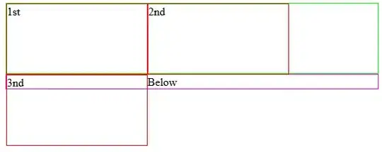
Immediately after it resolves the window.resize event, JQueryMobile decides to resize the page to an incorrect height. I can tell it is the page because I added a different color border to each element to see what was what. And in many cases, this resize action is causing half of my GUI to overflow underneath the bottom of the div, sometimes even making my cursor appear hidden under the div.

The best way to understand it is with a screenshot:

window.resize() triggering page resize

Now, I don't really expect anyone to have an exact answer for this. I'm just looking for debugging tips. I added a "debugger" statement into my window.resize() event and tried to step through the code. I was hoping to be lead to some other resize listener that is designed to resize the page . If I can find that, then I can temporarily cripple it when someone selects a form element, then re-enable resizing on blur or orientation change. The problem is, I stepped through every line of code and the debug process stops right before the resize occurs.

This makes me wonder if there is some other event being fired aside from window.resize. So I added the two lines below:

    document.addEventListener("throttledresize", function() { alert("throttledresize fired.") }, false);
    document.addEventListener("orientationchange", function() { alert("orientationchange fired.") }, false);

Neither fired, however. So I'm somewhat stuck. I have a good feeling I know what the problem is, but I can't trace it to the source. Any suggestions on where I can find this mysterious code that resizes the page on window.resize()?

Anthony
  • 5,275
  • 11
  • 50
  • 86
  • 2
    I really wish I had an answer for you mang – Ohgodwhy Oct 14 '12 at 06:43
  • Are you sure it's JQM and not Cordova? I'm sure I remember reading something recently (darned if I can find it now) about Cordova, resizing windows due to soft-keyboards appearing and making sure it isn't an orientation-change..... – Dave R Oct 14 '12 at 15:07
  • I'm pretty sure it's JQM, because it is only affecting the page
    Cordova doesn't have any UI specific intelligence. I think it's tripping something within JQM that is making JQM think "Hey, the page is smaller now, I'd better resize the canvas", even though it shouldn't. Also, this happens if I run it purely as a iPhone web app with Cordova disabled.
    – Anthony Oct 14 '12 at 20:34
  • BTW, you might be referring to http://stackoverflow.com/questions/6731517/phonegap-jquery-mobile-page-style-breaking-when-keyboard-is-visible. If so, unfortunately that's not the issue here. – Anthony Oct 14 '12 at 20:37
  • Funnily enough I've just created a page that has this exact problem - the input box is scrolled off screen when the keyboard appears so you can't see what you're typing. Will see what I can find out. – Dave R Oct 15 '12 at 14:15
  • I ran into the same issue. So glad I found your question on SO, otherwise I wouldn't have a clue what was going wrong. Its for reasons like this that I'm trying to move off of jQuery mobile. I've just got widget that Im using now in my app, once that is gone, I'm ditching jqm. – groodt Jul 04 '13 at 20:33
  • It took me a few days of hacking, but the problem has gone away for me. I actually found that many of the CSS hacks I put in back in the JQM 0.x days were messing with JQM 1.3.1. So I basically just disabled everything to see how the app behaved, then slowly re-enabled all of my custom CSS. I think at some point I screwed with the ui-page or ui-content's positioning, which caused side-effects. – Anthony Jul 04 '13 at 21:06
  • The following solution works for me easily. Just set viewport height. http://stackoverflow.com/questions/19169115/phonegap-keyboard-changes-window-height-in-ios-7 – Raydemo Dec 13 '13 at 03:14

5 Answers5

10

I'm glad to see I'm not crazy! I'm happy to report I've implemented a pretty good solution. Here are the steps, in case you'd like to do the same:

1) Go into jquery.mobile-1.x.x.js

2) Find $.mobile = $.extend() and add the following attributes:

last_width: null,
last_height: null,

3) Modify getScreenHeight to work as follows:

getScreenHeight: function() {
    // Native innerHeight returns more accurate value for this across platforms,
    // jQuery version is here as a normalized fallback for platforms like Symbian

    if (this.last_width == null || this.last_height == null || this.last_width != $( window ).width())
    {
        this.last_height = window.innerHeight || $( window ).height();
        this.last_width = $(window).width();
    }
    return this.last_height;
}

Basically this will prevent jQuery from recalculating the page height unless the width also changes. (i.e. an orientation change) Since the soft keyboard only affects the height, this method will returned the cached value instead of a modified height.

I'm going to create a separate post to ask how to properly override the $.mobile.getScreenHeight method. I tried adding the code below into a separate JS file, but it didn't work:

delete $.mobile.getScreenHeight;
$.mobile.last_width = null;
$.mobile.last_height = null;
$.mobile.getScreenHeight = function() 
{
   ... the code listed above
}

It fired most of the time, but also fired the original function. Kinda weird. I've posted a separate topic in regard to how to properly extend $.mobile here: Proper way to overide a JQuery Mobile method in $.mobile

Community
  • 1
  • 1
Anthony
  • 5,275
  • 11
  • 50
  • 86
  • Cool. I found that having header/footer with data-position="Fixed" was the source of my problem. By changing them to not be fixed my textbox was correctly positioned when the keyboard appears. – Dave R Oct 16 '12 at 13:39
  • You sir, are a life saver. This should be moved into jQuery mobile itself. – groodt Jul 04 '13 at 20:30
  • Well, it's pretty hacktastic. :) I also don't use it anymore. See my previous comments about CSS hacks being the root issue. Perhaps try doing a "Hello World" app and see if you still have the issue. If so, you probably have a CSS conflict somewhere. – Anthony Jul 04 '13 at 21:08
3

I had a similar issue try this:

  $('#main-browse').bind("orientationchange", function(event) {
    //Put the page dimensions for example with minimum height property

  }
mram888
  • 4,899
  • 5
  • 33
  • 59
2

I was having the same issue in Cordova (3.x) using JQuery Mobile 1.4--so this isn't something likely to be addressed by the authors of the library. I tried many different solutions--but none really fixed it. The closest candidate involved binding simple handlers bound to the "throttleresize" and "pageshow" events on the window and document objects, respectively.

Yet, I still lost the "locked down" feel of the UI and the user could drag my entire UI up after the keyboard exited. Sure the header and footer did not move, but my background and the main content area were now draggable, and scroll bars appeared. Totally unacceptable if you are trying for that native app feel...

So I decided to look in Chrome/Safari firebug and find out where the extra pixels are being added to the box model. Oddly, I noticed it isn't the height being changed at all, in my case it was the padding on the active page. so I adapted a solution from another Stack posting:

function resetActivePageHeight() {
var aPage = $( "." + $.mobile.activePageClass ),
  aPagePadT = parseFloat( aPage.css( "padding-top" ) ),
  aPagePadB = parseFloat( aPage.css( "padding-bottom" ) ),
  aPageBorderT = parseFloat( aPage.css( "border-top-width" ) ),
  aPageBorderB = parseFloat( aPage.css( "border-bottom-width" ) );
aPage.css( "min-height", deviceInfo.height - aPagePadT - aPagePadB - aPageBorderT - aPageBorderB )
.css("top","0px").css("padding","0px");}

Then I bound them to the document and window events on device ready.

  $( document ).bind( "pageshow", resetActivePageHeight );
  $( window ).bind( "throttledresize", resetActivePageHeight );

Again, although i would like to take credit, I think I just found an additional angle to someone else's good idea.

Robert Sherman
  • 391
  • 4
  • 6
1

go to your androidmanifest file and in the activity, change or update to this value android:windowSoftInputMode="adjustResize"

i know for a fact that adjustPan breaks the page so the controls are hidden. the default (unspecified) may be ok and there are other options here. i think if it is not to resize, it does not communicate to jqm that kb is shown

so leave jqm as is, without your changes and it will do its job btw, i am using cordova 2.2, jqm 1.2 and jquery 1.8.2

0

I had a problem where the virtual keyboard would extend the viewport, showing the contents underneath(an external panel).

I solved by setting the css height based on the window height:

$('#page').css('height', $(window).height());
Joe's Ideas
  • 492
  • 6
  • 22