3

enter image description here
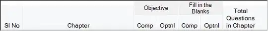
I have a datagrid in my form which has columns for each of Question Types. I want that column to be split into two as i want to accept number of compulsory and number of optional questions for each of the question type in the subsequent columns.

I have achieved this in winforms, thanks to stackoverflow.com.

I am trying to achieve the same in WPF

Thanks in advance

Narendra
  • 3,069
  • 7
  • 30
  • 51
  • Check out the similar post here.http://stackoverflow.com/questions/8090974/wpf-datagrid-column-splitting – sharmila Oct 19 '12 at 08:49
  • Please post a screenshot of UI on the question. I am quite not understand what do you want to do. – Ekk Oct 19 '12 at 08:52
  • I tried to post the screen shot of the same which i had done in winforms, but as I'm new to stackoverflow, I need at least 10 reputation to upload the image. – Narasimha Kashyap Oct 20 '12 at 06:26
  • After a lot of try, I gave up the idea of splitting the columns and used the StackPanel and ScrollViewer concept. Again thanks to all for all your help. – Narasimha Kashyap Oct 30 '12 at 12:15

3 Answers3

1

I guess this is the DataGrid layout you want.... right?

.------.-----------------.--------.
|      |   ID Details    |        |
| Name |-----------------| Status |
|      | ID   | Passport |        |
|------|------|----------|--------|
|X     | 123  | E567868  | Present|
|Y     | 236  | 7875678  | Absent |
'------'------'----------'--------'

WPF datagrid doesnt support this readily. But you can do some stretchy coding. The code like below can split the headers. You need to take caution that ...

When the split columns are reordered (DataGrid.ColumnReordered event), all the sibling columns under their common parent header should be moved, together. I am leaving that code to you.

Have some custom styles for DataGridHeaders

<Style TargetType="{x:Type Primitives:DataGridColumnHeader}" 
  x:Key="SplitHeaderStyle">
<Setter Property="VerticalContentAlignment" Value="Center" />
<Setter Property="Template">
    <Setter.Value>
    <ControlTemplate TargetType="{x:Type Primitives:DataGridColumnHeader}">
        <DockPanel LastChildFill="True">
        <Grid DockPanel.Dock="Bottom">
            <Controls:DataGridHeaderBorder 
            SortDirection="{TemplateBinding SortDirection}"
            IsHovered="{TemplateBinding IsMouseOver}"
            IsPressed="{TemplateBinding IsPressed}"
            IsClickable="{TemplateBinding CanUserSort}"
            Background="{TemplateBinding Background}"
            BorderBrush="{TemplateBinding BorderBrush}"
            BorderThickness="{TemplateBinding BorderThickness}"
            Padding ="{TemplateBinding Padding}"
            SeparatorVisibility="{TemplateBinding SeparatorVisibility}"
            SeparatorBrush="{TemplateBinding SeparatorBrush}">
            <ContentPresenter 
            Content="{Binding RelativeSource={RelativeSource TemplatedParent},
                      Path=Content[0]}"
            SnapsToDevicePixels="{TemplateBinding SnapsToDevicePixels}"
            VerticalAlignment="{TemplateBinding VerticalContentAlignment}"
            HorizontalAlignment="Center"/>
            </Controls:DataGridHeaderBorder>
            <Thumb x:Name="PART_LeftHeaderGripper"
               HorizontalAlignment="Left"
               Style="{StaticResource ColumnHeaderGripperStyle}"/>
            <Thumb x:Name="PART_RightHeaderGripper"
               HorizontalAlignment="Right"
               Style="{StaticResource ColumnHeaderGripperStyle}"/>
        </Grid>
        <Grid DockPanel.Dock="Top">
            <Controls:DataGridHeaderBorder
            HorizontalAlignment="Stretch"
            IsClickable="False"
            Background="{TemplateBinding Background}"
            BorderBrush="{TemplateBinding SeparatorBrush}"
            BorderThickness="{TemplateBinding BorderThickness}"
            Padding ="{TemplateBinding Padding}"
            SeparatorVisibility="{TemplateBinding Tag}"
            SeparatorBrush="{TemplateBinding SeparatorBrush}">
            <ContentPresenter 
                Content="{Binding RelativeSource={RelativeSource TemplatedParent}, 
                          Path=Content[1]}"
                SnapsToDevicePixels="{TemplateBinding SnapsToDevicePixels}"
                VerticalAlignment="{TemplateBinding VerticalContentAlignment}"
                HorizontalAlignment="{TemplateBinding HorizontalContentAlignment}"
                Margin="-8,2,-10,2"/>
            </Controls:DataGridHeaderBorder>
            <Thumb x:Name="PART_LeftSplitHeaderGripper"
            HorizontalAlignment="Right"
            Visibility="{TemplateBinding Tag}"
            Style="{StaticResource ColumnHeaderGripperStyle}"/>
        </Grid>
        </DockPanel>
    </ControlTemplate>
    </Setter.Value>
</Setter>
</Style>

<Style TargetType="{x:Type Primitives:DataGridColumnHeader}" 
   BasedOn="{StaticResource SplitHeaderStyle}"
   x:Key="SplitHeaderLeftStyle">
<Setter Property="HorizontalContentAlignment" Value="Left"/>
<Setter Property="Tag" Value="{x:Static Visibility.Visible}"/>
</Style>

<Style TargetType="{x:Type Primitives:DataGridColumnHeader}" 
   BasedOn="{StaticResource SplitHeaderStyle}"
   x:Key="SplitHeaderRightStyle">
<Setter Property="HorizontalContentAlignment" Value="Right"/>
<Setter Property="Tag" Value="{x:Static Visibility.Collapsed}"/>
</Style>

Have columns arranged like this...

<Controls:DataGrid.Columns>
<Controls:DataGridTextColumn 
         Header="Name" 
         Binding="{Binding Name}"/>
<Controls:DataGridTextColumn 
         Binding="{Binding ID}" 
    HeaderStyle="{StaticResource SplitHeaderRightStyle}">
    <Controls:DataGridTextColumn.Header>
    <x:ArrayExtension Type="System:String">
        <System:String>ID</System:String>
        <System:String>ID De</System:String>                            
    </x:ArrayExtension>
    </Controls:DataGridTextColumn.Header>
</Controls:DataGridTextColumn>
<Controls:DataGridTextColumn 
         Binding="{Binding Passport}"
    HeaderStyle="{StaticResource SplitHeaderLeftStyle}">
    <Controls:DataGridTextColumn.Header>
    <x:ArrayExtension Type="System:String">
        <System:String>Passport</System:String>
        <System:String>tails</System:String>                            
    </x:ArrayExtension>
    </Controls:DataGridTextColumn.Header>
</Controls:DataGridTextColumn>
<Controls:DataGridTextColumn 
            Header="Status"
            Binding="{Binding Status}"/>
  </Controls:DataGrid.Columns>

So basically you use the same default header layout of DataGrid but hack it in a way that two headers look like they are joined together.

C#

  1. Name your DataGrid e.g. x:Name="MyDataGrid".
  2. Keep all the styles in XAML in <DataGrid.Resources ..> tag. Make sure that they have x:Key set. e.g. x:Key="SplitHeaderLeftStyle" & x:Key="SplitHeaderRightStyle"

    <DataGrid x:Name="MyDataGrid">
         <DataGrid.Resources>
             <Style 
                  TargetType="{x:Type Primitives:DataGridColumnHeader}" 
                  x:Key="SplitHeaderStyle" .../>
    
             <Style x:Key="SplitHeaderLeftStyle" 
                    BasedOn="{StaticResource SplitHeaderStyle}".../>
    
             <Style x:Key="SplitHeaderRightStyle"
                    BasedOn="{StaticResource SplitHeaderStyle}" .../>
         </DataGrid.Resources>
         ...
    </DataGrid> 
    
  3. in your C# code when you add columns, set the styles by their Key.

      var dgIDColumn 
        = new DataGridTextColumn()
          {
            Header = new string[] { "ID", "ID Det" },
            Binding = new Binding() { Path = new PropertyPath("ID") },
            HeaderStyle = MyDataGrid.FindResource("SplitHeaderRightStyle") as Style;
          };
    
     MyDataGrid.Columns.Add(dgIDColumn);
    
      var dgPassportColumn 
       = new DataGridTextColumn()
         {
            Header = new string[] { "Passport", "ails" },
            Binding = new Binding() { Path = new PropertyPath("Passport") },
            HeaderStyle = MyDataGrid.FindResource("SplitHeaderLeftStyle") as Style;
         };
    
      MyDataGrid.Columns.Add(dgPassportColumn);
    
WPF-it
  • 19,625
  • 8
  • 55
  • 71
  • Oh that's really great... It works absolutely fine... I appreciate it... But my problem is still not solved as I have to do the same thing programmatically... – Narasimha Kashyap Oct 25 '12 at 06:41
  • You mean C# code? Templates \ Styles are very difficult to tame in C#. I am afraid the best you can do is create them in XAML and refer them by their `x:Key`. – WPF-it Oct 25 '12 at 07:01
  • oh... can you give me an example?? I'm very new to WPF – Narasimha Kashyap Oct 26 '12 at 06:09
  • The solution is really helpful, but can you please tell how we can implement this for multilingual column headers. – Narendra Sep 16 '13 at 10:55
0
<DataGrid ItemsSource="{Binding PeopleList}" AutoGenerateColumns="False">
    <DataGrid.Columns>
        <DataGridTemplateColumn Header="Name">
            <DataGridTemplateColumn.CellTemplate>
                <DataTemplate DataType="{x:Type local:Person}">
                    <TextBlock Text="{Binding Name}"/>
                </DataTemplate>
            </DataGridTemplateColumn.CellTemplate>
        </DataGridTemplateColumn>

        <DataGridTemplateColumn>
            <DataGridTemplateColumn.HeaderTemplate>
                <DataTemplate>
                    <Grid>
                        <Grid.ColumnDefinitions>
                            <ColumnDefinition/>
                            <ColumnDefinition Width="10"/>
                            <ColumnDefinition/>
                        </Grid.ColumnDefinitions>
                        <Grid.RowDefinitions>
                            <RowDefinition/>
                            <RowDefinition/>
                        </Grid.RowDefinitions>
                        <TextBlock Text="Question1" Grid.ColumnSpan="2"/>
                        <TextBlock Text="Compulsory" Grid.Row="1"/>
                        <TextBlock Text="Optional Q" Grid.Row="1" Grid.Column="2"/>
                    </Grid>
                </DataTemplate>
            </DataGridTemplateColumn.HeaderTemplate>
            <DataGridTemplateColumn.CellTemplate>
                <DataTemplate DataType="{x:Type local:Person}">
                    <Grid>
                        <Grid.ColumnDefinitions>
                            <ColumnDefinition/>
                            <ColumnDefinition Width="65"/>
                            <ColumnDefinition/>
                            <ColumnDefinition Width="*"/>
                        </Grid.ColumnDefinitions>
                        <TextBlock Text="{Binding Question.Col1}"/>
                        <TextBlock Text="{Binding Question.Col2}" Grid.Column="2"/>
                    </Grid>
                </DataTemplate>
            </DataGridTemplateColumn.CellTemplate>
        </DataGridTemplateColumn>
    </DataGrid.Columns>
</DataGrid>
Bizhan
  • 16,157
  • 9
  • 63
  • 101
  • Thanks a lot for the quick reply. But my problem is different. The question types are loaded based on the value in the database. And hence I want to split the column programmatically. – Narasimha Kashyap Oct 20 '12 at 06:23
  • I mean can you use a Grid instead of a DataGrid? it provides more freedom because it's more general. and with a bit more of work it provides what you need. – Bizhan Oct 22 '12 at 17:17
  • I don't know if that can be an option. As there is no fixed number of columns in the datagrid. – Narasimha Kashyap Oct 22 '12 at 18:46
  • There is a way to bind the number of rows and columns of a grid. look at this: http://stackoverflow.com/questions/9000549/how-can-i-dynamically-add-a-rowdefinition-to-a-grid-in-an-itemspaneltemplate – Bizhan Oct 22 '12 at 19:37
  • I've added another answer with more explanations – Bizhan Oct 22 '12 at 19:49
0

You can modify the Row/Column/ColumnSpan/RowSpan in DataTriggers of ItemsControl.ItemContainerStyle to your liking.

<ItemsControl ItemsSource="{Binding Path=Cells}">
    <ItemsControl.ItemsPanel>
        <ItemsPanelTemplate>
            <Grid 
                local:GridHelpers.ColumnCount="{Binding NumOfColumns}"
                local:GridHelpers.AutoColumns="0,1"
                local:GridHelpers.RowCount="{Binding NumOfRows}"
                local:GridHelpers.AutoRows="0,1">
            </Grid>
        </ItemsPanelTemplate>
    </ItemsControl.ItemsPanel>
    <ItemsControl.ItemContainerStyle>
        <Style TargetType="ContentPresenter">
            <Setter Property="Grid.Row" Value="{Binding Path=RowIndex}"/>
            <Setter Property="Grid.Column" Value="{Binding Path=ColumnIndex}"/>
            <Style.Triggers>
                <DataTrigger Binding="{Binding Path=CellType}" Value="BaseCell">
                    <Setter Property="ContentTemplate" Value="{StaticResource BaseCell}"/>
                    <Setter Property="Grid.ColumnSpan" Value="{Binding Path=ColumnSpan}"/>
                </DataTrigger>
                <DataTrigger Binding="{Binding Path=CellType}" Value="CornerHeader">
                    <Setter Property="ContentTemplate" Value="{StaticResource CornerHeader}"/>
                    <Setter Property="Grid.RowSpan" Value="2"/>
                    <Setter Property="Grid.ColumnSpan" Value="2"/>
                </DataTrigger>
                <DataTrigger Binding="{Binding Path=CellType}" Value="PersonNameCell">
                    <Setter Property="ContentTemplate" Value="{StaticResource PersonNameCell}"/>
                </DataTrigger>
                ...
            </Style.Triggers>
        </Style>
    </ItemsControl.ItemContainerStyle>
</ItemsControl>

I've added AutoColumns property to GridHelper class which is explained in this link

    #region AutoColumns Property

    /// <summary>
    /// Makes the specified Column's Width equal to Auto. 
    /// Can set on multiple Columns
    /// </summary>
    public static readonly DependencyProperty AutoColumnsProperty =
        DependencyProperty.RegisterAttached(
            "AutoColumns", typeof(string), typeof(GridHelpers),
            new PropertyMetadata(string.Empty, AutoColumnsChanged));

    // Get
    public static string GetAutoColumns(DependencyObject obj)
    {
        return (string)obj.GetValue(AutoColumnsProperty);
    }

    // Set
    public static void SetAutoColumns(DependencyObject obj, string value)
    {
        obj.SetValue(AutoColumnsProperty, value);
    }

    // Change Event - Makes specified Column's Width equal to Auto
    public static void AutoColumnsChanged(
        DependencyObject obj, DependencyPropertyChangedEventArgs e)
    {
        if (!(obj is Grid) || string.IsNullOrEmpty(e.NewValue.ToString()))
            return;

        SetAutoColumns((Grid)obj);
    }

    private static void SetAutoColumns(Grid grid)
    {
        string[] autoColumns = GetAutoColumns(grid).Split(',');

        for (int i = 0; i < grid.ColumnDefinitions.Count; i++)
        {
            if (autoColumns.Contains(i.ToString()))
                grid.ColumnDefinitions[i].Width = GridLength.Auto;
        }
    }

    private static void SetAutoRows(Grid grid)
    {
        string[] autoRows = GetAutoRows(grid).Split(',');

        for (int i = 0; i < grid.RowDefinitions.Count; i++)
        {
            if (autoRows.Contains(i.ToString()))
                grid.RowDefinitions[i].Height = GridLength.Auto;
        }
    }
    #endregion
Bizhan
  • 16,157
  • 9
  • 63
  • 101