0

I've been trying to do this plot in ggplot2 now for a long time now (days). I give up soon. Please help. I just want a simple plot for my 3 groups, A, B and C. This is my data simplified:

> mydata 
   A01 A02 A03 B01 B02 B03 C01 C02 C03
id0001    1    2    3    6    7    8    11    12    13

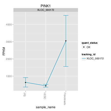
I would like to create a plot that looks like this one. A01, A02 and A03 should make up the confidence interval for A, etc. How can I have a very simple plot with the 3 groups on the x-axis. Eventually, I want to make a graph that contains more than one ID, so it looks like this one, but with error bars or CI like the first one.

If someone could help me or give me tips on how to proceed, I would appreciate it so much!

Thank you.

Roland
  • 127,288
  • 10
  • 191
  • 288
user1678000
  • 73
  • 1
  • 3
  • 9
  • 2
    Since you're been working on this for days (sorry 'bout that, btw!) would you mind sharing some of the things you've tried? – joran Nov 11 '12 at 15:35
  • I tried making a box plot, thinking that was the way to go and then remove the boxes, but learned that box plots are probably wrong! So now I need to start over, I'm new to ggplot and R so it's not so easy yet. :) – user1678000 Nov 11 '12 at 15:37
  • 2
    No, I mean what specific code have you tried to achieve the particular result you're asking about here? We sort of assume that you've actually made an attempt yourself before asking us to do it for you. – joran Nov 11 '12 at 15:51

1 Answers1

3
set.seed(42)
df <- data.frame(group=rep(c("a","b","c"),each=10),value=c(rnorm(10,mean=1,sd=0.1),rnorm(10,mean=1.5,sd=0.3),rnorm(10,mean=3,sd=0.2)))

library(ggplot2)
library(Hmisc)
p1 <- ggplot(df,aes(x=group,y=value)) 
p1 + 
  stat_summary(fun.data = "mean_cl_boot", colour = "red", geom = "errorbar") +  #errorbar with bootstrapped 95 % confidence interval
  stat_summary(fun.data = "mean_cl_normal", colour = "blue", geom = "errorbar") + #errorbar with normal 95 % confidence interval
  stat_summary(fun.y = "mean", colour = "black", geom = "point") + #means
  stat_summary(fun.y= "mean", colour="black", geom="line", aes(group = 1)) #lines connecting means

enter image description here

Think carefully if you really want to connect the group means as that doesn't make much sense.

Roland
  • 127,288
  • 10
  • 191
  • 288
  • Wow that is amazing!! It works! Thank you so so so much! I do want the lines in between, just like that, so I can visually see if the value has increased or decreased between the groups. – user1678000 Nov 11 '12 at 16:31
  • Now I just need to figure out how to make my data into a dataframe that looks like yours. > df <- data.frame(matrix(c(1:3, 6:8, 11:13), nrow = 1)) colnames(df)=c("A","A","A","B","B","B","C","C","C") The transform(df) didn't work. – user1678000 Nov 11 '12 at 16:35
  • That is a separate issue and should be asked as a new question. Just make sure to make it [reproducible](http://stackoverflow.com/questions/5963269/how-to-make-a-great-r-reproducible-example). – Roland Nov 11 '12 at 16:37
  • Ok, I will try some on my own first and then google it, I can probably figure it out soon. Thank you Roland so much for your help! – user1678000 Nov 11 '12 at 16:41
  • Hi Roland. Thank you again. I figured out how to read my data into the correct format from the beginning so I don't need to transform it. I only have one small question. In my df I have 4 groups with the order A,B,C,D. But when I plot it, the order changes so it's C,D,A,B on the x-axis. How can I have the x-axis as the correct order as it appears in the df? – user1678000 Nov 12 '12 at 13:27
  • You group variable might be a factor. Try converting it to character. Or maybe `?relevel`could help. – Roland Nov 12 '12 at 13:35