65

I have a div element that I want to hide when the width of the browser is less than or equal to 1026px. Is this possible to do with the css: @media only screen and (min-width: 1140px) {} If it isn't possible with css, Is there any alternative?

Extra info: When the div element is hidden, I don't want a blank white gap. I'd like the page to flow as it would if I deleted the div element entirely from the code.

The div I am hiding is <div id="fadeshow1"></div>.

HTML5 Doctype.

I used javascript to place a gallery into that div.


I want it to look like this when it is bigger than 1026px width: https://i.stack.imgur.com/REBPi.png


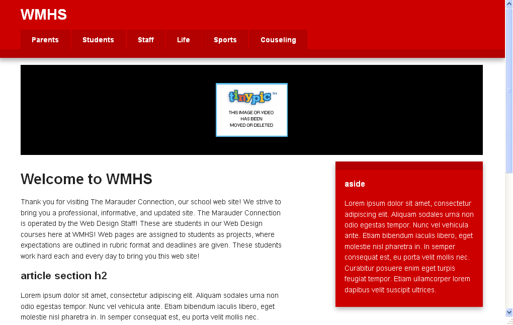
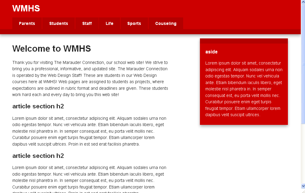
I want it to look like this when it is less than 1026px width: https://i.stack.imgur.com/XdiL4.png

Wafie Ali
  • 228
  • 9
  • 24
Brett Merrifield
  • 2,220
  • 6
  • 22
  • 21

10 Answers10

179

You can do this with CSS:

@media only screen and (max-width: 1026px) {
    #fadeshow1 {
        display: none;
    }
}

We're using max-width, because we want to make an exception to the CSS, when a screen is smaller than the 1026px. min-width would make the CSS rule count for all screens of 1026px width and larger.

Something to keep in mind is that @media queries are not supported on IE8 and lower.

mekb
  • 554
  • 8
  • 22
Cerbrus
  • 70,800
  • 18
  • 132
  • 147
  • This is working like charm!!! if you have class then just use `.` instead of `#` as per CSS rule like as follow. @media only screen and (max-width: 1026px) { .fadeshow1 { display: none; } } – Atul Baldaniya Jul 23 '20 at 08:27
  • Actually when screen is smaller or **equal** to 'max-width'. – Hassan Monjezi Aug 06 '22 at 00:48
25
@media only screen and (max-width: 1026px) { 
  #fadeshow1 { 
    display: none; 
  } 
}

Any time the screen is less than 1026 pixels wide, anything inside the { } will apply.

Some browsers don't support media queries. You can get round this using a javascript library like Respond.JS

Andy
  • 14,427
  • 3
  • 52
  • 76
10

if you are using bootstrap u can just use the hidden-sm ( lg or md or xs) depending on what u want. u can then go into the css file and specify the percentages u want it to show on. in the sample below it will be hiding on large screens, medium ones and extra small ones but show on small screens by taking half of the screen.

<div class="col-sm-12 hidden-lg hidden-md hidden-xs">what ever you want</div>
Kabengwa Patrick
  • 339
  • 3
  • 15
  • Bootstrap by defualt has this css file with all the @media screen sizes for extra small, small,medium and large set all u need to do is adjust them to ur needs. even if you are not using bootstrap u can copy and paste in ur css file. *link to file ->* [link](https://drive.google.com/file/d/0B5X-yh_L2HHNZ2gyejdXTWRCc28/view?usp=sharing ) – Kabengwa Patrick Mar 29 '17 at 11:46
7

I don't know about CSS but this Javascript code should work:

    function getBrowserSize(){
       var w, h;

         if(typeof window.innerWidth != 'undefined')
         {
          w = window.innerWidth; //other browsers
          h = window.innerHeight;
         } 
         else if(typeof document.documentElement != 'undefined' && typeof      document.documentElement.clientWidth != 'undefined' && document.documentElement.clientWidth != 0) 
         {
          w =  document.documentElement.clientWidth; //IE
          h = document.documentElement.clientHeight;
         }
         else{
          w = document.body.clientWidth; //IE
          h = document.body.clientHeight;
         }
       return {'width':w, 'height': h};
}

if(parseInt(getBrowserSize().width) < 1026){
 document.getElementById("fadeshow1").style.display = "none";
}
NaijaProgrammer
  • 2,892
  • 2
  • 24
  • 33
  • 2
    Using @media in css is the easier. Javascript makes this task more complicated. –  Dec 15 '14 at 15:24
  • I'm new to web applications so correct me if I'm wrong but isn't it better to use `==!` instead of `=!` ? – Touk Apr 28 '17 at 09:35
3

You simply need to use a media query in CSS to accomplish this.

@media (max-width: 1026px) {
    #fadeshow1 { display: none; }
}

Unfortunately some browsers do not support @media (looking at you IE8 and below). In those cases, you have a few options, but the most common is Respond.js which is a lightweight polyfill for min/max-width CSS3 Media Queries.

<!--[if lt IE 9]>
    <script src="respond.min.js"></script>
<![endif]-->

This will allow your responsive design to function in those old versions of IE.
*reference

Community
  • 1
  • 1
JRulle
  • 7,448
  • 6
  • 39
  • 61
2

This should help:

if(screen.width<1026){//get the screen width
   //get element form document
   elem.style.display == 'none'//toggle visibility
}

768 px should be enough as well

palamunder
  • 2,555
  • 1
  • 19
  • 20
Vaibhav
  • 703
  • 1
  • 7
  • 18
  • 2
    `Visibility:hidden` makes the div invisible but doesn't get rid of the area it took up on the page, so OP would have a big blank block in the middle of his site. `Display: none` is better – Andy Nov 20 '12 at 15:26
1
@media only screen and (min-width: 1140px)

should do his job, show us your css file

HK boy
  • 1,398
  • 11
  • 17
  • 25
Mirco
  • 2,940
  • 5
  • 34
  • 57
1

You have to use max-width instead of min-width.

<style>
    @media (max-width: 1026px) {
        #test {
            display: none;
        }
    }
</style>
<div id="test">
    <h1>Test</h1>
</div>
0

The easiest approach I know of is using onresize() func:

   window.onresize = function(event) {
        ...
    }

Here is a fiddle for it

DeeDub
  • 1,654
  • 1
  • 12
  • 18
0

This is kind of a hack but it works well and it's all CSS:

#fadeshow1 {
  /**
Sets the max-width to 0px if the calculation
if right statement is negative thus rendering it invisible.
                  |
                  |   120px is the size you want the width to be set to 0px
                  |   if the calc(100% - 120px) is negative it sets it to 0px
                  |   if the calc(100% - 120px) is positive it sets it to calc(100% - 120px)
                  |                 |
                  |                 |
                  |                 |     Multiply by a very high number always greater than the width
                  |                 |     |
                  V                 v     v
  */
  max-width: max(0px, calc((100% - 120px) * 999));
  /** Necessart otherwise it doesn't hide the element */
  overflow: hidden;
}

I picked this up from this article: https://medium.com/swlh/hiding-an-element-when-there-is-no-enough-space-thanos-snap-technique-8a11e31267c0.