I really need your R skills here. Been working with this plot for several days now. I'm a R newbie, so that might explain it.
I have sequence coverage data for chromosomes (basically a value for each position along the length of every chromosome, making the length of the vectors many millions). I want to make a nice coverage plot of my reads. This is what I got so far:

Looks alright, but I'm missing y-labels so I can tell which chromosome it is, and also I've been having trouble modifying the x-axis, so it ends where the coverage ends. Additionally, my own data is much much bigger, making this plot in particular take extremely long time. Which is why I tried this HilbertVis plotLongVector. It works but I can't figure out how to modify it, the x-axis, the labels, how to make the y-axis logged, and the vectors all get the same length on the plot even though they are not equally long.
source("http://bioconductor.org/biocLite.R")
biocLite("HilbertVis")
library(HilbertVis)
chr1 <- abs(makeRandomTestData(len=1.3e+07))
chr2 <- abs(makeRandomTestData(len=1e+07))

par(mfcol=c(8, 1), mar=c(1, 1, 1, 1), ylog=T)

# 1st way of trying with some code I found on stackoverflow
# Chr1
plotCoverage <- function(chr1, start, end) { # Defines coverage plotting function.
  plot.new()
  plot.window(c(start, length(chr1)), c(0, 10))
  axis(1, labels=F)
  axis(4)
  lines(start:end, log(chr1[start:end]), type="l")
}
plotCoverage(chr1, start=1, end=length(chr1)) # Plots coverage result.

# Chr2
plotCoverage <- function(chr2, start, end) { # Defines coverage plotting function.
  plot.new()
  plot.window(c(start, length(chr1)), c(0, 10))
  axis(1, labels=F)
  axis(4)
  lines(start:end, log(chr2[start:end]), type="l")
}
plotCoverage(chr2, start=1, end=length(chr2)) # Plots coverage result.


# 2nd way of trying with plotLongVector
plotLongVector(chr1, bty="n", ylab="Chr1") # ylab doesn't work
plotLongVector(chr2, bty="n")
Then I have another vector called genes that are of special interest. They are about the same length as the chromosome-vectors but in my data they contain more zeroes than values.
genes_chr1 <- abs(makeRandomTestData(len=1.3e+07))
genes_chr2 <- abs(makeRandomTestData(len=1e+07))
These gene vectors I would like plotted as a red dot under the chromosomes! Basically, if the vector has a value there (>0), it is presented as a dot (or line) under the long vector plot. This I have not idea how to add! But it seems fairly straightforward.
Please help me! Thank you so much.
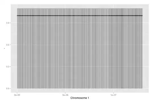 This has 7000 random data points (about double the amount of genes on Chromosome 1 in reality). I used alpha to show dense areas (not many here, as it's random data).