67

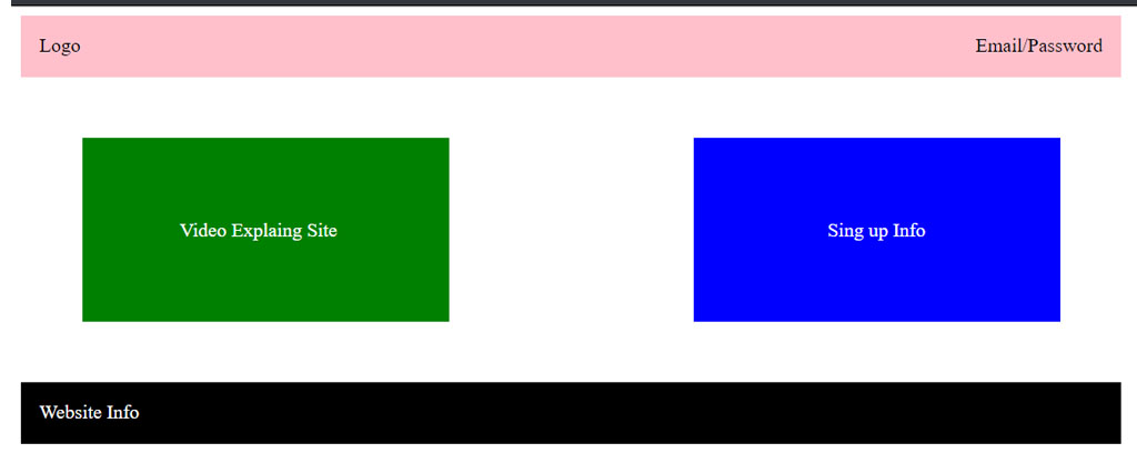
So I'm quite new to writing code (about a few weeks) and I've hit a wall while writing code for my website. I want to have a layout like this:

Image But I can't figure out how to put the two boxes side by side. One box will be a video explaining my website, while the other box will be a sign up registration form. I want the boxes to be next to each other, with about an inch of separation between them.

I also need help with the width of my website's header. Right now it looks like the header doesn't fit on the page, causing a horizontal scroll. Kind of like this:

Image I want it so that the entire website is like one big box, and all the content is inside that box. Can someone please help me? Much appreciated. Thank you in advance.

Richard Linares
  • 679
  • 1
  • 6
  • 5

8 Answers8

79

http://jsfiddle.net/kkobold/qMQL5/

#header {
    width: 100%;
    background-color: red;
    height: 30px;
}

#container {
    width: 300px;
    background-color: #ffcc33;
    margin: auto;
}
#first {
    width: 100px;
    float: left;
    height: 300px;
        background-color: blue;
}
#second {
    width: 200px;
    float: left;
    height: 300px;
    background-color: green;
}
#clear {
    clear: both;
}
<div id="header"></div>
<div id="container">
    <div id="first"></div>
    <div id="second"></div>
    <div id="clear"></div>
</div>
thumbtackthief
  • 6,093
  • 10
  • 41
  • 87
Danilo Kobold
  • 2,562
  • 1
  • 21
  • 31
44

This will work

<div style="width:800px;">
  <div style="width:300px; float:left;"></div>
  <div style="width:300px; float:right;"></div>
</div>
<div style="clear: both;"></div>
Jens
  • 5,767
  • 5
  • 54
  • 69
8
<div style="display: inline">
    <div style="width:80%; display: inline-block; float:left; margin-right: 10px;"></div>
    <div style="width: 19%; display: inline-block; border: 1px solid red"></div>
</div>
Arel
  • 3,888
  • 6
  • 37
  • 91
Dostonbek Oripjonov
  • 1,508
  • 1
  • 12
  • 28
  • 4
    While this code may answer the question, providing additional context regarding **how** and **why** it solves the problem would improve the answer's long-term value. – Alexander Mar 30 '19 at 12:31
5

I am just giving the code for two responsive divs side by side

*{
  margin: 0;
  padding: 0;
}

#parent {
  display: flex;
  justify-content: space-around;
}

#left {
  border: 1px solid lightgray;
  background-color: red;
  width: 40%;
}

#right {
  border: 1px solid lightgray;
  background-color: green;
  width: 40%;
}
<!DOCTYPE html>
<html lang="en">
<head>
    <meta charset="UTF-8">
    <meta name="viewport" content="width=device-width, initial-scale=1.0">
    <title>Document</title>
</head>
<body>
    <div id="parent">
        <div id="left">
        lorem ipsum dolor sit emet
        </div>
        <div id="right">
        lorem ipsum dolor sit emet
        </div>
    </div>
</body>
</html>
keemahs
  • 780
  • 11
  • 14
3

This is just a simple(not-responsive) HTML/CSS translation of the wireframe you provided.

enter image description here

HTML

<div class="container">

  <header>
    <div class="logo">Logo</div>
    <div class="menu">Email/Password</div>
  </header>

  <div class="first-box">
    <p>Video Explaning Site</p>
  </div>

  <div class="second-box">
    <p>Sign up Info</p>
  </div>

  <footer>
    <div>Website Info</div>
  </footer>

</div>

CSS

.container {
  width:900px; 
  height: 150px;
}

header {
  width:900px; 
  float:left; 
  background: pink; 
  height: 50px;
}

.logo {
  float: left;
  padding: 15px
}

.menu {
  float: right;
  padding: 15px
}

.first-box {
  width:300px; 
  float:left; 
  background: green; 
  height: 150px;
  margin: 50px
}

.first-box p {
  color: #ffffff;
  padding-left: 80px;
  padding-top: 50px;
}

.second-box {
  width:300px; 
  height: 150px; 
  float:right; 
  background: blue;
  margin: 50px
}

.second-box p {
  color: #ffffff;
  padding-left: 110px;
  padding-top: 50px;
}

footer {
  width:900px; 
  float:left; 
  background: black; 
  height: 50px;
  color: #ffffff;
}

footer div {
  padding: 15px;
}
Victor Ejiogu
  • 1,184
  • 14
  • 23
2

You can do it in three ways:

Float Method

<div class="float-container">
  <div class="float-child">
    <div class="green">Float Column 1</div>
  </div>
  <div class="float-child">
    <div class="blue">Float Column 2</div>
  </div>
</div>

.float-container {
    border: 3px solid #fff;
    padding: 20px;
}

.float-child {
    width: 50%;
    float: left;
    padding: 20px;
    border: 2px solid red;
}

Flexbox Method

<div class="flex-container">
  <div class="flex-child magenta">
    Flex Column 1
  </div>
  <div class="flex-child green">
    Flex Column 2
  </div>
</div>
.flex-container {
    display: flex;
}

.flex-child {
    flex: 1;
    border: 2px solid yellow;
}  

.flex-child:first-child {
    margin-right: 20px;
} 

CSS Grid Method

<div class="grid-container">
    <div class="grid-child purple">
        Grid Column 1
    </div>
    <div class="grid-child green">
        Grid Column 2
    </div>
</div>
.grid-container {
    display: grid;
    grid-template-columns: 1fr 1fr;
    grid-gap: 20px;
}

Source

Khabir
  • 5,370
  • 1
  • 21
  • 33
1

Have a look at CSS and HTML in depth you will figure this out. It just floating the boxes left and right and those boxes need to be inside a same div. http://www.w3schools.com/html/html_layout.asp might be a good resource.

  • 3
    w3schools should be avoided as a resource, a lot of their information is inaccurate. The W3C wiki is a decent alternative http://www.w3.org/wiki/CSS/Training – Cody Bonney Mar 21 '13 at 19:25
1

Regarding the width of your website, you'll want to consider using a wrapper class to surround your content (this should help to constrain your element widths and prevent them from expanding too far beyond the content):

<style>
.wrapper {
  width: 980px;
}
</style>

<body>
  <div class="wrapper">
    //everything else
  </div>
</body>

As far as the content boxes go, I would suggest trying to use

<style>
.boxes {
  display: inline-block;
  width: 360px;
  height: 360px;
}
#leftBox {
  float: left;
}
#rightBox {
  float: right;
}
</style>

I would spend some time researching the box-object model and all of the "display" properties. They will be forever helpful. Pay particularly close attention to "inline-block", I use it practically every day.

Jason Sears
  • 429
  • 1
  • 7
  • 18