13

I'm trying to add a data-table to a graph made in ggplot (similar to the excel functionality but with the flexibility to change the axis its on)

I've had a few goes at it and keep hitting a problem with scaling so attempt 1) was

library(grid)
library(gridExtra)
library(ggplot2)
xta=data.frame(f=rnorm(37,mean=400,sd=50))
xta$n=0
for(i in 1:37){xta$n[i]<-paste(sample(letters,4),collapse='')}
xta$c=0
for(i in 1:37){xta$c[i]<-sample((1:6),1)}
rect=data.frame(xmi=seq(0.5,36.5,1),xma=seq(1.5,37.5,1),ymi=0,yma=10)
xta=cbind(xta,rect)
a = ggplot(data=xta,aes(x=n,y=f,fill=c)) + geom_bar(stat='identity')
b = ggplot(data=xta,aes(x=n,y=5,label=round(f,1))) + geom_text(size=4) + geom_rect(aes(xmin=xmi,xmax=xma,ymin=ymi,ymax=yma),alpha=0,color='black')
z = theme(axis.text=element_blank(),panel.background=element_rect(fill='white'),axis.ticks=element_blank(),axis.title=element_blank())
b=b+z
la=grid.layout(nrow=2,ncol=1,heights=c(0.15,2),default.units=c('null','null'))
grid.show.layout(la)
grid.newpage()
pushViewport(viewport(layout=la))
print(a,vp=viewport(layout.pos.row=2,layout.pos.col=1))
print(b,vp=viewport(layout.pos.row=1,layout.pos.col=1))
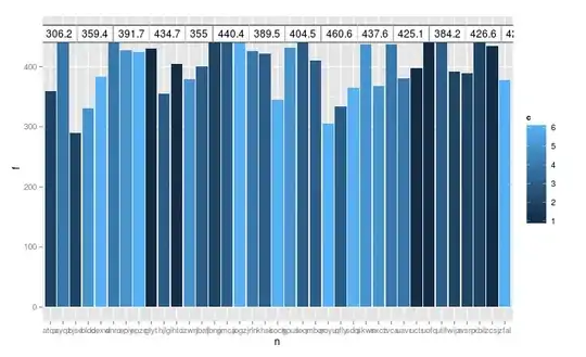
which produced

2 ggplots

the second attempt 2) was

xta1=data.frame(t(round(xta$f,1)))
xtb=tableGrob(xta1,show.rownames=F,show.colnames=F,show.vlines=T,gpar.corefill=gpar(fill='white',col='black'),gp=gpar(fontsize=12),vp=viewport(layout.pos.row=1,layout.pos.col=1))
grid.newpage()
la=grid.layout(nrow=2,ncol=1,heights=c(0.15,2),default.units=c('null','null'))
grid.show.layout(la)
grid.newpage()
pushViewport(viewport(layout=la))
print(a,vp=viewport(layout.pos.row=2,layout.pos.col=1))
grid.draw(xtb)

which produced

using a straight table grob and grid.draw

and finally 3) was

grid.newpage()
print(a + annotation_custom(grob=xtb,xmin=0,xmax=37,ymin=450,ymax=460))

which produced

using annotate_custom

Of them option 2 would be the best if I could scale the tableGrob to the same size as the plot, but I've no idea how to do that. Any pointers on how to take this further? - Thanks

Richie Cotton
  • 118,240
  • 47
  • 247
  • 360
Tahnoon Pasha
  • 5,848
  • 14
  • 49
  • 75

3 Answers3

14

You can try the new version of tableGrob; the resulting gtable width/height can be set to a specific size (here equi-distributed npc units)

library(ggplot2)
library(gridExtra)
library(grid)
tg <- tableGrob(head(iris), rows=NULL)
tg$widths <- unit(rep(1/ncol(tg),ncol(tg)),"npc")
tg$heights <- unit(rep(1/nrow(tg),nrow(tg)),"npc")

qplot(colnames(iris), geom="bar")+ theme_bw() +
  scale_x_discrete(expand=c(0,0)) +
  scale_y_continuous(lim=c(0,2), expand=c(0,0)) +
  annotation_custom(ymin=1, ymax=2, xmin=-Inf, xmax=Inf, tg)

enter image description here

baptiste
  • 75,767
  • 19
  • 198
  • 294
  • thanks @baptiste I haven't had a chance to test this yet. Will do so over the weekend but this looks like the right answer. Thanks also for a terrific package – Tahnoon Pasha Apr 12 '13 at 10:28
  • A quick question @baptiste do I have to load the `source_gist` every time? When you you anticipate the experimental tableGrob will enter the mainstream code? – Tahnoon Pasha Apr 14 '13 at 09:18
  • My advice if you find it useful would be to copy the code and load it locally yourself (in a package, or in your .Rprofile). I really can't promise any release date since I very rarely work on this package, and this new version is highly experimental. If it works for you, it should be easy to adapt with custom colors etc. – baptiste Apr 14 '13 at 12:17
11

You can use for instance a table created by ggplot and combine them with like in this blog. I made a simplified and working example here:

First produce your plot:

library(ggplot2)
library(reshape2)
library(grid)

 df <- structure(list(City = structure(c(2L,
     3L, 1L), .Label = c("Minneapolis", "Phoenix",
     "Raleigh"), class = "factor"), January = c(52.1,
     40.5, 12.2), February = c(55.1, 42.2, 16.5),
     March = c(59.7, 49.2, 28.3), April = c(67.7,
         59.5, 45.1), May = c(76.3, 67.4, 57.1),
     June = c(84.6, 74.4, 66.9), July = c(91.2,
         77.5, 71.9), August = c(89.1, 76.5,
         70.2), September = c(83.8, 70.6, 60),
     October = c(72.2, 60.2, 50), November = c(59.8,
         50, 32.4), December = c(52.5, 41.2,
         18.6)), .Names = c("City", "January",
     "February", "March", "April", "May", "June",
     "July", "August", "September", "October",
     "November", "December"), class = "data.frame",
     row.names = c(NA, -3L))

dfm <- melt(df, variable = "month")

 levels(dfm$month) <- month.abb
 p <- ggplot(dfm, aes(month, value, group = City,
     colour = City))
 p1 <- p + geom_line(size = 1) + theme(legend.position = "top") + xlab("")

Next produce the data table in ggplot. Use the same x-axis as the plot:

none <- element_blank()
data_table <- ggplot(dfm, aes(x = month, y = factor(City),
     label = format(value, nsmall = 1), colour = City)) +
     geom_text(size = 3.5) +
  scale_y_discrete(labels = abbreviate)+ theme_bw()  +
     theme(panel.grid.major = none, legend.position = "none",
         panel.border = none, axis.text.x = none,
         axis.ticks = none) + theme(plot.margin = unit(c(-0.5,
     1, 0, 0.5), "lines")) + xlab(NULL) + ylab(NULL)

Combine the two with viewport:

Layout <- grid.layout(nrow = 2, ncol = 1, heights = unit(c(2,
     0.25), c("null", "null")))
grid.show.layout(Layout)
vplayout <- function(...) {
     grid.newpage()
     pushViewport(viewport(layout = Layout))
 }

subplot <- function(x, y) viewport(layout.pos.row = x,
     layout.pos.col = y)

mmplot <- function(a, b) {
     vplayout()
     print(a, vp = subplot(1, 1))
     print(b, vp = subplot(2, 1))
 }

mmplot(p1, data_table)

Note that still some tweaking is needed like the position of the legend of the plot and the abbrevation of the city names in the table, but the result looks nice: enter image description here

Applied to your example:

library(grid)
library(gridExtra)
library(ggplot2)
xta=data.frame(f=rnorm(37,mean=400,sd=50))
xta$n=0
for(i in 1:37){xta$n[i]<-paste(sample(letters,4),collapse='')}
xta$c=0
for(i in 1:37){xta$c[i]<-sample((1:6),1)}
rect=data.frame(xmi=seq(0.5,36.5,1),xma=seq(1.5,37.5,1),ymi=0,yma=10)
xta=cbind(xta,rect)
a = ggplot(data=xta,aes(x=n,y=f,fill=c)) + geom_bar(stat='identity')+ theme(legend.position = "top")+xlab("")

none <- element_blank()
z=ggplot(xta, aes(x = n, y = "fvalues",
     label = round(f,1)) )+
     geom_text(size = 3)+ theme_bw()  +
     theme(panel.grid.major = none, legend.position = "none",
         panel.border = none, axis.text.x = none,
         axis.ticks = none) + theme(plot.margin = unit(c(-0.5,
     1, 0, 0.5), "lines")) + xlab(NULL) + ylab(NULL)

Layout <- grid.layout(nrow = 2, ncol = 1, heights = unit(c(2,
     0.25), c("null", "null")))
grid.show.layout(Layout)
vplayout <- function(...) {
     grid.newpage()
     pushViewport(viewport(layout = Layout))
 }

subplot <- function(x, y) viewport(layout.pos.row = x,
     layout.pos.col = y)

mmplot <- function(a, b) {
     vplayout()
     print(a, vp = subplot(1, 1))
     print(b, vp = subplot(2, 1))
 }

mmplot(a, z)

enter image description here

EDIT:

similar to Dennis his solution but than a barplot and with + coord_flip(). You can remove the latter if you don't want to flip it, but it increases readability:

ggplot(xta, aes(x=n,y=f,fill=c)) +
   geom_bar() +
   labs(color = "c") +
   geom_text(aes(y = max(f)+30, label = round(f, 1)), size = 3, color = "black") + coord_flip()
Jonas Tundo
  • 6,137
  • 2
  • 35
  • 45
  • Thanks @JT85 this is useful and I did see that blog. My first attempt (not using a tableGrob) is essentially exactly that process but with the function calls removed and rectangles around the numbers. I know I can get it to work if I move the legend, but I'm trying to resize the grob to the graphic not change the graphic to permit the data to be shown. This is very nearly what I need though. – Tahnoon Pasha Apr 05 '13 at 10:43
  • 1
    I added another solution to the answer. – Jonas Tundo Apr 05 '13 at 11:25
  • thanks @JT85. This is definitely a solution, but I'd like to get to an actual data table if possible. If you don't mind I'll hold off marking this one as the answer since it still looks like an annotation rather than a distinct table for the values. I have a definite look and feel I'm going for. – Tahnoon Pasha Apr 06 '13 at 10:27
1

IMHO this is not a well designed graphic. Firstly, I don't understand why you need a zero origin when the values range from 300 to 500, which is a disguised way of saying that I don't like the bar chart metaphor. You're also attempting to use bar fill to represent differences in the values of c, of which there are only six. Here's what I believe is a simpler approach to the problem. Given your xta data,

# Convert the categories to a factor
xta$N <- factor(xta$n, levels = xta$n)

# Simple approach:
ggplot(xta, aes(x = f, y = N, color = factor(c))) +
   geom_point() +
   labs(color = "c") +
   geom_text(aes(x = 575, label = round(f, 1)), size = 4, color = "black")

That's not an interesting graphic to me. What might add a little insight, depending on the context of the problem, would be to sort the responses in increasing order and add a size aesthetic to punctuate differences between levels of c. (You could also use size without color.) Finally, because we put the factor levels on the vertical axis so that their labels are clearly visible, we can also insert the f values as text by extending the horizontal axis a bit.

ggplot(xta, aes(x = f, y = reorder(N, f), color = factor(c), size = c)) + 
   geom_point() +
   labs(color = "c") +
   geom_text(aes(x = 575, label = round(f, 1)), size = 4, color = "black")

There are enough hints in this code for you to take it in a different direction. I'll leave that up to you.

Dennis
  • 732
  • 4
  • 4
  • 1
    thanks for the input @Dennis. The actual data is sorted and the dataset is more appropriate to using a barplot. I thought about the dotplot but for my audience I expect it would simply confuse matters because they are not familiar with the graphic. I appreciate the input though. I will be using a dotplot for a separate visual aid in the same project. – Tahnoon Pasha Apr 05 '13 at 10:40