3

I used the position value fixed in order for the header to remain in place when the user scrolls down.

enter image description here

The problem is that if I zoom in I can't see or access some of my tabs for example:

enter image description here

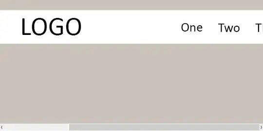
Is there a way to zoom in and still be able to see and access my tabs?

My code:

JSFIDDLE CODE

HTML:

<div id="top">
    <header>
        <hgroup>
            <h1>LOGO</h1>
        </hgroup>
        <nav>
            <ul>
                <li class="tabs"><a href="#">First</a></li>
                <li class="tabs"><a href="#">Second</a></li>
                <li class="tabs"><a href="#">Third</a></li>
                <li class="tabs"><a href="#">Fourth</a></li>
            </ul>
       </nav>
    </header>

CSS:

#top {
    background-color: #1b1b1b;
    box-shadow: 0px 0px 9px rgba(0,0,0,0.15);
    padding: 20px 100px;
    width: 100%;
    height: 70px;
    z-index: 99999;
    position: fixed;
    top: 0;
    left: 0;
}
header {
    position: relative;
    width: 440px;
    height: 70px;
    margin: 0 auto;
}
header hgroup {
    position: absolute;
    display: block;
    top: 5px;
    left: -50px;
}
header hgroup h1 {
    font-size: 50px;
    color: #fff;
    display: block;
    height: 100px;
    width: 610px;
}
nav {
    float: right;
}
nav ul li:hover > ul {
    display: block;
}
nav ul {
    margin-top: 10px;
    padding: 0 20px;  
    list-style: none;
    position: relative;
    display: inline-table;
    margin-right: -80px;
}
nav ul:after {
    content: ""; 
    clear: both; 
    display: block;
}
nav ul li {
    float: left;
}
nav ul li:hover {
    color: #fff;
}
.tabs:hover {
    border-bottom: 5px solid #fff;
}
nav ul li a:hover {
    color: #fff;
}
nav ul li a {
    display: block; 
    padding: 15px 15px;     
    font-family: 'PT Sans', sans-serif;
    color: #fff; 
    text-decoration: none;
}
kalpetros
  • 983
  • 3
  • 15
  • 35
  • You should be aiming for a liquid layout... right now every measurement is fixed, while only the position of your banned should be fixed, and elements in it relative to their respective position... – sg3s Apr 25 '13 at 16:18
  • Is [this](http://stackoverflow.com/questions/8025818/unable-to-get-the-scroll-when-positionfixed-elements-disappears-form-the-scr/8026202#8026202) any help ? – Philippe Boissonneault Apr 25 '13 at 16:23
  • It doesn't seem to work. – kalpetros Apr 25 '13 at 16:31
  • I think your problem is that when you zoom in, your image locates on top of your menu, so it covers part of your menu, making impossible to click it as your image is above. Try to reduce the image size and tell us if that's happening. – Sonhja Apr 25 '13 at 16:57
  • The logo doesn't cover the menu when I zoom in. Open the fiddle I provided and make the result screen bigger. Then try to zoom in. Some of the tabs disappear. – kalpetros Apr 25 '13 at 17:09
  • Try this: http://jsfiddle.net/rTmm7/3/ or direct result: http://jsfiddle.net/rTmm7/3/embedded/result/ – Sonhja Apr 25 '13 at 17:19
  • As it's been mentioned already, the problem is the pixel values in your header selectors. You need to use percentages there to make it a fluid layout. – Matt Lambert Apr 25 '13 at 17:49
  • The solution below works but if I keep zooming in the logo covers the menu. I can still click/use the menu though. – kalpetros Apr 26 '13 at 20:35

1 Answers1

3

Do not use fixed width for your header, use 100% instead:

#top {
    background-color: #1b1b1b;
    box-shadow: 0px 0px 9px rgba(0,0,0,0.15);

    width: 100%;
    height: 70px;
    z-index: 99999;
    position: fixed;
    top: 0;
    left: 0;
}
header {
    position: relative;
    width: 100%;
    height: 70px;
    margin: 0 auto;
}

Updated Fiddle

Eli
  • 14,779
  • 5
  • 59
  • 77