47

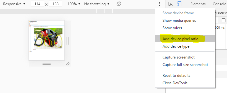
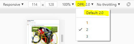
While it is easy to test different screen resolutions in Google Chrome i wonder how developers could test different device pixel ratios underlying the following CSS media queries.

/* Pixel ratio of 1. Background size is 100% (of a 100px image) */
#header { background: url(header.png); }

/* Pixel ratio of 1.5. Background-size is 1/1.5 = 66.67% (of a 150px image) */
@media only screen and (-moz-min-device-pixel-ratio: 1.5), only screen and (-o-min-device-pixel-ratio: 3/2), only screen and (-webkit-min-device-pixel-ratio: 1.5), only screen and (min-device-pixel-ratio: 1.5) {
    #header { background: url(headerRatio1_5.png); background-size: 66.67%; }

}

/* Pixel ratio of 2. Background-size is 1/2 = 50% (of a 200px image) */
@media only screen and (-moz-min-device-pixel-ratio: 2), only screen and (-o-min-device-pixel-ratio: 2/1), only screen and (-webkit-min-device-pixel-ratio: 2), only screen and (min-device-pixel-ratio: 2) {
    #header { background: url(headerRatio2.png); background-size: 50%; }

}

Does there exist any way or a browser extension to mimic device pixel ratio?

BoltClock
  • 700,868
  • 160
  • 1,392
  • 1,356
Stephan Ahlf
  • 3,310
  • 5
  • 39
  • 68
  • Chrome supports this in a very convenient way starting with version 32 (see my answer below). For Firefox, andrewb's answer still applies. – rob74 Feb 23 '14 at 03:46
  • Possible duplicate of [How to test a webpage meant for Retina display?](http://stackoverflow.com/questions/12243549/how-to-test-a-webpage-meant-for-retina-display) – Szabolcs Páll Nov 23 '15 at 11:44
  • 1
    Note that `-moz-min-device-pixel-ratio` is deprecated, see https://developer.mozilla.org/en-US/docs/Web/CSS/Media_Queries/Using_media_queries#-moz-device-pixel-ratio for more details and newer methods. – andrewb Apr 18 '16 at 02:54

5 Answers5

51

about:config hack on Firefox

You actually can using Firefox:

  1. Go to "about:config"
  2. Find "layout.css.devPixelsPerPx
  3. Change it to your desired ratio (1 for normal, 2 for retina, etc.)

Refresh your page - boom, your media query has now kicked in! Hats off to Firefox for being awesome for web developing!

This was done on Windows 7 with Firefox 21.0.

Zooming on Firefox & Edge

Currently on Firefox and Edge, if you zoom it triggers dppx-based media queries. So this easier approach may be sufficient, but be aware that the functionality is reported as a "won't fix" bug for Firefox, so this could change.

andrewb
  • 5,200
  • 6
  • 36
  • 54
  • @andrewb is right, I didn't come across that setting before his message. Although `1 for normal, 2 for retina` isn't precise. As the original bugs https://bugzilla.mozilla.org/show_bug.cgi?id=394103 and https://bugzilla.mozilla.org/show_bug.cgi?id=512522 lay out, value 1 is default for 96 dpi(~ ppi). If you wanna go for a MacBook Pro with 220 ppi, you have to enter `2.29` (220/96) or for a iPhone enter `3.4` (326/96). – Volker E. Jun 22 '13 at 02:00
  • 2
    @VolkerE. It depends on what you're testing. What you've said is possibly right for physical image display size (i.e. cmxcm) and maybe font size (em). However for whether or not media queries are triggering, I'm quite confident that 2 is the right number. Also, for image rendering, 2 will again be the right number. – andrewb Jun 22 '13 at 11:29
  • When I try this, not only does the viewer window increase in "zoom factor" (expected), but also (1) the chrome (2) all windows, not just the one under test (sort of expected, because of the global nature of the setting) (3) firebug (I probably should have expected this one, but didn't). The latter means that higher resolution displays (think about your 600dpi printer, for example) may be displayable, but are not debuggable. There needs to be a setting that only affects the content of a particular tab and window. – Victoria Oct 14 '14 at 06:07
  • 1
    @Victoria Yep definitely, it's hacky, and having it tab-specific would be great. Unfortunately I've yet to find anything else which is as comprehensive of an emulation. Chrome DevTools is close, but it doesn't zoom in appropriately, so you can't review the full-res pixel output. – andrewb Oct 14 '14 at 21:47
  • Thanks for the comment regarding Chrome DevTools... I was going to check it out when I got a chance, but you nailed the one main feature I was looking for, as being missing, so you saved me some time. – Victoria Oct 15 '14 at 02:55
  • Still there is a huge difference between simulation and the real device. I am trying to do a proper media query for iphone 12 pro max and the simulation claims to give me the real stuff. However, when I load my site on a real device, it is a whole different ballgame. – AnatuGreen Jul 20 '22 at 00:18
39

The Chrome DevTools have a feature called "Device Mode & Mobile Emulation" available in Chrome 32 and higher. It is described in detail here. Here's a video tutorial from Google's DevBytes YouTube channel.

Open DevTools by pressing F12 (or Shift+Ctrl+I / Cmd+Opt+I on Mac). In current Chrome versions, click the "smartphone" icon in the upper left corner of the DevTools window to activate Mobile Emulation. You can change most of the settings (device type, screen resolution & rotation, zoom factor...) in the toolbar on the emulation screen. For further options, click "..." on the right side of the toolbar.

enter image description here enter image description here

In older versions of Chrome, you may have to enable the feature before you can use it: in DevTools, click the Settings icon (cogwheel), then click "Overrides" and select "Show 'Emulation' view in console drawer". Then, click the ">=" icon to the left of the Settings icon to show the "console drawer" and you should see an "Emulation" tab, where you can enable the emulation and change the settings.

GoTo
  • 5,966
  • 2
  • 28
  • 31
rob74
  • 4,939
  • 29
  • 31
  • My frustrating with this, and Safari's recent similar feature, is that you can't zoom in sufficiently. So if your purpose is to carefully review pixels, it's not going to be sufficient. A real shame, as emulating window size and touch is great! – andrewb Apr 18 '16 at 02:52
  • Although this is handy for testing/developing your media queries, it will not show you what the rendering will look like; for instance a super-light font will still look great as you are viewing it on a high res screen. All web designers should have a rubbish screen on-hand with windows PC attached for testing. – Duncanmoo Sep 12 '17 at 08:30
  • > For further options, click "..." on the right side of the toolbar. Thank you for this. The "•••" was so tiny I'd missed it. – LodeRunner Apr 24 '21 at 17:21
  • Such a shame we can't use these tools without DevTools being opened. https://stackoverflow.com/questions/39804898 – Simon_Weaver Feb 10 '23 at 00:11
4

Volker E. is correct in that pixel-ratio media queries will not be triggered.

It is, however, possible at least to preview the visual appearance (read: scaling) of media queries for devices which are 1.5x, 2x, etc.

Just specify your desired resolution in Chrome Dev Tools, and make sure "Fit in window" is selected. Then, resize your browser window appropriately.

enter image description here

Example: to emulate a Galaxy Nexus in landscape mode, just enter 720x1280 as the dimensions, and then resize your browser window to be 640px wide. Voila! You have now emulated the device's 2x pixel ratio.

(device width [in pixels]) ÷ (device pixel ratio) = the size your window must be

derrylwc
  • 826
  • 8
  • 15
1

derrylwc has a good suggestion but did not include instructions:

  • Open the developer tools (ctrl-shift-i or command-alt-i)
  • Click the gear on the bottom right corner for settings
  • Choose the "Overrides" tab (on the left side)
  • Click "Enable" and "Enable on DevTools startup"
  • Check "Device metrics" and customize. "Font scale factor" appears to be the device pixel ratio.
-4

You are just able to test the media query corresponding to the device pixel ratio on your specific device, you're looking at it's browser while testing.
The device pixel ratio is a device specific unchangeable number because it takes in account the devices available physical pixels. See ppk's research on devicePixelRatio

So it's basically not possible to mimic a different device pixel ratio than the device's very own. Still you can smoke test your code f.e. rather simply by applying a different media query rule.

Take care about min-device-pixel-ratio: 1.5 as newer HDPi devices like Nexus 7 have 1.3 device pixel ratio.

Volker E.
  • 5,911
  • 11
  • 47
  • 64
  • Thanks ! Well it is on demand there https://code.google.com/p/chromium/issues/detail?id=133590 DevTools device metrics need a way to override devicePixelRatio! You right I have no other chance to fake the media queries. That sucks :) – Stephan Ahlf May 06 '13 at 08:01
  • Sorry but this is not true, you can mimic other ratios. Look at my answer. – andrewb Jun 21 '13 at 05:07