1

I have created a message tool tip like : enter image description here
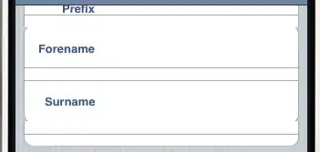
But it consists of an image of :

enter image description here

And a regular div to the right. (with text inside)

However , I prefer not to do it with image. I want to create the triangle part with rotated div.

I've managed to do it here by creating a simple div and rotate it:

   transform: rotate(45deg);
  -ms-transform: rotate(45deg); /* IE 9 */
  -webkit-transform: rotate(45deg); /* Safari and Chrome */

and the result is :
enter image description here

However (and this is my question) -- can I remove the right part of the rotated div , so i'll only have :

enter image description here

Is it possible ?

p.s. - I know thtat I can hide the right part with div by using another div with position relative/absolute. but I want to know if there is a solution with removing the right part. (or maybe , is there any code to create triangle ?). Also lets assume the angle is 90 deg. like in the red div.

Royi Namir
  • 144,742
  • 138
  • 468
  • 792

1 Answers1

3

You can do this without rotating the element, wrap this inside a position relative element, and use position absolute to set it right

Demo

.left {
    width: 0; 
    height: 0; 
    border-top: 10px solid transparent;
    border-bottom: 10px solid transparent;
    border-right:10px solid #001744; 
}
Mr. Alien
  • 153,751
  • 34
  • 298
  • 278
  • amazing. ( still digesting it) . but how come the border-top is not a pure rectangle of border ? how can a border create triangle ? – Royi Namir May 06 '13 at 08:01
  • @RoyiNamir Good read here http://stackoverflow.com/questions/7073484/how-does-this-css-triangle-shape-work – Mr. Alien May 06 '13 at 08:01
  • 1
    @RoyiNamir You can see some amazing examples here too http://css-tricks.com/examples/ShapesOfCSS/ – Mr. Alien May 06 '13 at 08:04