3

sorry for my extreme-ignorance in html-css. I developed a standard Rails application using twitter bootstrap framework. As shown in the snippet below (application.html.erb), I have pages organized as usual like header container footer

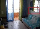
Now I would like that every page could fit the height of the screen (reaching 100% of the screen height in case content is shorter, as in the case of attached scrrenshot).

indeed, as you see in the scrrenshot, I have a grey area in the lower part of screen, instead I would like a with page that fill the entire screen...

I presume it's some CSS configuration, but I tryied some CSS setting without success. Any suggestion ?

thanks! giorgio

<!DOCTYPE html> <html>   <head>
    <title>Esami Anatomia</title>
    <%= render 'layouts/responsive' %> 
    <%= stylesheet_link_tag "application", media: "all" %>
    <%= javascript_include_tag "application" %>
    <%= csrf_meta_tags %>
    <%= render 'layouts/shim' %>   </head>   <body>   <%= render 'layouts/header' %>
    <div class="container-flow">
      <%= render 'layouts/flashes' %>
      <%= yield %>
    <div class="layout-filler"> </div>
    </div>   <%= render 'layouts/footer' %>   </body> </html>

scrrenshot

Giorgio Robino
  • 2,148
  • 6
  • 38
  • 59

1 Answers1

7

If you just want your layout to stretch to 100% height of the browser, you can use this basic setup:

<!DOCTYPE html>
<html lang="en">
<head>
<meta charset="utf-8">

<style media="all"> 
html, body{height:100%;} 
#outer{
min-height:100%;
}

* html #outer{height:100%;} /* for IE 6, if you care */

body, p { margin:0; padding:0}

</style>

</head>
<body>

<div id="outer"> 
    <p>content goes here</p>
</div>

</body>
</html>

If you want your footer always stuck to the bottom of the screen (assuming there's not enough content to push it further down), you can use something like this:

<!DOCTYPE html>
<html lang="en">
<head>
<meta charset="utf-8">

<style media="all">
html, body {height: 100%; margin: 0; padding: 0;}

* html #outer {/* ie6 and under only*/
    height:100%;
}

.wrapper {
    min-height: 100%;
    margin: -240px auto 0;
}

.content {padding-top: 240px;}

.footer {
    height: 240px; background: #F16924;
}

</style>

</head>
<body>

<div class="wrapper">
    <div class="content">content here</div>
<!-- end wrapper --></div>
<div class="footer"></div>

</body>
</html>
ralph.m
  • 13,468
  • 3
  • 23
  • 30
  • thanks Ralph! I would like the footer stay at the bootom of teh screen. later I try your code! – Giorgio Robino May 09 '13 at 15:57
  • OK, good luck. You can change the 240px value to suit, but don't modify things too much. Keep all of your content inside the wrapper div, except for the footer content. The limitation here is that a height needs to be set on the footer. – ralph.m May 09 '13 at 16:05