2

I want to create a boostrap markup definition with this image:

enter image description here

What do I have to do that row1, row2 and row3 share the same div/column?

If I would do table design then I would use a rowspan...

UPDATE

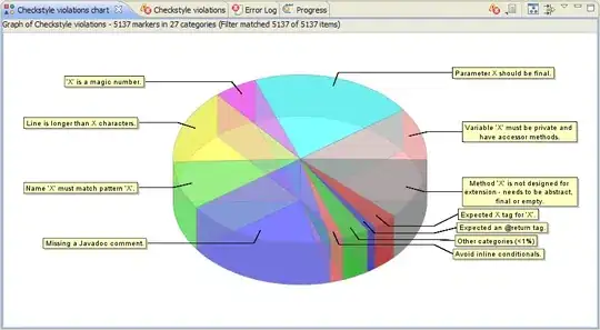
Bad resizing behavior with a larger window (see button)

enter image description here

Better resizing behavior with a smaller window (see button)

enter image description here

Thats the code:

<div class="row">
    <div class="span6">
        <div class="row">
            <div class="span3">xxxxxxxxxxxx name</div>
            <div class="span3">
                <input type="text" class="text" />
            </div>
        </div>
        <div class="row">
            <div class="span3">xxxxxxxxxxxxxx from</div>
            <div class="span3">
                <input type="text" class="text" />
            </div>
        </div>
        <div class="row">
            <div class="span3">xxxxxxxxxxxx to</div>
            <div class="span3">
                <input type="text" placeholder="Please enter the end date" class="text" />
            </div>
        </div>
    </div>
    <div class="span3">
        <input type="checkbox" class="checkbox" value="Green melons" />LightBlue Peaaaas<br />
        <input type="checkbox" class="checkbox" value="Green melons" />Blue Melons<br />
        <input type="checkbox" class="checkbox" value="Green melons" />Red Apples<br />
        <input type="checkbox" class="checkbox" value="Green melons" />Yellow Bananas<br />
        <input type="checkbox" class="checkbox" value="Green melons" />Black Mushis<br />
        <input type="checkbox" class="checkbox" value="Green melons" />Pink Bermudas<br />
    </div>
    <div class="span3">
        <div class="row">
            <div class="span3">
                <span>First day of week</span>
            </div>
        </div>
        <div class="row">
            <div class="span3">
                <input type="radio" class="radio" />Monday
            </div>
        </div>
        <div class="row">
            <div class="span3">
                <input type="radio" class="radio" />Tuesday
            </div>
        </div>
    </div>
</div>

<div class="row">
    <div class="span12">
        <button class="btn pull-right">Next</button>
    </div>
</div>

UPDATE

The fiddle from Jack on IE 10 has also bad resizing behavior as you can judge from the checkboxes diving into the left textboxes: enter image description here

Elisabeth
  • 20,496
  • 52
  • 200
  • 321
  • 2
    Bootstraps grid system (actually most CSS grid systems) are not tables. If you need to do this you may want to use tables - or alternatively "fake" the columns, for example by using background images. In any case if you give more information on what you want your layout to look like - and more importantly how you want it to behave behave with different content sizes -, then it would be possible to more detailed suggestions. – RoToRa May 13 '13 at 13:50

1 Answers1

0

Try this

<div class="row">
    <div class="span6">
        <div class="row">
            <div class="span3"></div>
            <div class="span3"></div>
        </div>
        <div class="row">
            <div class="span3"></div>
            <div class="span3"></div>
        </div>
        <div class="row">
            <div class="span3"></div>
            <div class="span3"></div>
        </div>
    </div>
    <div class="span3">
    </div>
    <div class="span3">
        <div class="row">
            <div class="span3"></div>
        </div>
        <div class="row">
            <div class="span3"></div>
        </div>
        <div class="row">
            <div class="span3"></div>
        </div>
    </div>
</div>

<div class="row">
    <div class="span12"></div>
</div>
JackPoint
  • 4,031
  • 1
  • 30
  • 42
  • so far the result seems ok. But what I do not like is the resize behavior. When I resize to the right and more space is available for the "Next" button in the last row on the right side (see new image) the right buttons dives particularly in the right screen edge. When I resize to the left and there is less space the "Next" button on the right side is put correctly before the right screen edge. That makes no sense to me... – Elisabeth May 13 '13 at 20:47
  • All in all I must say why not float 4 divs(4 columns) and a 5th div which is the bottom row and totally ignore the bootstrap row concept? Then in each of the 4 divs I can do what I want and put in each div 3 controls (3 rows formerly) with line break and I have less stress? I do not see the benefit of bootstrap for such a simple formular. – Elisabeth May 13 '13 at 20:57
  • Strange, it seems the last column jumps to the next row on a small screen. I tested on http://jsfiddle.net/GYWam/ and with a small screen it doesnt jump to the next row. Have you included the responsive css? Its a 12 colums grid, you can mix all spans as long as they are 12 in total. – JackPoint May 14 '13 at 08:04
  • Yes the responsive.css is included. Jack check out my update in the post with a screenshot from your fiddle on IE 10. – Elisabeth May 14 '13 at 20:01
  • Isn't that good? If the input boxes are to big, give it spans so they are responsive. – JackPoint May 14 '13 at 20:56
  • I did then the whole layout is messed. Really in IE 10 the radio buttons do a line break when the windows size increases that makes no sense at all. And to continue the bootstrap rant disabled buttons work in IE 10 but not Chrome or FF thats ridiculous. I start learning bootstrap and already hate it. That should not be. – Elisabeth May 15 '13 at 18:03