1

I am using R to plot line chart, with the following command

data <- read.table("input_data.txt", header=T, sep="\t")

ind=seq(1,nrow(data),by=2)

pdf(file="result.pdf")

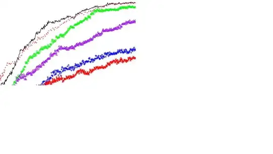
plot_colors <- c("black","red","green","blue","purple","red")

plot(data$column_one, type="l", lty=1, col=plot_colors[1], ann=FALSE)

lines(data$column_two, type="l", lty=2, col=plot_colors[2])

lines(data$column_three, type="o", pch=1, lty=0, col=plot_colors[3], cex=1)

lines(data$column_four, type="o", pch=3, lty=0, col=plot_colors[4], cex=1)

lines(data$column_five, type="o", pch=2, lty=0, col=plot_colors[5], cex=1)

lines(data$column_six, type="o", pch=4, lty=1, col=plot_colors[6], cex=1)

box()

dev.off()

The problem is, I have 500 data points, and the symbol markers are all mashed up on the line, tightly compact on the line. I could not see the symbols on the line.

Is there a way to just show the symbol markers at fixed interval, without them cluttering together?

enter image description here

Michael
  • 1,398
  • 5
  • 24
  • 40
  • Could you share some example data? I think you could just reduce `cex` to make the points smaller. – Paul Hiemstra May 20 '13 at 14:10
  • I have attached the graph. I have tried to reduce cex, but if the points become too small, I could not see the symbols – Michael May 20 '13 at 14:19
  • You could always try switching to different symbols, since it looks like you're currently using color and symbol to distinguish the different lines. – Thomas May 20 '13 at 14:20
  • @Thomas Yes, I have used different symbols, but as you can see, there are too many points and irregardless of what symbols I used, all the lines look the same – Michael May 20 '13 at 14:28
  • 2
    How about filtering the data to only have every `n`th observation (e.g. `data$column_one[seq(1, length(data$column_one), 10)]` for 10), and then plotting a line behind to get the fine detail? – huon May 20 '13 at 14:31
  • @Michael please provide us with some example data, than we can provide some concerete coding tips. – Paul Hiemstra May 20 '13 at 15:47
  • @PaulHiemstra I have added the code, but how do I attached the input data file? – Michael May 21 '13 at 04:45
  • @Michael have a look at http://stackoverflow.com/questions/5963269/how-to-make-a-great-r-reproducible-example, this contains the details you need. Basically, you can call `dput` on `data` and paste the result into your question. – Paul Hiemstra May 21 '13 at 05:12
  • If you have that many points, you don't really need to use plotting symbols -- the line itself will show the trend. – Hong Ooi May 21 '13 at 05:16

1 Answers1

2

Use something like that:

lines(data$column_three, type="o", pch=c(1,NA,NA,NA,NA), lty=0, col=plot_colors[3], cex=1)

For the pch command: The number (here "1") defines your symbol as before. The "NA" means, that these points are plotted with no symbol. This vector will be repeatedly used until the end of your plot. Here, every 5th point is plotted with symbol 1.

Roland
  • 36
  • 2