0

I have a little problem using responsive navbar. I have two divs that centralize my page.

<div id="tudo">
    <div id="conteudo">
        <!--My content here-->
    </div>
</div>

And the css:

#tudo
{
    width: 876px;
    margin: 0 auto;
    text-align: left; /*hack for IE*/
}
#conteudo
{
    padding: 5px;
}

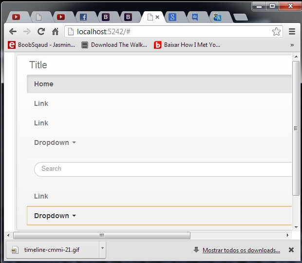
But when I copy the code for responsive the layout does not work -> Here

Douglas Ramalho
  • 81
  • 1
  • 10

1 Answers1

1

The problem is that your CSS is setting #tudo to a fixed width of 876px which doesn't allow the navbar to be responsive.

The easiest solution would be to use a @media query to set the width of the #tudo to auto when the responsive navbar kicks in at 979px

#tudo
{
    width: 876px;
    margin: 0 auto;
    text-align: left; /*hack for IE*/
    overflow:hidden;
}
#conteudo
{
    padding: 5px;
    overflow:hidden;
}

@media (max-width: 979px) {

  #tudo {
      width: auto; 
    margin: 0;
  }
  #conteudo {
      width: auto;
  }

}

Demo on Bootply

Carol Skelly
  • 351,302
  • 90
  • 710
  • 624
  • This solves my problem. What the name of that declaration @media, I don't know the usage. – Douglas Ramalho May 28 '13 at 19:35
  • Here is more info on @media queries- http://stackoverflow.com/questions/12045893/which-are-the-most-important-media-queries-to-use-in-creating-mobile-responsive – Carol Skelly May 28 '13 at 19:54