I think there are two different answers to what you're asking: a direct answer to your question, and an answer to your problem:
To "How can I calculate the X and Y coord. of each div?"
Note - The following answer is a reformulation of a post I made for the thread Transform GPS-Points to Screen-Points with Perspective Projection in Android. You can also chech the Wikipedia article "3D projection" for a more generic answer.
You will need a bit more information to execute you perspective projection, such as the position/orientation of your camera/eye, its angle of view, and the surface you want to project your cube on.
With all this, you should be able to loop on your div elements, then on their 4 corner vertices to apply your rotation transform and project each of them, to finally use the 2D coordinates you get to render the elements.
Applying the rotation
Let's simplify the situation. We have:
- A vertex A(x_0, y_0, z_0), one of the corners of your
div
- θ and δ the angles defining the rotation you want to apply, resp. the pitch angle and the yaw angle (Tayt-Brian angles)
... and we want:
- D(x,y,z), the position of our rotated element
Thus your linearized equations are:
x = sin(δ) * y_0 + cos(δ) * x_0y = sin(θ) * z_0 + cos(θ) * (cos(δ) * y_0 − sin(δ) * x_0)z = cos(θ) * z_0 i sin(θ) * (cos(δ) * y_0 − sin(δ) * x_0)
The projection - Intro
Now we have:
- Our point D(x,y,z)
- w * h, the dimension of the surface you want to project on (
innerWidth * innerHeight for instance in your case)
- A half-angle of view α
... and we want:
- The coordinates of B in the surface plane (let's call them X and Y)
A schema for the X-screen-coordinates:
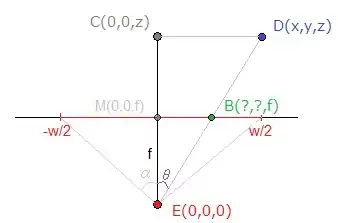
E is the position of our "eye" in this configuration, which I chose as origin to simplify. If it is not the case and/or if you want to also rotate your camera, you'll need to apply again the corresponding translation and/or rotation transform(s) to D before the next steps.
The focal length f can be estimated knowing that:
A bit of Geometry
You can see on the picture that the triangles ECD and EBM are similar, so using the Side-Splitter Theorem, we get:
MB / CD = EM / EC <=> X / x = f / z (2)
With both (1) and (2), we now have:
X = (x / z) * ( (w / 2) / tan(α) )
Note: Same reasoning for Y.
Practical Use
Some remarks:
- Usually, α = 45deg is used, which means
tan(α) = 1. That's why this term doesn't appear in many implementations.
If you want to preserve the ratio of the elements you display, keep f constant for both X and Y, ie instead of calculating:
X = (x / z) * ( (w / 2) / tan(α) ) and Y = (y / z) * ( (h / 2) / tan(α) )
... do:
X = (x / z) * ( size / 2) / tan(α) ) and Y = (y / z) * ( (size / 2) / tan(α) ) with size a constant value you defined (size = min(w,h) or size = (w+h)/2 are often used for instance). It will only affect the focal, and thus the angle of view.
As you may have noticed on the picture above, the screen coordinates are here defined between [-w/2 ; w/2] for X and [-h/2 ; h/2] for Y, but you probably want [0 ; w] and [0 ; h] instead. X += w/2 and Y += h/2 - Problem solved.
To the problem of displaying a 3D cube made of div
As I see the situation, there is a flaw with the method described above. Sure you can get the 2D coordinates defining your rotated and projected div elements, but how can you use it to render them?.
Once projected, your div won't probably look rectangular anymore, making it hard to render using simple CSS, especially if your div elements contain complex stuff.
So if your real purpose is to display a 3D DOM cube, with rotations and perspective, I recommend you to use CSS3 3D transforms, letting the browser do the computations.
For instance, you'll find here a tutorial to implement such a cube with only HTML and CSS3.
The advantages are multiple:
- You benefit of the browsers GPU acceleration, making it smoother than done using plain JS.
- It affects the contents of your
div (rotation, perpespective)
- No maths to implement
You may only have to worry about the browsers compatibility of you aim for older versions (http://caniuse.com/transforms3d).
If you want to dynamically rotate your cube (for instance when the mouse moves), just use JS to edit your CSS transforms
Example
I quickly made this JSFiddle, simply copying the implementation from the tutorial and adding an onmousemove handler to update the rotation.
Hope it helped, bye!