Add extra colors to your less files and recompile. Also see Twitter Bootstrap Customization Best Practices.
update
As mentioned by @ow3n since v3.0.3 use:
.btn-custom {
  .button-variant(@btn-default-color; @btn-default-bg; @btn-default-border);
}
Note in the above @btn-default-color sets the font color,@btn-default-bg the background color and @btn-default-border the color of the border. Colors for states like active, hover and disabled are calculated based on of these parameters.
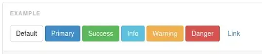
For example:
.btn-custom {
  .button-variant(blue; red; green);
}
will result in:

For who want to use the CSS direct, replace the colors in this code:
.btn-custom {
  color: #0000ff;
  background-color: #ff0000;
  border-color: #008000;
}
.btn-custom:hover,
.btn-custom:focus,
.btn-custom:active,
.btn-custom.active,
.open .dropdown-toggle.btn-custom {
  color: #0000ff;
  background-color: #d60000;
  border-color: #004300;
}
.btn-custom:active,
.btn-custom.active,
.open .dropdown-toggle.btn-custom {
  background-image: none;
}
.btn-custom.disabled,
.btn-custom[disabled],
fieldset[disabled] .btn-custom,
.btn-custom.disabled:hover,
.btn-custom[disabled]:hover,
fieldset[disabled] .btn-custom:hover,
.btn-custom.disabled:focus,
.btn-custom[disabled]:focus,
fieldset[disabled] .btn-custom:focus,
.btn-custom.disabled:active,
.btn-custom[disabled]:active,
fieldset[disabled] .btn-custom:active,
.btn-custom.disabled.active,
.btn-custom[disabled].active,
fieldset[disabled] .btn-custom.active {
  background-color: #ff0000;
  border-color: #008000;
}
.btn-custom .badge {
  color: #ff0000;
  background-color: #0000ff;
}
end update
To generate a custom button:
.btn-custom {
    .btn-pseudo-states(@yourColor, @yourColorDarker);
 }
The above will generate the following css:
.btn-custom {
  background-color: #1dcc00;
  border-color: #1dcc00;
}
.btn-custom:hover,
.btn-custom:focus,
.btn-custom:active,
.btn-custom.active {
  background-color: #19b300;
  border-color: #169900;
}
.btn-custom.disabled:hover,
.btn-custom.disabled:focus,
.btn-custom.disabled:active,
.btn-custom.disabled.active,
.btn-custom[disabled]:hover,
.btn-custom[disabled]:focus,
.btn-custom[disabled]:active,
.btn-custom[disabled].active,
fieldset[disabled] .btn-custom:hover,
fieldset[disabled] .btn-custom:focus,
fieldset[disabled] .btn-custom:active,
fieldset[disabled] .btn-custom.active {
  background-color: #1dcc00;
  border-color: #1dcc00;
}
In the above #1dcc00 will be your custom color and #19b300 your darker color. In stead of the less solution you also can add this css direct to your html files (after the bootstrap css).
Or get your css code direct from Twitter's Bootstrap 3 Button Generator