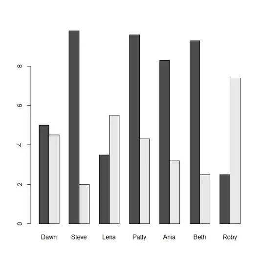
I have a dataset for TV watching on Weekdays and Weekend for 7 students (named "TVwatch") as follows:
TV watching in hours:
Names   Wkdays Wkend
Dawn     5.0    4.5
Steve    9.8    2.0
Lena     3.5    5.5
Patty    9.6    4.3
Ania     8.3    3.2
Beth     9.3    2.5
Roby     2.5    7.4
How can I create a comparison plot where vertical bars will show the hours of TVwatching on wkdays and wkends(on Y-axis) for each students (on X-axis) in R (similar to Clustered columns in Excel)?
Thanks,