71

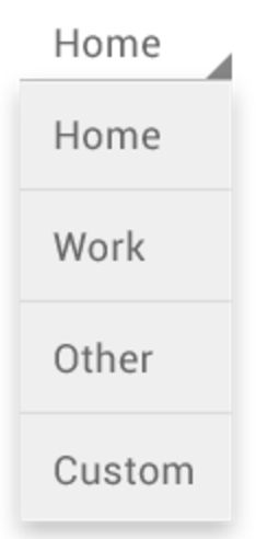
I want to develop custom spinner like line around spinner with triangle at right bottom corner.
like following image

enter image description here

For above fig I wrote my custom spinner like a

spinner.xml

 <Spinner android:background="@drawable/spinner_background"/>

spinner_background.xml

<?xml version="1.0" encoding="UTF-8"?>

<item android:state_pressed="true"
      android:drawable="@drawable/spinner_ab_pressed_new_theme_bs">
    <shape>

        <solid 
            android:color="@color/White" />

        <corners android:radius="3dp" />

        <padding 
            android:bottom="10dp" 
            android:left="10dp" 
            android:right="10dp" 
            android:top="10dp" />

         <stroke 
            android:width="2dp" 
            android:color="@color/skyblue" />
    </shape>
 </item>
 <!-- spinner_ab_default_new_theme_bs -> this image for corner triangle -->
<item

    android:drawable="@drawable/spinner_ab_default_new_theme_bs" >
    <shape>
        <solid
            android:color="@color/White">
        </solid>

        <corners android:radius="3dp" />

        <padding
            android:bottom="10dp" 
            android:left="10dp" 
            android:right="10dp" 
            android:top="10dp" />
         <stroke 
            android:width="2dp" 
            android:color="@color/gray"/>
    </shape>
</item>

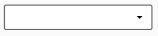
And I got output like following image
enter image description here

I tried lot but not achieve my goal please anybody have solution to develop spinner.
like above first one image.

Vadim Kotov
  • 8,084
  • 8
  • 48
  • 62
nilesh wani
  • 1,261
  • 5
  • 18
  • 30

8 Answers8

143

Spinner

<Spinner
    android:id="@+id/To_Units"
    style="@style/spinner_style" />

style.xml

    <style name="spinner_style">
          <item name="android:layout_width">match_parent</item>
          <item name="android:layout_height">wrap_content</item>
          <item name="android:background">@drawable/gradient_spinner</item>
          <item name="android:layout_margin">10dp</item>
          <item name="android:paddingLeft">8dp</item>
          <item name="android:paddingRight">20dp</item>
          <item name="android:paddingTop">5dp</item>
          <item name="android:paddingBottom">5dp</item>
          <item name="android:popupBackground">#DFFFFFFF</item>
     </style>

gradient_spinner.xml (in drawable folder)

<?xml version="1.0" encoding="utf-8"?>
<selector xmlns:android="http://schemas.android.com/apk/res/android">

    <item><layer-list>
            <item><shape>
                    <gradient android:angle="90" android:endColor="#B3BBCC" android:startColor="#E8EBEF" android:type="linear" />

                    <stroke android:width="1dp" android:color="#000000" />

                    <corners android:radius="4dp" />

                    <padding android:bottom="3dp" android:left="3dp" android:right="3dp" android:top="3dp" />
                </shape></item>
            <item ><bitmap android:gravity="bottom|right" android:src="@drawable/spinner_arrow" />
            </item>
        </layer-list></item>

</selector>  

@drawable/spinner_arrow is your bottom right corner image

Samadhan Medge
  • 2,049
  • 2
  • 16
  • 24
41

This is a simple one.

your_layout.xml

<android.support.v7.widget.AppCompatSpinner
  android:layout_width="match_parent"
  android:layout_height="wrap_content"
  android:background="@drawable/spinner_background"
/>

In the drawable folder, spinner_background.xml

<?xml version="1.0" encoding="utf-8"?>
<selector xmlns:android="http://schemas.android.com/apk/res/android">
  <item><layer-list>
    <item>
        <shape>
            <solid
                android:color="@color/colorWhite">
            </solid>

            <corners android:radius="3dp" />

            <padding
                android:bottom="10dp"
                android:left="10dp"
                android:right="10dp"
                android:top="10dp" />
            <stroke
                android:width="2dp"
                android:color="@color/colorDarkGrey"/>
        </shape>
    </item>
    <item >
        <bitmap android:gravity="bottom|right"
        android:src="@drawable/ic_arrow_drop_down_black_24dp" />
    </item>
  </layer-list></item>
</selector>

Preview:

Spinner example

Nabin Bhandari
  • 15,949
  • 6
  • 45
  • 59
96var3
  • 567
  • 4
  • 11
10

You can achieve the following by using a single line in your spinner declaration in XML: enter image description here

Just add this: style="@android:style/Widget.Holo.Light.Spinner"

This is a default generated style in android. It doesn't contain borders around it though. For that you'd better search something on google.

Hope this helps.

UPDATE: AFter a lot of digging I got something which works well for introducing border around spinner.

<?xml version="1.0" encoding="utf-8"?>
<layer-list xmlns:android="http://schemas.android.com/apk/res/android">
    <item
        android:bottom="8dp"
        android:top="8dp">
        <shape>
            <solid android:color="@android:color/white" />
            <corners android:radius="4dp" />
            <stroke
                android:width="2dp"
                android:color="#9E9E9E" />
            <padding
                android:bottom="16dp"
                android:left="8dp"
                android:right="16dp"
                android:top="16dp" />
        </shape>
    </item>
</layer-list>

Place this in the drawable folder and use it as a background for spinner. Like this:

<RelativeLayout
        android:id="@+id/speaker_relative_layout"
        android:layout_width="0dp"
        android:layout_height="70dp"
        android:layout_marginEnd="8dp"
        android:layout_marginLeft="8dp"
        android:layout_marginRight="8dp"
        android:layout_marginStart="8dp"
        android:layout_marginTop="16dp"
        android:background="@drawable/spinner_style"
        app:layout_constraintLeft_toLeftOf="parent"
        app:layout_constraintRight_toRightOf="parent"
        app:layout_constraintTop_toTopOf="parent">

        <Spinner
            android:id="@+id/select_speaker_spinner"
            style="@style/Widget.AppCompat.DropDownItem.Spinner"
            android:layout_width="match_parent"
            android:layout_height="70dp"
            android:entries="@array/select_speaker_spinner_array"
            android:spinnerMode="dialog" />

    </RelativeLayout>
Karan Thakkar
  • 1,007
  • 5
  • 24
  • 41
  • Default styles are also great as said by [Karan Thakkar](https://stackoverflow.com/users/5406239/karan-thakkar), I used this default style: `style="@android:style/Widget.Spinner"`, there are lot of others also available, try it out. – Reejesh PK Feb 06 '19 at 18:25
4

If you don't prefer to create multiple XML files, try:

<com.google.android.material.card.MaterialCardView
        android:layout_width="match_parent"
        android:layout_height="wrap_content"
        app:strokeWidth="1dp"
        app:strokeColor="@color/black"
        app:cardCornerRadius="4dp">

        <androidx.appcompat.widget.AppCompatSpinner
            android:id="@+id/spinner"
            android:layout_width="match_parent"
            android:layout_height="wrap_content"
            android:padding="20dp"/>

    </com.google.android.material.card.MaterialCardView>

To change the border color:

app:strokeColor="YOUR_COLOR_HERE"

To change the border's width:

app:strokeWidth="YOUR_DP_WIDTH_HERE"
Yasser AKBBACH
  • 539
  • 5
  • 7
1

There are two ways to achieve this.

1- As already proposed u can set the background of your spinner as custom 9 patch Image with all the adjustments made into it .

android:background="@drawable/btn_dropdown" 
android:clickable="true"
android:dropDownVerticalOffset="-10dip"
android:dropDownHorizontalOffset="0dip"
android:gravity="center"

If you want your Spinner to show With various different background colors i would recommend making the drop down image transparent, & loading that spinner in a relative layout with your color set in.

btn _dropdown is as:

<selector xmlns:android="http://schemas.android.com/apk/res/android">
<item
    android:state_window_focused="false" android:state_enabled="true"
    android:drawable="@drawable/spinner_default" />
<item
    android:state_window_focused="false" android:state_enabled="false"
    android:drawable="@drawable/spinner_default" />
<item
    android:state_pressed="true"
    android:drawable="@drawable/spinner_pressed" />
<item
    android:state_focused="true" android:state_enabled="true"
    android:drawable="@drawable/spinner_pressed" />
<item
    android:state_enabled="true"
    android:drawable="@drawable/spinner_default" />
<item
    android:state_focused="true"
    android:drawable="@drawable/spinner_pressed" />
<item
    android:drawable="@drawable/spinner_default" />
</selector>

where the various states of pngwould define your various States of spinner seleti

1

To change only "background" (add corners, change color, ....) you can put it into FrameLayout with wanted background drawable, else you need to make nine patch background for to not lose spinner arrow. Spinner background is transparent.

Gurgen Hakobyan
  • 951
  • 10
  • 13
0

You could design a simple nine-patch png image and use it as the background of spinner. Using GIMP you can put both border and right triangle in image.

alrama
  • 618
  • 11
  • 17
  • declare your nine-patch png image as background . Or if you need two backgrounds for pressed/up mode you can declare your nine-patches in xml like here: http://tech.chitgoks.com/2011/06/25/change-spinner-style-in-android/ – alrama Jun 21 '13 at 09:51
0

It's super easy you can just add this to your Adapter -> getDropDownView

getDropDownView:

convertView.setBackground(getContext().getResources().getDrawable(R.drawable.bg_spinner_dropdown));

bg_spinner_dropdown:

<?xml version="1.0" encoding="utf-8"?>
<shape xmlns:android="http://schemas.android.com/apk/res/android"
    android:shape="rectangle">
    <solid android:color="@color/white" />
    <corners
        android:bottomLeftRadius=enter code here"25dp"
        android:bottomRightRadius="25dp"
        android:topLeftRadius="25dp"
        android:topRightRadius="25dp" />
</shape>