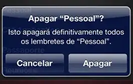
Interesting question. What @twilight-pony-inc is asking seems trivial but is not. Twitter's Bootstrap is build with a 'responsive' mind. The layout build with TB will adopt to the device which shows it. The example you give seems to build with a mobile frame work like jQuery Mobile. Mobile frameworks can be use to build mobile apps (only).
Nowadays mobile frameworks become more responisve and the coming version of Twitter's Bootstrap uses a mobile first approach. Twitter's Bootstrap 3 will have a mobile grid also. (see also http://jquerymobile.com/demos/1.3.0-beta.1/docs/demos/grids/rwd-basics.html and http://bassjobsen.weblogs.fm/twitter-bootstrap-3-breakpoints-and-grid/)
Consider if you need a mobile framework in stead of Twitter's Bootstrap first. Second consider to use Twitter's Bootstrap 3 cause it will make your mobile development easier.
Offcourse you can build such a layout with twitter boostrap too. Read about the grid first: http://twitter.github.io/bootstrap/scaffolding.html#gridSystem. Start with row for your navbar and split it in columns:
<div class="container navbar">
<div class="row">
<div class="span3 text-left"><button class="btn">back</button></div>
<div class="span6 text-center"><h3>Title (centered)</h3></div>
<div class="span3 text-right"><button class="btn">Home</button></div>
</div>
</div>
Also consider the fluid grid here: http://twitter.github.io/bootstrap/scaffolding.html#fluidGridSystem
This will give you a navbar with two button. But on a small / mobile screen (below 768 px) your layout breaks. Below 768 px yor columns (divs with class spanX) will stack (and get a 100% width). You can use media queries to fix this:
@media (max-width:767px)
{
   .navbar div[class*="span"] { float: left;} /* float left */
   .navbar div.span3 { width:25%; }
   .navbar div.span6 { width:50%; }
   body {padding:0;}
}
This will create a row with three columns on small screens too. See: http://www.bootply.com/66054 or the image below:

The CSS make the mobile layout fluid cause the colums width is set by percentage (100% in a row).
Twitter's Bootstrap 3
TB3 has a fluid layout by default. TB3 has two grid the big grid for 768+ pixels width screens and a small mobile grid. Cause you can use the mobile grid, you don't need media queries to get a layout as above with TB3. In TB3 the width of columns is set by the col-span-{X} classes. Likewise for the small grid col-small-span-{X} are used to set the width.
So with Twitter's Bootstrap 3 you can build your navbar with:
<div class="container navbar">
<div class="row">
<div class="col-span-3 col-small-span-3 text-left"><button class="btn">back</button></div>
<div class="col-span-6 col-small-span-6 text-center"><h3>Title (centered)</h3></div>
<div class="col-span-3 col-small-span-3 text-right"><button class="btn">Home</button></div>
</div>
</div>
Twitter’s Bootstrap 3 defines three grids: Tiny grid for Phones (<768px), Small grid for Tablets (>768px) and the Medium-Large grid for Destkops (>992px). The row class prefixes for these grid are “.col-”, “.col-sm-” and “.col-lg-”. The Medium-large grid will stack below 992 pixels screen width. So does the Small grid below 768 pixels and the tiny grid never stacks. Except for old phones which always will stack the elements (mobile first design).
For this reason you should use the “.col-” prefixes for your mobile app:
<div class="container navbar">
<div class="row">
<div class="col-3 text-left"><button class="btn btn-default">back</button></div>
<div class="col-6 text-center"><h3>Title (centered)</h3></div>
<div class="col-3 text-right"><button class="btn  btn-default">Home</button></div>
</div>
</div>
See: http://bootply.com/73382

