7

The following code

library(ggplot2)
library(reshape2)

m=melt(iris[,1:4])

ggplot(m, aes(value)) + 
  facet_wrap(~variable,ncol=2,scales="free_x") +
  geom_histogram()

produces 4 graphs with fixed y axis (which is what I want). However, by default, the y axis is only displayed on the left side of the faceted graph (i.e. on the side of 1st and 3rd graph).

What do I do to make the y axis show itself on all 4 graphs? Thanks!

EDIT: As suggested by @Roland, one could set scales="free" and use ylim(c(0,30)), but I would prefer not to have to set the limits everytime manually.

@Roland also suggested to use hist and ddply outside of ggplot to get the maximum count. Isn't there any ggplot2 based solution?

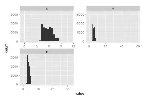
EDIT: There is a very elegant solution from @babptiste. However, when changing binwidth, it starts to behave oddly (at least for me). Check this example with default binwidth (range/30). The values on the y axis are between 0 and 30,000.

library(ggplot2)
library(reshape2)

m=melt(data=diamonds[,c("x","y","z")])

ggplot(m,aes(x=value)) + 
  facet_wrap(~variable,ncol=2,scales="free") +
  geom_histogram() +
  geom_blank(aes(y=max(..count..)), stat="bin")

enter image description here

And now this one.

ggplot(m,aes(x=value)) + 
  facet_wrap(~variable,scales="free") +
  geom_histogram(binwidth=0.5) +
  geom_blank(aes(y=max(..count..)), stat="bin")

enter image description here

The binwidth is now set to 0.5 so the highest frequency should change (decrease in fact, as in tighter bins there will be less observations). However, nothing happened with the y axis, it still covers the same amount of values, creating a huge empty space in each graph.

[The problem is solved... see @baptiste's edited answer.]

jakub
  • 4,774
  • 4
  • 29
  • 46

3 Answers3

8

Is this what you're after?

ggplot(m, aes(value)) + 
  facet_wrap(~variable,scales="free") +
  geom_histogram(binwidth=0.5) +
  geom_blank(aes(y=max(..count..)), stat="bin", binwidth=0.5)
baptiste
  • 75,767
  • 19
  • 198
  • 294
3
ggplot(m, aes(value)) + 
  facet_wrap(~variable,scales="free") +
  ylim(c(0,30)) +
  geom_histogram()
Roland
  • 127,288
  • 10
  • 191
  • 288
  • This does the job perfectly. But isn't there a way to do it without specifying the limits manually? If I use this bit of code in a function, I would prefer no to bother with setting the limits everytime. – jakub Jul 01 '13 at 09:28
  • 1
    You can replace 30 by something like `max(table(m$value)` for example – agstudy Jul 01 '13 at 09:42
  • 2
    Better use `hist` and `ddply` outside of `ggplot` to get the maximum count. You need to fiddle a bit with the parameters to get the same default as in `stat_bin`, but "By default, stat_bin uses 30 bins - this is not a good default, but the idea is to get you experimenting with different binwidths." – Roland Jul 01 '13 at 09:56
  • @agstudy, thanks for the suggestion, your solution is simple and functional - but it only works because the most frequent value of Petal.Width happens to ocurr 29 times - which is close to the value of the highest bin in the plot. But since the frequency depends on the binwidth, one can not expect this solution to work most of the time. – jakub Jul 01 '13 at 11:29
0

Didzis Elferts in https://stackoverflow.com/a/14584567/2416535 suggested using ggplot_build() to get the values of the bins used in geom_histogram (ggplot_build() provides data used by ggplot2 to plot the graph). Once you have your graph stored in an object, you can find the values for all the bins in the column count:

library(ggplot2)
library(reshape2)

m=melt(iris[,1:4])    

plot = ggplot(m) + 
  facet_wrap(~variable,scales="free") +
  geom_histogram(aes(x=value))

ggplot_build(plot)$data[[1]]$count

Therefore, I tried to replace the max y limit by this:

max(ggplot_build(plot)$data[[1]]$count)

and managed to get a working example:

m=melt(data=diamonds[,c("x","y","z")])

bin=0.5 # you can use this to try out different bin widths to see the results

plot=
  ggplot(m) + 
  facet_wrap(~variable,scales="free") +
  geom_histogram(aes(x=value),binwidth=bin)

ggplot(m) + 
  facet_wrap(~variable,ncol=2,scales="free") +
  geom_histogram(aes(x=value),binwidth=bin) +
  ylim(c(0,max(ggplot_build(plot)$data[[1]]$count)))

enter image description here

It does the job, albeit clumsily. It would be nice if someone improved upon that to eliminate the need to create 2 graphs, or rather the same graph twice.

Community
  • 1
  • 1
jakub
  • 4,774
  • 4
  • 29
  • 46