10

How can I plot a "step" or "staircase" histogram in ggplot2 in R? something like:

enter image description here

where width of each horizontal line represents the bin size (of the x-axis values) and the height corresponds to fraction of the data that falls in that bin (unlike the attached image where it is a probability density!). is there a way to do this with geom_histogram?

2 Answers2

14

Use geom_step

Generate some data:

foo <- data.frame(bar=rnorm(100))

Histogram with step geom and counts on y-axis:

ggplot(foo,aes(x=bar)) + stat_bin(geom="step")

Histogram with step geom and density on y-axis:

ggplot(foo,aes(x=bar)) + stat_bin(aes(y=..density..),geom="step")

And with "fraction of data that falls into that bin":

ggplot(foo,aes(x=bar)) + stat_bin(aes(y=..count../sum(..count..)),geom="step")

enter image description here

ziggystar
  • 28,410
  • 9
  • 72
  • 124
2

Might be other, prettier ways to do this but here's one idea.

foo <- data.frame(bar = rnorm(100)) + theme_bw()
p <- ggplot(data = foo, aes(x = bar, y = ..count../sum(..count..))) ## or aes(x = bar, y = ..density..) if you want that
p + geom_histogram(size = 2, colour = "red", fill = "white") + geom_histogram(colour = "transparent", fill = "white")

enter image description here

Edit:

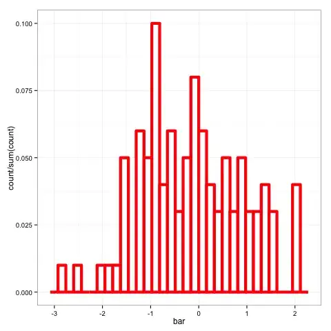
geom_histogram(size = 2, colour = "red", fill = "white") creates this enter image description here

I edited the thickness of the outline to size = 2 to make the final output look nice. It looks awful at this stage. To remove the interior lines you add geom_histogram(colour = "transparent", fill = "white") which will draw another histogram on top covering the interior lines (and some of the outline which is why I think size = 2 looks nice)

Jake Burkhead
  • 6,435
  • 2
  • 21
  • 32
  • Could you explain why there are two calls to `geom_histogram`? –  Jul 05 '13 at 15:08
  • @user248237dfsf Just remove the second one and see what happens. It should be obvious. – Roland Jul 05 '13 at 15:25
  • @Roland: I see it's a trick to try to get the right color/stepshape... but I don't see how to generalize this to the case where `colour` is set to a variable in the df to encode different conditions. –  Jul 05 '13 at 15:26
  • @user248237dfsf ziggystar's answer is better and should make it easier to use colours and to draw more than one of these on the same plot. it sounds like that is your final goal – Jake Burkhead Jul 05 '13 at 15:33
  • @JakeBurkhead: agreed though when I try that solution with multiple colours the histograms still occlude each other and it doesn't look good. `geom_density` gets multiple colored lines right, but isn't the right shape so not sure what the answer is –  Jul 05 '13 at 16:02
  • @user248237dfsf Who is using `geom_density`? My solution uses `geom_step` (which is exactly what you were asking for) and Jake's solution is using `geom_histogram`. – ziggystar Jul 05 '13 at 16:05
  • @ziggystar: I was contrasting geom_density with your solution. When I try your solution with multiple colors, the lines occlude each other –  Jul 05 '13 at 18:09
  • @user248237dfsf I dont really see what else you would expect. If you are using drawing multiple step histograms with the same bin widths and similar distributions some of the lines will have to be in the same place. May be you want something like this http://stackoverflow.com/questions/6957549/overlaying-histograms-with-ggplot2-in-r – Jake Burkhead Jul 05 '13 at 18:22