Take a box. Say it's 5 pixels high and 5 pixels wide. Now say it has a 4px border. Here's what you should envision: http://jsfiddle.net/FrsGR/190.
.arrow { // box
   height: 5px;
   width: 5px;
   border: 4px solid blue;
}
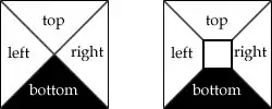
Now imagine that the box doesn't have a width or height, so you are just left with the borders: http://jsfiddle.net/FrsGR/885/.
.arrow { // box with no width/height
   height: 0;
   width: 0;
   border: 4px solid blue;
}
They now overlap one another, and this is where the magic happens with creating arrows. The overlap line is drawn diagonally from each corner to the center. So, the end result is transparent triangles on the top, left, and right, with a black triangle on the bottom. Hope that helped!
Great reference: How do CSS triangles work?