2

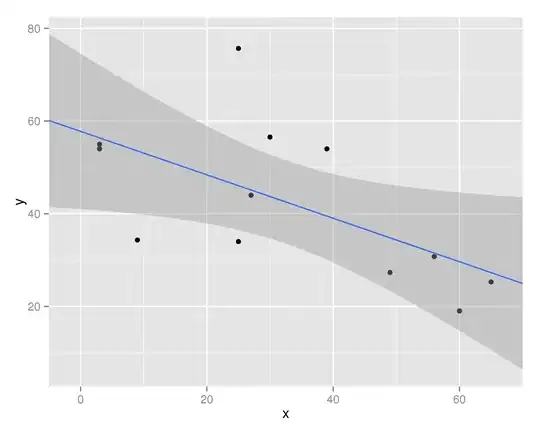
I have a small question regarding the ggplot, where in I want to know how to get the data points start with a 0 line without leaving that small gap on the left, right and the bottom.

This is my code:

hov.dat <- structure(list(x = c(3L, 3L, 9L, 25L, 25L, 27L, 30L, 39L, 49L, 
56L, 60L, 65L), y = c(55, 54, 34.33, 34, 75.66, 44, 56.55, 54, 
27.34, 30.75, 19.04, 25.29)), .Names = c("x", "y"), class = "data.frame", row.names = c(NA, 
-12L))

with(hov.dat, plot(x, y))

qplot(x, y, data=hov.dat, geom=c('point', 'smooth'), method='lm', formula=y ~ ns(x, 3))

enter image description here

can anyone help me with what am I supposed to code to remove the left, right, and bottom gaps in the plot (marked with arrows in the picture)

ziggystar
  • 28,410
  • 9
  • 72
  • 124
Letin
  • 1,255
  • 5
  • 20
  • 36
  • Try `scale_y_continuous(expand = c(0,0))` and corresponding for x axis – Henrik Sep 06 '13 at 09:49
  • 1
    Unfortunately, this argument is not very thoroughly described in the help texts, I believe. – Henrik Sep 06 '13 at 09:55
  • @Henrik, thanks for the help. I tried "scale_y_continuous(expand = c(0,0))", but it does not change anything.. You are right, its not really described in the help texts. – Letin Sep 06 '13 at 09:57
  • Use `dput` on your data to produce runnable code. Don't paste the CSV into the question: http://stackoverflow.com/questions/5963269/how-to-make-a-great-r-reproducible-example – ziggystar Sep 06 '13 at 10:17

1 Answers1

1

You have to supply the expand argument to scale_x_continuous (same for y-axis):

qplot(data=d,x,y,geom=c("point","smooth"),method="lm") + 
  scale_y_continuous(expand=c(0,0)) + 
  scale_x_continuous(expand=c(0,0))

I could not execute function ns, so I didn't use your formula.

enter image description here

expand: a numeric vector of length two giving multiplicative and additive expansion constants. These constants ensure that the data is placed some distance away from the axes.

Note that you can also extend the interpolation of your smoothing function, like in the following plot, which IMHO looks nicer. See this question on CV:

gplot(hov.dat,aes(x=x,y=y)) + geom_point() + stat_smooth(method="lm",fullrange=T) + scale_x_continuous(limits=c(-5,70),expand=c(0,0))

enter image description here

Community
  • 1
  • 1
ziggystar
  • 28,410
  • 9
  • 72
  • 124
  • thanks for this. I am still getting errors. Can you update the last line of my own code by putting in this argument, so that I can try it in the same way ? – Letin Sep 06 '13 at 10:12
  • @PoojaMandaviya Only if you provide a self-contained example. Your code relies on "example.csv"; I cannot test it. You should do this for every question if its feasible. – ziggystar Sep 06 '13 at 10:13