Short version
When using flex-flow: column wrap and display: inline-flex, it doesn't shrinkwrap like inline-block:
(function() {
  var ascending = true;
  setInterval(function() {
    var parent = document.getElementById('flex');
    if (ascending) {
      var child = document.createElement('p');
      child.innerHTML = "foo";
      parent.appendChild(child);
    } else {
      parent.removeChild(parent.children[0]);
    }
    if (parent.children.length <= 1) ascending = true;
    if (parent.children.length >= 40) ascending = false;
  }, 20);
})();
(function() {
  var ascending = true;
  setInterval(function() {
    var parent = document.getElementById('failex');
    if (ascending) {
      var child = document.createElement('p');
      child.innerHTML = "foo";
      parent.appendChild(child);
    } else {
      parent.removeChild(parent.children[0]);
    }
    if (parent.children.length <= 1) ascending = true;
    if (parent.children.length >= 40) ascending = false;
  }, 20);
})();
#flexdesc {position: absolute; top: 25px;}
#flex {
top: 50px;
position: absolute;
display: inline-flex;
flex-flow: row wrap;
outline: 1px solid black;
padding: 3px;
max-height: 100%;
max-width: 180px;
align-content: flex-start;
transform: matrix(0, 1, 1, 0, 0, 0);
transform-origin: top left;
}
#flex > p {
margin: 0;
outline: 1px solid black;
height: 30px;
width: 30px;
align-self: flex-start;
transform: matrix(0, 1, 1, 0, 0, 0);
}
#failexdesc {position: absolute; top: 275px;}
#failex {
top: 300px;
position: absolute;
display: flex;
flex-flow: column wrap;
outline: 1px solid black;
padding: 3px;
max-height: 200px;
align-content: flex-start;
transform-origin: top left;
}
#failex > p {
margin: 0;
outline: 1px solid black;
height: 30px;
width: 30px;
align-self: flex-start;
}<!DOCTYPE html>
<html>
<head>
<meta charset=utf-8 />
<title>JS Bin</title>
</head>
<body>
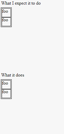
<div id="flexdesc">What I expect it to do</div>
<div id="flex">
<p>foo</p>
<!-- add extra "<p>foo</p>" here. -->
</div>
<div id="failexdesc">What it does</div>
<div id="failex">
<p>foo</p>
</div>
</body>
</html>Notice how the size of each flex container changes (or doesn't change!)
I want this behavior because I want to place these element side by side for a horizontally scrolling website.
Why doesn't it shrinkwrap? How do I make it shrinkwrap?
Original question
flex-flow: row wrap is simple enough to understand. If nothing is "flexing", it acts similar to inline elements; It flows to the right until it can't do so anymore, at which point it makes a new row.
flex-flow: column wrap with display: flex is similar. It flows down, until it can't flow down anymore (max-width?), and then starts a new column. Of course, since the parent is display: flex, it's a block-level element, so that column will be halfway over due to the fact that align-content defaults to stretch. I could easily change that to flex-start to make the new column adjacent to the previous.
...but the container is still too wide. It's still a block, and fills the width of it's parent.
I need the flexbox to shrink-to-fit its columns. Why? I'm trying to use flexbox in a horizontally scrolling website. Granted, I could just let the children overflow, but that overflowing tends to... break things.
So I figured I needed flex-flow: column wrap with display: inline-flex. I was hoping for a "top to bottom, left to right" effect, where the parent has no empty space.
...and then this happened. In chrome, the parent width is equal to the sum of the widths of the children, but otherwise, wrapping is normal. In firefox, the parent is full width, and just grows taller to accomodate the elements (I don't think firefox supports wrapping). In IE11, the width is correct, but the children just overflow down (even out of the body).
I'm so confused.
What am I doing wrong here? I understand that flexbox is a more recent feature, but I can't tell how much of this is my fault vs the browser.
By they way, I'm testing this in chrome. A chrome-only solution is fine by me. (But an elegant catch-all solution is always nice!)
Here's the code for the demo I linked to, in case jsbin is down:
var ascending = true;
   setInterval(function() {
     var parent = document.getElementById('flex');
     if (ascending) {
       var child = document.createElement('p');
       child.innerHTML = "f";
       parent.appendChild(child);
     } else {
       parent.removeChild(parent.children[0]);
     }
     if (parent.children.length <= 1) ascending = true;
     if (parent.children.length >= 30) ascending = false;
   }, 200);
#flex {
display: inline-flex;
flex-flow: column wrap;
outline: 1px solid black;
padding: 3px;
max-height: 100%;
align-content: flex-start;
}
p {
margin: 0;
outline: 1px solid black;
width: 10px;
}
body {
height: 150px;
width: 300px;
outline: 1px dashed black
}<!DOCTYPE html>
<html>
<head>
<meta charset=utf-8 />
<title>JS Bin</title>
</head>
<body>
<div id="flex">
<p>f</p>
<!-- add extra "<p>foo</p>" here. -->
</div>
</body>
</html>