62

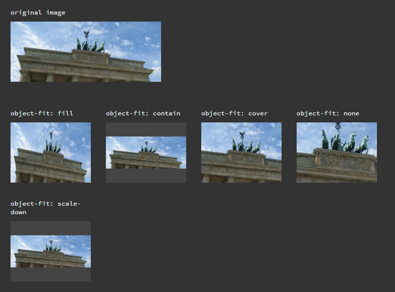
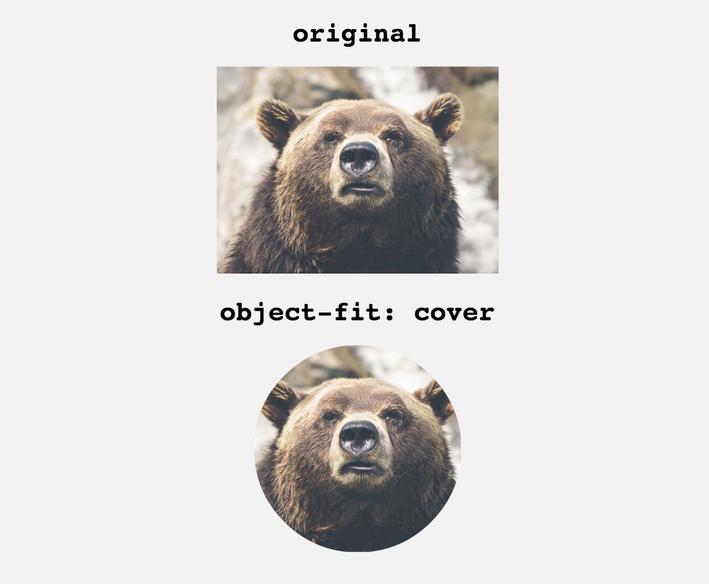
I need to always crop a random-sized image to a square 160x160 using only CSS. The images should stay centered when cropped.

My markup should be:

<a href="#" class="cropper">
   <img src="image" alt="description" />
</a>

Searching on StackOverflow I've found some answers (such as CSS - How to crop an image to a square, if it's already square then resize it), but they don't work for cases where your image can be larger horizontal (wide) OR vertical (tall).

Specifically, I need to be able to present both a wide image like this:

wide image

and a tall image like this:

tall image

in square form, without knowing in advance which one is a horizontal rectangle or a vertical rectangle. It should also support already squared images.

Itay
  • 16,601
  • 2
  • 51
  • 72
PurpleFoxy
  • 1,107
  • 3
  • 12
  • 17

10 Answers10

105

jsFiddle Demo

div {
    width: 250px;
    height: 250px;
    overflow: hidden;
    margin: 10px;
    position: relative;
}
img {
    position: absolute;
    left: -1000%;
    right: -1000%;
    top: -1000%;
    bottom: -1000%;
    margin: auto;
    min-height: 100%;
    min-width: 100%;
}
<div>
    <img src="https://i.postimg.cc/TwFrQXrP/plus-2.jpg" />
</div>

A note regarding sizes

As Salman A mentioned in the comments, we need to set the img's position coordinates (top, left, bottom, right) to work with percents higher than the image's actual dimensions. I use 1000% in the above example, but of course you can adjust it according to your needs.

Before and after the fix

* Further explanation: When we set the img's left and right (or: top and bottom) coordinates to be -100% (of the containing div), the overall allowed width (or: height) of the img, can be at most 300% of the containing div's width (or: height), because it's the sum of the div's width (or: height) and the left and right (or: top and bottom) coordinates.

Itay
  • 16,601
  • 2
  • 51
  • 72
52

object-fit property does the magic. On JsFiddle.

CSS

.image {
  width: 160px;
  height: 160px;
}

.object-fit_fill {
  object-fit: fill
}

.object-fit_contain {
  object-fit: contain
}

.object-fit_cover {
  object-fit: cover
}

.object-fit_none {
  object-fit: none
}

.object-fit_scale-down {
  object-fit: scale-down
}

HTML

<div class="original-image">
  <p>original image</p>
  <img src="http://lorempixel.com/500/200">
</div>

<div class="image">
  <p>object-fit: fill</p>
  <img class="object-fit_fill" src="http://lorempixel.com/500/200">
</div>

<div class="image">
  <p>object-fit: contain</p>
  <img class="object-fit_contain" src="http://lorempixel.com/500/200">
</div>

<div class="image">
  <p>object-fit: cover</p>
  <img class="object-fit_cover" src="http://lorempixel.com/500/200">
</div>

<div class="image">
  <p>object-fit: none</p>
  <img class="object-fit_none" src="http://lorempixel.com/500/200">
</div>

<div class="image">
  <p>object-fit: scale-down</p>
  <img class="object-fit_scale-down" src="http://lorempixel.com/500/200">
</div>

Result

How the rendered images look (in a browser that supports <code>object-fit</code>)

Chris W.
  • 1,680
  • 16
  • 35
Turdaliev Nursultan
  • 2,538
  • 1
  • 22
  • 28
  • 1
    It's definitely the way to go unless you really need IE support. Even then, it's probably better just to inform your users they need to switch to a modern browser... – Danish Ashfaq May 25 '16 at 10:26
  • 2
    Great to know that this exists! Let's hope full cross-browser compatibility soon. – Alvaro Oct 18 '16 at 17:54
16
<div>
    <img class="crop" src="http://lorempixel.com/500/200"/>
</div>

<img src="http://lorempixel.com/500/200"/>


div {
    width: 200px;
    height: 200px;
    overflow: hidden;
    margin: 10px;
    position: relative;
}
.crop {
    position: absolute;
    left: -100%;
    right: -100%;
    top: -100%;
    bottom: -100%;
    margin: auto; 
    height: auto;
    width: auto;
}

http://jsfiddle.net/J7a5R/56/

Snicolas
  • 37,840
  • 15
  • 114
  • 173
DeathGrip
  • 171
  • 1
  • 5
8

With the caveat of it not working in IE and some older mobile browsers, a simple object-fit: cover; is often the best option.

.cropper {
  position: relative;
  width: 100px;
  height: 100px;
  overflow: hidden;
}
.cropper img {
  position: absolute;
  width: 100%;
  height: 100%;
  object-fit: cover;
}

Without the object-fit: cover support, the image will be stretched oddly to fit the box so, if support for IE is needed, I'd recommend using one of the other answers' approach with -100% top, left, right and bottom values as a fallback.

http://caniuse.com/#feat=object-fit

Matt Fletcher
  • 8,182
  • 8
  • 41
  • 60
1

Try putting your image into a container like so:

HTML:

<div>
    <img src="http://www.testimoniesofheavenandhell.com/Animal-Pictures/wp-content/uploads/2013/04/Dog-Animal-Picture-Siberian-Husky-Puppy-HD-Wallpaper.jpg" />
</div>

CSS:

div
{
    width: 200px;
    height: 200px;
    overflow: hidden;
}

div > img
{
    width: 300px;
}

Here's a fiddle.

MisterBla
  • 2,355
  • 1
  • 18
  • 29
  • @PurpleFoxy It would work best with a more square image, guess you'd need to play with the dimensions a bit. – MisterBla Sep 07 '13 at 14:02
1

clip property with position may help you

a{
position:absolute;
clip:rect(0px,200px,200px,0px);
}

a img{
position:relative;
left:-50%;
top:-50%;
 }

WORKING FIDDLE

RbG
  • 3,181
  • 3
  • 32
  • 43
1

enter image description here I found a better solutions in following link. Only use "object-fit" https://medium.com/@chrisnager/center-and-crop-images-with-a-single-line-of-css-ad140d5b4a87

khoa
  • 31
  • 1
  • 4
0
<div style="specify your dimension:overflow:hidden">
    <div style="margin-top:-50px">
       <img ...  />
    </div>
</div>

The above will crop 50px from the top of the image. You may want to compute to come up wit a top margin that will fit your requirements based on the dimension of the image.

To crop from the bottom simply specify the height of the outer div and remove the inner div. Apply the same principle to crop from the sides.

Omirp
  • 52
  • 3
  • In this way I need to know if the image is rectangular or horizontal and I also need to know how many pixel I need to move the image. Is not a solution at all. – PurpleFoxy Sep 07 '13 at 14:04
0

HTML:

<div class="thumbnail">
</div>

CSS:

.thumbnail { 
background: url(image.jpg) 50% 50% no-repeat; /* 50% 50% centers image in div */
width: 250px;
height: 250px;
}
Priya
  • 89
  • 1
  • 1
0

2023 answer

img {
  width: 200px; /* Determines square size */
  aspect-ratio: 1/1; /* Will keep height equal to width */
  object-fit: cover; 
}
<img src="https://i.stack.imgur.com/HkGvg.jpg" />
Ben Carp
  • 24,214
  • 9
  • 60
  • 72