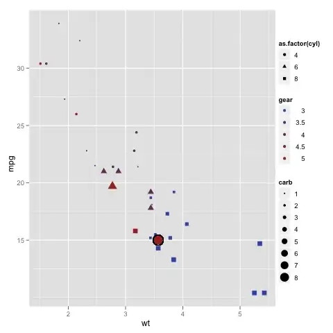
I have two 2D arrays, each of them representing a property on a map. One of them represents hail probability (0%-100%) and the othe one hail severity (0-No Hail, 1-Low, 2-Medium, 3-High).
I can plot this arrays separately with matplotlib's imshow and a predefined colormap:
import matplotlib.pyplot as plt
import matplotlib.colors as cl

cmap = cl.ListedColormap(['#00FF00', '#FFFF00', '#FF0000'])
bounds = [0, 30, 60, 100]
norm = cl.BoundaryNorm(bounds, cmap.N)

plt.subplot(121)
plt.imshow(hail_prob, cmap=cmap, norm=norm)

cmap = cl.ListedColormap(['#00FF00', '#FFFF00', '#FF0000'])
bounds = [0.5, 1.5, 2.5, 3.5]
norm = cl.BoundaryNorm(bounds, cmap.N)

plt.subplot(122)
plt.imshow(hail_sev, cmap=cmap, norm=norm)
This is quite easy as seen above.
However I want a unique plot that combines both features. I have tested the contour function, but the data is quite irregular and the plots look quite bad.
I have been thinking about combining both characteristics into one colormap, but I'm not quite sure about how to do it. Let's say that I want a colour for each combination of probability and severity.
Any ideas on how to do this?

