We need to have a concrete set of data and a program to refer to. No problems here:
data.txt:
2013-08-18 00   IE  1000    500 3000
2013-08-19 00   FF  2000    250 6000
2013-08-20 00   Opera   3000    450 9000
2001-03-21 00   Chrome/29   3000    450 9000
2013-08-21 00   Chrome/29   3000    450 9000
2014-01-22 00   Chrome/29   3000    750 9000
.
import pandas as pd
import numpy as np
import matplotlib.pyplot as plt
import matplotlib.dates as md
import datetime as dt


df = pd.read_table(
    'data.txt',
    index_col=0,
    parse_dates=True,
    date_parser=lambda s: dt.datetime.strptime(s, '%Y-%m-%d %H'),
    header=None,
    names=['browser', 'metric1', 'metric2', 'metric3']
)

print df

df[df['browser']=='Chrome/29']['metric2'].plot()
ax = plt.gca()
ax.xaxis.set_major_formatter(md.DateFormatter('%B %d %H %Y'))
plt.draw()
plt.show()


--output:--
              browser  metric1  metric2  metric3
2013-08-18         IE     1000      500     3000
2013-08-19         FF     2000      250     6000
2013-08-20      Opera     3000      450     9000
2001-03-21  Chrome/29     3000      450     9000
2013-08-21  Chrome/29     3000      450     9000
2014-01-22  Chrome/29     3000      750     9000
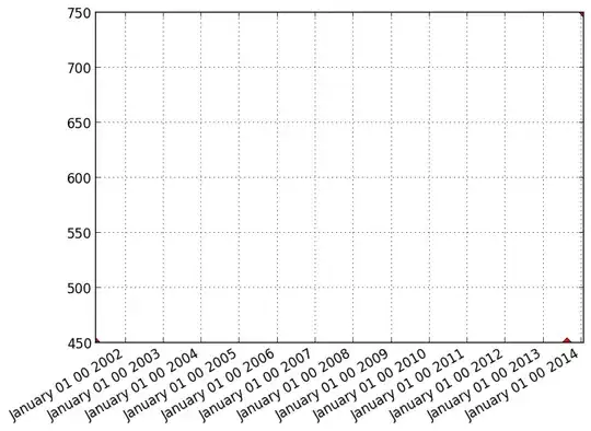
And with the axes adjusted so you can see the points better(setting date range of x axis, setting range of y axis):
...
df[df['browser']=='Chrome/29']['metric2'].plot(style='r--')
ax = plt.gca()
ax.xaxis.set_major_formatter(md.DateFormatter('%B %d %H %Y'))

ax.set_xlim(dt.datetime(2000, 1, 1,), dt.datetime(2017, 1, 1))
ax.set_ylim(400, 1000)
...
...
As long as you refuse to post a minimal example along with the data that produces the output you don't want...