3

I want to display Image under Text. I have done this with Photoshop but it's a Image. So every time text change I have to do changes in Photoshop. I want to achieve same using jQuery or CSS3 or any other web technique.

I want similar to this but NOT by creating new images each time my text changes

Image under Text

mplungjan
  • 169,008
  • 28
  • 173
  • 236
Hardik Sondagar
  • 4,347
  • 3
  • 28
  • 48

4 Answers4

3

Canvas

This is not using CSS as requested but the canvas element.

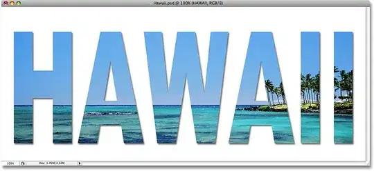
The following example will clip the image by the text as well as add a shadow to it.

Example

LIVE DEMO HERE

The result from doing this will be:

demo snapshot

/// set some text settings
ctx.textBaseline = 'top';  /// defaults to baseline, using top makes life simpler
ctx.font = '150px impact'; /// set the font and size we want to use
ctx.textAlign = 'center';  /// center for example

/// next draw the text
ctx.fillText(txt, demo.width * 0.5, 10);

Next step is to change the composite mode so we use the already drawn text as clipping for the next thing we draw:

/// change composite mode to fill text
ctx.globalCompositeOperation = 'source-in';

/// draw the image you want on top; will be clipped by text
ctx.drawImage(img, 0, 0);

Now the image we drew got clipped. To add a shadow we need to go an extra round as if we added shadow from the beginning the images would have been drawn into the shadow area as well.

So what we need to do is to reset composite mode to default, set shadow and then draw the canvas back to itself. As it's drawn on top in the exact same position we won't notice.

We are using save and restore here to avoid resetting the shadow manually.

/// reset composite mode to normal
ctx.globalCompositeOperation = 'source-over';

/// create a shadow by setting shadow...
ctx.save();
ctx.shadowColor = 'rgba(0,0,0,0.5)';
ctx.shadowBlur = 7;
ctx.shadowOffsetX = 3;
ctx.shadowOffsetY = 3;

/// ... and drawing it self back
ctx.drawImage(demo, 0, 0);
ctx.restore();

In the demo I made a loop that changes the text so you can see that it's simply a matter of supplying a different text.

Also notice that the background is transparent so you can place the canvas on top of other elements (in the demo I changed the background color of the body).

I would suggest that the demo code is refactored to a universal function instead. For that you can put all settings inside it and move save to the beginning and restore to the end in order to preserve other settings set outside the function.

Community
  • 1
  • 1
  • The text is getting clipped at the bottom in Chrome. Also, your width and height don't seem to get applied. – Bram Vanroy Oct 13 '13 at 08:22
  • Actually, it is a typo I made in the canvas element itself (`height`) which makes canvas default to 150 pixels height (thereby clipping the text). Corrected now. In addition, Chrome handles text a bit different than Firefox so the sizes and positions may differ slightly - this is what made it visible in Chrome. Thanks for the feedback. –  Oct 13 '13 at 08:52
2

Solution using webkit-background-clip - please note that for now this does not work in Firefox

Rewrite from here HTML/CSS: "See Through Background" Text?

Live Demo

enter image description here

h1, p { margin: 0; }

#container {
    padding: 20px 20px 100px;
    margin: 50px;
    position: relative;
}
#container h1 {
    /* has same bg as #container */
    background: url(http://media.royalcaribbean.com/content/shared_assets/images/destinations/regions/hero/hawaii_01.jpg);

    font-size: 12em;
    font-family: impact;
    left: 0;
    line-height: 100%;
    padding-top: 25px; /* padding + border of div */
    position: absolute; /* position at top left of #containter to sync bg */
    text-align: center;
    top: 0;
    width: 100%;
    text-fill-color: transparent;
    background-clip: text;
    text-fill-color: transparent;
    background-clip: text;
    -webkit-text-fill-color: transparent;
    -webkit-background-clip: text;
    -moz-text-fill-color: transparent;
    -moz-background-clip: text;
}
Community
  • 1
  • 1
mplungjan
  • 169,008
  • 28
  • 173
  • 236
1

Combining the solutions of Ken - Abdias Software and mplungjan, I decided to make a relatively cross-browser CSS solution that allows changing of the text from an array.

Live demo

Important CSS (for clipping)

h1 {
    background: white;
    -moz-background-clip: padding;
    -webkit-background-clip: padding;
    background-clip: padding-box;
    width: 100%;
    max-width: 960px;
    margin: 5% auto;
}
.backgroundclip h1 span {
    background: url(http://i.imgur.com/TzKl9Kml.jpg) center center no-repeat;
    text-align: center;
    -webkit-background-clip: text;
    -webkit-text-fill-color: transparent;
    -moz-background-clip: text;
    -moz-text-fill-color: transparent;
}

Important jQuery for looping

var terms = ["This", "is", "Hawaii"];
function rotateTerm() {
  var ct = $("h1 > span").data("term") || 0;
  $("h1 > span").data("term", ct == terms.length -1 ? 0 : ct + 1).text(terms[ct])
              .fadeIn().delay(600).fadeOut(600, rotateTerm);
}

$(rotateTerm);

References to the original authors are in the Fiddle. Adapted from those authors.

Bram Vanroy
  • 27,032
  • 24
  • 137
  • 239
-5

If the text does not change simply make an image with a white background and the transparent text then with css put that image over your backgrounds no need for jquery.

sanchixx
  • 275
  • 2
  • 5
  • 12