In expandable Notifications: what dimensions (in dp) should the icons have? Like the Icons for Snooze and Email here:
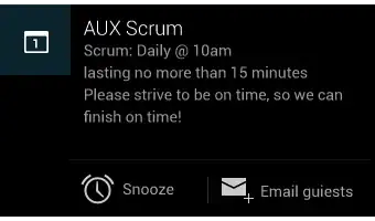
In expandable Notifications: what dimensions (in dp) should the icons have? Like the Icons for Snooze and Email here:
So to clarify this, I found the following in the Javadoc within the Android support library:
Add an action to this notification. Actions are typically displayed by the system as a button adjacent to the notification content.
Every action must have an icon (32dp square and matching the Holo Dark action bar visual style, a textual label, and a
PendingIntent.A notification in its expanded form can display up to 3 actions, from left to right in the order they were added. Actions will not be displayed when the notification is collapsed, however, so be sure that any essential functions may be accessed by the user in some other way.
So these should be identical to your action bar icons (for the Holo Dark theme), which is:
Asset Size: 32dp x 32dp
Optical Square: 24dp x 24dp
Color (Enabled): #FFFFFF 80% opacity
Color (Disabled): #FFFFFF 30% opacity
In Pixels:
22 × 22 area in 24 × 24 (mdpi)
33 × 33 area in 36 × 36 (hdpi)
44 × 44 area in 48 × 48 (xhdpi)
66 × 66 area in 72 × 72 (xxhdpi)
88 × 88 area in 96 × 96 (xxxhdpi)
as seen on http://iconhandbook.co.uk/reference/chart/android/
I did a tear down of the gmail apk: it seems those icons are 32 x 32 dp
hope someone can confirm this
Preferred Notification Icon Size 24x24dp
mdpi @ 24.00dp = 24.00px
hdpi @ 24.00dp = 36.00px
xhdpi @ 24.00dp = 48.00px
Wow, the answers here seem to mix apples and pears without references or a definitive answer. What you're usually interested in when creating an icon image is the size in pixels, not dp (density-independent pixels).
Looking at the UI guidelines for status bar icons on the official Android Developer website, it clearly lists the recommended icon sizes in pixels.
                            lpdi      mdpi      hdpi      xhdpi
Status bar icon size
in pixels                   18x18px   24x24px   36x36px   48x48px
(Android 3.0 and later)
You can also include a few pixels of padding in status bar icons to maintain a consistent visual weight with adjacent icons. For example, a 48 x 48 pixel xhdpi status bar icon can contain a 44 x 44 pixel shape with 2 pixels on each side for padding.