1

This is for research I am doing for my Masters Program in Public Health

I am graphing data against each other, a standard x,y type deal, over top of that I am plotting a predicted line. I get what I think to be the most funky looking point/boxplot looking thing ever with an x axis that is half filled out and I don't understand why as I do not call a boxplot function. When I call the plot function it is my understanding that only the points will plot.

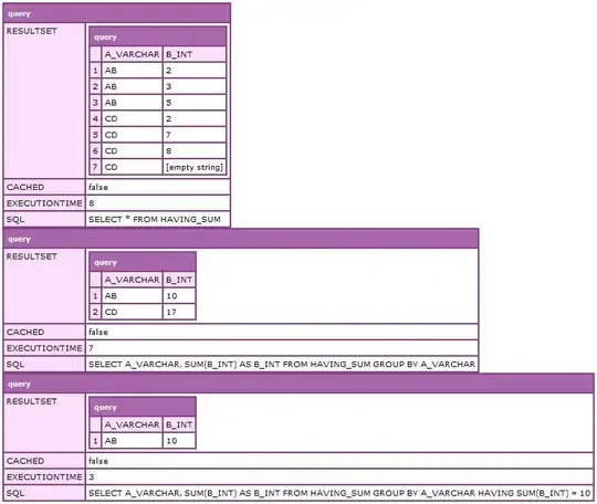
The data I am plotting looks like this

TOTAL.LACE | DAYS.TO.FAILURE
9          | 15
16         | 7
...        | ...

The range of the TOTAL.LACE is from 0 to 19 and DAYS.TO.FAILURE is 0 - 30

My code is as follows, maybe it is something before the plot but I don't think it is:

# To control the type of symbol we use we will use psymbol, it takes
# value 1 and 2
psymbol <- unique(FAILURE + 1)

# Build a test frame that will predict values of the lace score due to
# a patient being in a state of failure
test <- survreg(Surv(time = DAYS.TO.FAILURE, event = FAILURE) ~ TOTAL.LACE,
                dist = "logistic")

pred <- predict(test, type="response") <-- produces numbers from about 14 to 23
summary(pred) 

ord <- order(TOTAL.LACE)
tl_ord <- TOTAL.LACE[ord]
pred_ord <- pred[ord]
plot(TOTAL.LACE, DAYS.TO.FAILURE, pch=unique(psymbol)) <-- Produces goofy graph
lines(tl_ord, pred_ord) <-- this produces the line not boxplots

Here is the resulting picture Goofy looking plot in R

Not to sure how to proceed from here, this is an off shoot of another problem I had with the same data set at this link here I am not understanding why boxplots are being drawn, the reason being is I did not specifically call the boxplot() command so I don't know why they appeared along with point plots. When I issue the following command: plot(DAYS.TO.FAILURE, TOTAL.LACE) I only get points on the resulting plot like I expected, but when I change the order of what is plotted on x and y the boxplots show up, which to me is unexpected.

Here is a link to sample data that will hopefully help in reproducing the problem as pointed out by @Dwin et all Some Sample Data

Thank you,

Community
  • 1
  • 1
MCP_infiltrator
  • 3,961
  • 10
  • 45
  • 82
  • " ... data on the school drive"? If this is is homework, you should be forthright about it. – IRTFM Oct 18 '13 at 19:29
  • Yes good point and bad on my part, I'll change the heading and question to reflect – MCP_infiltrator Oct 18 '13 at 19:39
  • "funky", "x-axis doesn't look right". What exactly are you expecting for the axis and for the predicted? Put in `str(lace)`. Don't use `attach`. – IRTFM Oct 18 '13 at 22:03
  • I now see that you have used this dataset before in earlier questions. You should link to that. – IRTFM Oct 18 '13 at 22:19
  • By funky graph I mean I did not expect to see points and boxplots on the same graph. I'll get rid of the attach and use str() as suggested. I'll input the link to the question as suggested. – MCP_infiltrator Oct 19 '13 at 18:20
  • I don't understand why you are surprised to see both boxplots and lines in the same graphic. You are the one who issued the command `lines` right after a plot. – IRTFM Oct 19 '13 at 19:25
  • even without the lines command, the graph is still produced in the same format. The only thing the lines command does here is put the line on the graph, it does not add the boxplots. – MCP_infiltrator Oct 19 '13 at 20:32
  • 1
    You have way too much code. Multiple plotting commands and no data. How do you expect an answer? Simplify the code and provide a way to create the data needed to run it. – IRTFM Oct 19 '13 at 21:57

1 Answers1

2

Since you don't have a reproducible example, it is a little hard to provide an answer that deals with your situation. Here I generate some vaguely similar-looking data:

set.seed(4)
TOTAL.LACE      <- rep(1:19, each=1000)
zero.prob       <- rbinom(19000, size=1, prob=.01)
DAYS.TO.FAILURE <- rpois(19000, lambda=15)
DAYS.TO.FAILURE <- ifelse(zero.prob==1, DAYS.TO.FAILURE, 0)

And here is the plot:

enter image description here

First, the problem with some of the categories not being printed on the x-axis is because they don't fit. When you have so many categories, to make them all fit you have to display them in a smaller font. The code to do this is to use cex.axis and set the value <1 (you can read more about this here):

boxplot(DAYS.TO.FAILURE~TOTAL.LACE, cex.axis=.8)

enter image description here

As to the question of why your plot is "goofy" or "funky-looking", it is a bit hard to say, because those terms are rather nebulous. My guess is that you need to more clearly understand how boxplots work, and then understand what these plots are telling you about the distribution of your data. In a boxplot, the midline of the box is the 50th percentile of your data, while the bottom and top of the box are the 25th and 75th percentiles. Typically, the 'whiskers' will extend out to the furthest datapoint that is at most 1.5 times the inter-quartile range beyond the ends of the box. In your case, for the first 9 TOTAL.LACEs, more than 75% of your data are 0's, so there is no box and thus no whiskers are possible. Everything beyond the whisker limits is plotted as an individual point. I don't think your plots are "funky" (although I'll admit I have no idea what you mean by that), I think your data may be "funky" and your boxplots are representing the distributions of your data accurately according to the rules by which boxplots are constructed.

In the future (and I mean this politely), it will help you get more useful and faster answers if you can write questions that are more clearly specified, and contain a reproducible example.


Update: Thanks for providing more information. I gather by "funky" you mean that it is a boxplot, rather than a typical scatterplot. The thing to realize is that plot() is a generic function that will call different methods depending on what you pass to it. If you pass simple continuous data, it will produce a scatterplot, but if you pass continuous data and a factor, then it will produce a boxplot, even if you don't call boxplot explicitly. Consider:

plot(TOTAL.LACE, DAYS.TO.FAILURE)

enter image description here

plot(as.factor(TOTAL.LACE), DAYS.TO.FAILURE)

enter image description here

Evidently, you have converted DAYS.TO.FAILURE to a factor without meaning to. Presumably this was done in the pch=unique(psymbol) argument via the code psymbol <- unique(FAILURE + 1) above. Although I haven't had time to try this, I suspect eliminating that line of code and using pch=(FAILURE + 1) will accomplish your goals.

Community
  • 1
  • 1
gung - Reinstate Monica
  • 11,583
  • 7
  • 60
  • 79
  • I am going to attach the exact information, I was took them from my excel file and put the two columns in another file that I will add to my question so the exact information is there and hopefully the problem will be reproducible – MCP_infiltrator Oct 21 '13 at 12:49
  • I found out by using your examples that my TOTAL.LACE was actually the factor, so I used plot(as.numeric(TOTAL.LACE), DAYS.TO.FAILURE) and that worked just the way I thought it would. Thanks again. – MCP_infiltrator Oct 21 '13 at 17:18
  • 1
    Glad to help, @MCP_infiltrator. Good luck w/ your project. – gung - Reinstate Monica Oct 21 '13 at 17:48