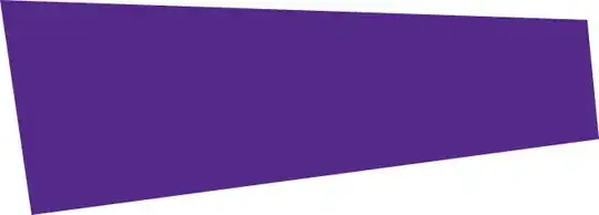
Is it possible to make this shape in CSS3?

I saw this link http://css-tricks.com/examples/ShapesOfCSS/ , I don't know if any shape in this page can be edited to look like the shape i need.
Thank you..
Is it possible to make this shape in CSS3?
I saw this link http://css-tricks.com/examples/ShapesOfCSS/ , I don't know if any shape in this page can be edited to look like the shape i need.
Thank you..
put this to your css your shape div
 -webkit-transform: rotatey(16deg);
 -moz-transform: rotatey(16deg);
 transform: rotatey(16deg);
 position: absolute;
put this code your parent div of your shape div
-webkit-perspective: 175;
-moz-perspective: 175;
perspective: 175;
position: relative;
top: 0px;
left: 0px;
right: 0px;
bottom: 0px;
this code may be make shape that will you want and set height width and other css as your requirement. this code dont work on old browser like ie.
and you could make many type of shape with and css you want with the help of google web design software
here is link: https://www.google.com/webdesigner/
Here is my approach:
div {
    position: absolute;
    top: 0;
    left: 0;
    overflow: hidden;

    -webkit-transform: rotate(2deg);
    -moz-transform: rotate(2deg);
    -ms-transform: rotate(2deg);
    -o-transform: rotate(2deg);
    transform: rotate(2deg);
    -webkit-backface-visibility: hidden;

    -webkit-transform-origin: top left;
    -moz-transform-origin: top left;
    -ms-transform-origin: top left;
    -o-transform-origin: top left;
    transform-origin: top left;
}
div:after {
    content: "";
    display: block;
    position: absolute;
    border-style: solid;
    border-color: #FFF transparent transparent;
    border-width: 127px 0 25px 19px;
    right: 0;
}
div:before {
    background: rgba(255, 0, 0, 0.45);
    width: 668px;
    height: 240px;
    content: "";
    display: block;

    -webkit-transform-origin: top left;
    -moz-transform-origin: top left;
    -ms-transform-origin: top left;
    -o-transform-origin: top left;
    transform-origin: top left;

    -webkit-transform: rotate(-9.5deg) skewX(1deg);
    -moz-transform: rotate(-9.5deg) skewX(1deg);
    -ms-transform: rotate(-9.5deg) skewX(1deg);
    -o-transform: rotate(-9.5deg) skewX(1deg);
    transform: rotate(-9.5deg) skewX(1deg);
}
I guess, jingesh kheni's solution might be more clean but I tried it and somehow the perspective property doesn't work for me.
EDIT:
According to OP's comment about rough edges of the div, I updated the fiddle and the code above. I simply added this line of CSS:
-webkit-backface-visibility: hidden;
These rough edges are a bug in Chrome, here's the explanation.
 " it's not smooth from the top.
– user1118829
Oct 23 '13 at 12:25
" it's not smooth from the top.
– user1118829
Oct 23 '13 at 12:25