7

I have come across a number of situations where I want to plot more points than I really ought to be -- the main holdup is that when I share my plots with people or embed them in papers, they occupy too much space. It's very straightforward to randomly sample rows in a dataframe.

if I want a truly random sample for a point plot, it's easy to say:

ggplot(x,y,data=myDf[sample(1:nrow(myDf),1000),])

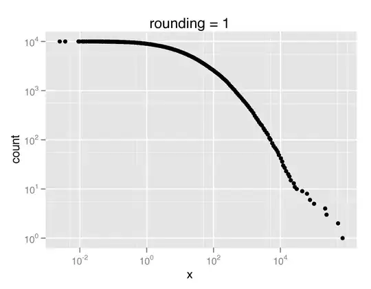
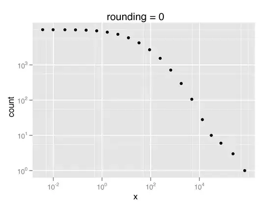
However, I was wondering if there were more effective (ideally canned) ways to specify the number of plot points such that your actual data is accurately reflected in the plot. So here is an example. Suppose I am plotting something like the CCDF of a heavy tailed distribution, e.g.

ccdf <- function(myList,density=FALSE)
{
  # generates the CCDF of a list or vector
  freqs = table(myList)
  X = rev(as.numeric(names(freqs)))
  Y =cumsum(rev(as.list(freqs)));
  data.frame(x=X,count=Y)
}
qplot(x,count,data=ccdf(rlnorm(10000,3,2.4)),log='xy')

This will produce a plot where the x & y axis become increasingly dense. Here it would be ideal to have fewer samples plotted for large x or y values.

Does anybody have any tips or suggestions for dealing with similar issues?

Thanks, -e

eytan
  • 5,945
  • 3
  • 20
  • 11
  • Hello Rob, Dirk - I want to clarify that I'm not looking for a way to deal with overplotting using a different visualization method. I specifically want to do a point plot that I can embed in a LaTeX paper as a scalable vector graphic. The way I'd like to do this is to reduce the number of plot points necessary to convey my data. – eytan Dec 26 '09 at 15:18
  • Then sub-sampling may be your best bet. That can of course be done with 'non-uniform' sampling, so you may want to keep more points (or even all) from the tails but can afford to thin out the main part dramatically. But this seems problem-specific so you may have to cook it up yourself. – Dirk Eddelbuettel Dec 26 '09 at 17:37

4 Answers4

8

I tend to use png files rather than vector based graphics such as pdf or eps for this situation. The files are much smaller, although you lose resolution.

If it's a more conventional scatterplot, then using semi-transparent colours also helps, as well as solving the over-plotting problem. For example,

x <- rnorm(10000); y <- rnorm(10000)
qplot(x, y, colour=I(alpha("blue",1/25)))
Rob Hyndman
  • 30,301
  • 7
  • 73
  • 85
5

Beyond Rob's suggestions, one plot function I like as it does the 'thinning' for you is hexbin; an example is at the R Graph Gallery.

Dirk Eddelbuettel
  • 360,940
  • 56
  • 644
  • 725
4

Here is one possible solution for downsampling plot with respect to the x-axis, if it is log transformed. It log transforms the x-axis, rounds that quantity, and picks the median x value in that bin:

downsampled_qplot <- function(x,y,data,rounding=0, ...) {
  # assumes we are doing log=xy or log=x
  group = factor(round(log(data$x),rounding))
  d <- do.call(rbind, by(data, group, 
    function(X) X[order(X$x)[floor(length(X)/2)],]))
  qplot(x,count,data=d, ...)
}

Using the definition of ccdf() from above, we can then compare the original plot of the CCDF of the distribution with the downsampled version:

myccdf=ccdf(rlnorm(10000,3,2.4))

qplot(x,count,data=myccdf,log='xy',main='original')

downsampled_qplot(x,count,data=myccdf,log='xy',rounding=1,main='rounding = 1')

downsampled_qplot(x,count,data=myccdf,log='xy',rounding=0,main='rounding = 0')

In PDF format, the original plot takes up 640K, and the downsampled versions occupy 20K and 8K, respectively.

Bernhard Barker
  • 54,589
  • 14
  • 104
  • 138
eytan
  • 5,945
  • 3
  • 20
  • 11
  • rather than rounding, one could also more generally do something like: group = cut(log(data$x), b=maxpoints) – eytan Dec 26 '09 at 19:14
2

I'd either make image files (png or jpeg devices) as Rob already mentioned, or I'd make a 2D histogram. An alternative to the 2D histogram is a smoothed scatterplot, it makes a similar graphic but has a more smooth cutoff from dense to sparse regions of space.

If you've never seen addictedtor before, it's worth a look. It has some very nice graphics generated in R with images and sample code.

Here's the sample code from the addictedtor site:

2-d histogram:

require(gplots) 

# example data, bivariate normal, no correlation
x <- rnorm(2000, sd=4) 
y <- rnorm(2000, sd=1) 

# separate scales for each axis, this looks circular
hist2d(x,y, nbins=50, col = c("white",heat.colors(16))) 
rug(x,side=1) 
rug(y,side=2) 
box() 

smoothscatter:

library("geneplotter")  ## from BioConductor
require("RColorBrewer") ## from CRAN

x1  <- matrix(rnorm(1e4), ncol=2)
x2  <- matrix(rnorm(1e4, mean=3, sd=1.5), ncol=2)
x   <- rbind(x1,x2)

layout(matrix(1:4, ncol=2, byrow=TRUE))
op <- par(mar=rep(2,4))
smoothScatter(x, nrpoints=0)
smoothScatter(x)
smoothScatter(x, nrpoints=Inf,
              colramp=colorRampPalette(brewer.pal(9,"YlOrRd")),
              bandwidth=40)
colors  <- densCols(x)
plot(x, col=colors, pch=20)

par(op)
Community
  • 1
  • 1
James Thompson
  • 46,512
  • 18
  • 65
  • 82
  • Can you please assist me in how to locate the minimum point coordinates in multiple lines graph using r, for example, if the minimum point coordinates is (17. 2.333), how can I locate this coordniate only in the plot using r? Thank you very much for your assistance! – Stackuser Feb 10 '20 at 14:09