0

I have a table exported in csv from PostgreSQL and I'd like to create a stacked bar graph in R. It's my first project in R.

Here's my data and what I want to do:

enter image description here

It the quality of the feeder bus service for a certain provider in the area. For each user of the train, we assign a service quality based of synchronization between the bus and the train at the train stations and calculate the percentage of user that have a ideal or very good service, a correct service, a deficient service or no service at all (linked to that question in gis.stackexchange)

So, It's like to use my first column as my x-axis labels and my headers as my categories. The data is already normalized to 100% for each row.

In Excel, it's a couple of clicks and I wouldn't mind typing a couple of line of codes since it's the final result of an already quite long plpgsql script... I'd prefer to continue to code instead of moving to Excel (I also have dozens of those to do).

So, I tried to create a stacked bar using the examples in Nathan Yau's "Visualize This" and the book "R in Action" and wasn't quite successful. Normally, their examples use data that they aggregate with R and use that. Mine is already aggregated.

So, I've finally come up with something that works in R:

enter image description here

but I had to transform my data quite a bit:

enter image description here

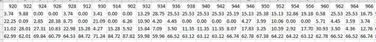
I had to transpose my table and remove my now-row (ex-column) identifier.

Here's my code:

# load libraries
library(ggplot2)
library(reshape2)

# load data
stl <- read.csv("D:/TEMP/rabat/_stl_rabattement_stats_mtl.csv", sep=";", header=TRUE)

# reshape for plotting
stl_matrix <- as.matrix(stl)

# make a quick plot
barplot(stl_matrix, border=NA, space=0.1, ylim=c(0, 100), xlab="Trains", ylab="%",
main="Qualité du rabattement, STL", las = 3)

Is there any way that I could use my original csv and have the same result?

I'm a little lost here...

Thanks!!!!

Community
  • 1
  • 1
fgcarto
  • 335
  • 1
  • 2
  • 8

2 Answers2

1

It appears that you transposed the matrix manually. This can be done in R with the t() function.

Add the following line after the as.matrix(stl) line:

stl_matrix <- t(stl_matrix)

Christopher Louden
  • 7,540
  • 2
  • 26
  • 29
1

Try the ggplot2 and reshape library. You should be able to get the chart you want with

stl$train_order <- as.numeric(rownames(stl))
stl.r <- melt(stl, id.vars = c("train_no", "train_order"))
stl.r$train_no <- factor(
    stl.r$train_no, 
    levels = stl$train_no[order(stl$train_order)])    
ggplot(stl.r, aes(x = factor(train_no), y = value, fill = variable)) + geom_bar(stat = 'identity')
colcarroll
  • 3,632
  • 17
  • 25
  • One little problem though... When I used my manually transposed my table, the order was the one I gave it in my table (the 912 is after the 928). Not, my train numbers are sorted and I'd like to keep the in their original order (by time of departure...) – fgcarto Nov 01 '13 at 18:10
  • Thanks for helping me. It's not working, but I'll keep trying. I put my data here: http://www.fgcartographix.com/R/_stl_rabattement_stats_mtl__.csv and my script http://www.fgcartographix.com/R/stl_stackedbars.R Just in case... ;) – fgcarto Nov 02 '13 at 19:57
  • 1
    This is really a different question (see http://stackoverflow.com/questions/5208679/order-bars-in-ggplot2-bar-graph), but I edited the answer once more for this problem. – colcarroll Nov 03 '13 at 20:36
  • I'm terribly sorry for the delay, but I'm currently on parental leave and my 2 weeks old boy doesn't give me a lot of time to work on improving my R... ;) So, I took half an hour this afternoon to add your changes in my script and it worked!! :) THANKS A GAZILLION time!! – fgcarto Nov 18 '13 at 20:28