6

I am trying to create CSS for the following layout. This is very similar to a table, but I am using it to render XML that does not contain tabular data.

I want two or more columns and one or more horizontal rules (invisible lines) running through those columns. The vertical space between the rules is determined exactly like a table's row height, by the maximum height of content in that row's cells.

All "cells" in this "table" contain two optional blocks. The upper block is aligned below the upper rule. The lower block is aligned above the lower rule. Here is an illustration:

CSS goal

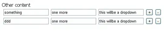
The above and below blocks are both optional, so each "cell" will have one of the following configurations. The blocks do not have a fixed height; they may contain text that wraps depending on the width of the "cell".

All possible "cell" configurations

Since this is so much like a table, I tried rendering it with display:table. First problem: how can I create both upper and lower blocks inside a single table-cell? Here's my first attempt.

I think this is equivalent to the problem of "floating" a block at the bottom of its container. The accepted answer to this question suggests this may not be possible.

XML fragment

Here is a simplified sample of the XML I'm trying to render.

<block>
    <horizontal-rule>
        <column>
            <above-rule>When in the Course of human events</above-rule>
        </column>
        <column>
            <above-rule>to dissolve the political bands</above-rule>
            <below-rule>it becomes necessary for one people</below-rule>
        </column>
        <column>
            <below-rule>which have connected them with another</below-rule>
        </column>
    </horizontal-rule>
</block>

In attempting to get this to work, I have been experimenting with a modification to my original XML schema. In this second XML sample, instead of grouping by the adjacent horizontal rule, I'm trying a more "table"-like grouping by row. In the translation, the <above-rule> becomes <cell-bottom> and <below-rule> becomes <cell-top>. I prefer the original one, but I've made more progress with this one.

<block>
    <row>
        <cell>
            <cell-bottom>When in the Course of human events</cell-bottom>
        </cell>
        <cell>
            <cell-top>it becomes necessary for one people</cell-top>
            <cell-bottom>to dissolve the political bands</cell-bottom>
        </cell>
        <cell>
            <cell-top>which have connected them with another</cell-top>
        </cell>
    </row>
</block>

A Really Ugly Solution

I have one idea that is particularly ugly. I can modify my XML schema and require the entire XML <block> to be repeated twice with the exact same content. Then I put both copies of the <block> in a wrapper element <block-wrapper> and I define separate styles for the first child of the wrapper and the last child of the wrapper.

The first child aligns cell contents at the top and hides the <bottom> blocks. The last child aligns cell contents at the bottom and hides the <top> blocks.

I use position:absolute to make the two rendered tables overlap exactly.

Here's an implementation of this idea.

Questions

  • Is there a better way of doing this?
  • I've read lots of debates about tables and CSS. Is display:table a smart approach?
  • Is there any way of using my original XML schema?
  • I'd like to be able to distribute just the XML document and a user with the CSS can view it in a browser. But would it instead be better to insert a XML-transformation step, to create an intermediary XML schema that is easier to render with CSS? (My ugly solution might not be so bad in that case.)
Community
  • 1
  • 1
dlh
  • 549
  • 4
  • 7
  • 20
  • A table like structure will be the only way to do this, I think. For the alignment effect you'd need to cells and a `rowspan` although I'm not sure whether this can be done without an actual `` element? This question seems to suggest so: [CSS - rowspan like effect](http://stackoverflow.com/q/13585789) (The `position: absolute` workaround in the answer is ugly IMO)
    – Pekka Nov 01 '13 at 21:56
  • I suspect a rowspan-like effect would not work. See this [example](http://dabblet.com/gist/7272902). – dlh Nov 01 '13 at 22:20
  • The example seems to look ok in my browser, maybe I'm not seeing the problem? – Pekka Nov 01 '13 at 22:22
  • That example uses the ugly workaround. It shows something I don't know how to do with rowspans. – dlh Nov 01 '13 at 22:26
  • Here is an example with a classical `table` and rowspans: http://jsfiddle.net/953an/ this may be a case where `table` functionality can't be entirely replicated with other elements and CSS (although the ugly route using `position: absolute` may not be so ugly, depending on what your actual use case is - its only real fault is that if the contents are too big, they will start overlapping) – Pekka Nov 01 '13 at 22:36
  • please show you html code that we can help you – Ashkan Mobayen Khiabani Nov 01 '13 at 22:54
  • Actually, the ugly solution doesn't have a problem with overlaps. Maybe if I have to transform the XML before rendering, the ugly solution is not so bad after all. – dlh Nov 01 '13 at 23:59
  • Thank you for the comments. I've made some substantial revisions to my question to address them and hopefully clarify. – dlh Nov 02 '13 at 18:47

1 Answers1

0

You don't have to use tables. Try this (tested in Chrome only):

<html>
<head>
<title>CSS</title>
</head>


<style type="text/css">
div {
    float: left;
    width: 100px;
    margin-left: 10px;
    margin-right: 10px;
    border-width: 1px;
    border-style: solid;
    visibility: visible;
    height: 50%;
    background-color: white;
    position: relative;
}

div div {
    background-color: grey;
    z-index: 3;
}

div#OUTER {
    width: 100%;
    display: block;
    height: 600px;
    border: 0;
}

span { background-color: white; width: 100%; }

.line { width: 100%; visibility: visible; z-index: 5; }
.top { position: absolute; top: 10%; }
.bottom { position: absolute; bottom: 10%; }
.red-line { border: solid 2px red; }
.blue-line { border: solid 2px blue; }
.top-line { position: absolute; top: 2%; }
.bottom-line { position: absolute; bottom: 50%; }
</style>

<body>

    <div id="OUTER" style="">
        <hr class="line red-line top-line" />
        <hr class="line blue-line bottom-line" />
        <div>
            <span class="top">11111<br>111111<br>111111111</span>
        </div>
        <div>
            <span class="bottom">22222</span>
        </div>
        <div>
            <span class="bottom">33333<br>33333<br>33333</span>
        </div>
        <div>
            <span class="top">44444<br>44444<br>4444<br>4444</span> 
            <span class="bottom">55555<br>555555<br>5555<br>5555</span>
        </div>
    </div>
</body>
</html>
resigned
  • 1,044
  • 1
  • 10
  • 11
  • Thanks for the idea. Unfortunately this doesn't auto-size the vertical space between the horizontal rules. If the "4" or "5" spans in your solution grow too large, they overlap instead. – dlh Nov 03 '13 at 18:41