I'm trying to create an e-mail newsletter in HTML. The layout has a fixed-width (600px) center. If the viewport is larger than 600px in width, there should be some decoration images on the left and the right. These images should be 'glued' to the viewport's edges:
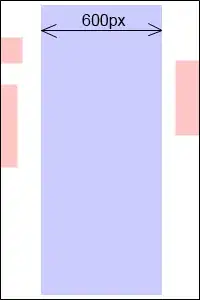
As you can see, when the viewport scales, the fixed-width (blue) content stays centered, but the (red) images on the left and on the right are moving with the viewport's edges.
If the viewport gets too narrow, the (red) images should become fixed such that they don't overlap the (blue) center content.
To accomplish this, I'm using <div>s with auto margins for the (red) images, for example: margin:0 auto 0 0.
This works well, except that on small devices like the iPhone, I want the e-mail client to just show the (blue) centered content:
But the <div>s with the (red) images on the side influence the content width, so the e-mail clients show them too.
How can I achieve this? Using Javascript and/or CSS media queries is not an option, since most e-mail clients strip CSS and JS from the e-mail HTML.