6

I’m trying to make a <div> with horizontal scroll only, and I achieved this by using <span>s with white-space: no-wrap; within a <div> with overflow-x: scroll;. The problem is that I can’t use paragraphs with wrapping text within these <span>s, because it breaks the layout in Chrome.

These are what I want (works in Firefox) and what I’ve got in Chrome:

In Chrome only the first box in the horizontally scrolling DIV is aligned to the top, the other ones are a bit below. In Firefox all boxes are aligned properly.

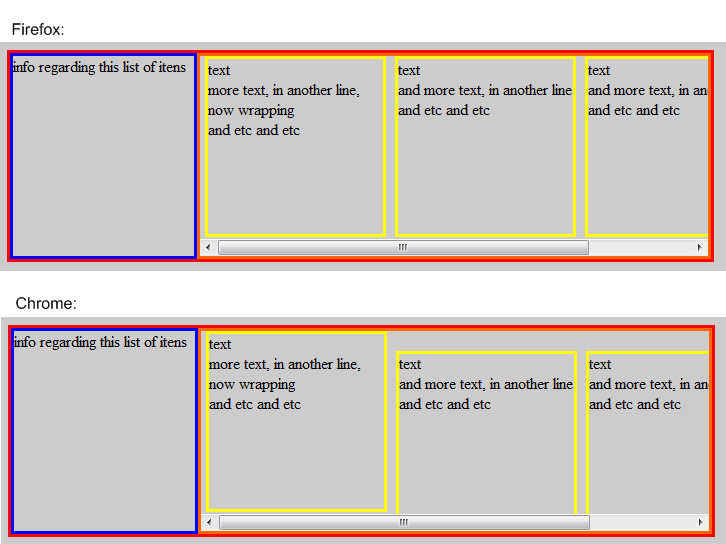
The problem happens every time a paragraph text wraps inside the <span>s.

This is my HTML and CSS:

.info {
  width: 250px;
  height: 200px;
  float: left;
}
.list {
  height: 200px;
  overflow-x: scroll;
  overflow-y: hidden;
  white-space: nowrap;
}
.item {
  height: 175px;
  width: 175px;
  display: inline-block;
  margin-left: 5px;
  overflow: hidden; /* without this, the layout breaks in Firefox, too */
}
.item * {
  white-space: normal;
}
<div id="listOne red">
  <div class="info blue">
    <p>Info regarding this list of items</p>
  </div>
  <div class="list orange">
    <span class="item yellow">
      <p>text</p>
      <p>more text, in another line, now wrapping</p>
      <p>and etc and etc</p>
    </span>
    <span class="item yellow">
     <p>second item</p>
    </span>
    <span class="item yellow">
     <p>third item</p>
    </span>
    <span class="item yellow">
     <p>and more</p>
    </span>
  </div>
  <div class="clear"></div>
</div>

Does someone know how to fix this? Or does someone know another way to make this <div> with horizontal scroll? (I’m using fluid layout, so my orange div does not have a fixed width).

Sebastian Simon
  • 18,263
  • 7
  • 55
  • 75
raphael
  • 176
  • 1
  • 9

5 Answers5

6

Fixed :-)

The problem was not the line breaks, it was the vertical alignment. Thanks to tahdhaze09 who helped me to figure out the problem, this is the solution I've got:

.item {
  height: 175px;
  width: 175px;
  display: inline-block;
  margin-left: 5px;
/*overflow: hidden; without this, the layout breaks in FF too - REMOVED */
  vertical-align:text-top; /* ADDED */
}

I don't know why, but overflow:hidden forced the inline elements to align on top on Firefox. It is unnecessary then. vertical-align:text-top fixed the issue in all major browsers.

raphael
  • 176
  • 1
  • 9
0

Have you tried adding top:0 to the list specification ? (can't try it out here, just my thoughts).

Edelcom
  • 5,038
  • 8
  • 44
  • 61
  • And adding position:absolute (as I said before I 'm just reading this site, can't try it out because I'm not sitting on my development pc). Maybe I'm just stating obvious things, though. – Edelcom Dec 30 '09 at 17:16
  • Yeap, afaik you can only set top, bottom, right and left attributes if you set a position. I tried absolute and relative positions, neither of the two worked. (don't worry about stating the obvious, perhaps it's not as that obvious for the one who is reading :). I know you're only trying to help) – raphael Dec 30 '09 at 20:56
0

Just a shot in the dark, but can you try removing all the white space between the divs? (No indentation).

And FYI, <p>s inside <span> s won't validate. That is probably not the root of your problem, but having valid HTML is always when hunting for a bug.

Pekka
  • 442,112
  • 142
  • 972
  • 1,088
  • Thanks for the advice, but I'm already aware of the validation problem too. Actually I was using divs, but I couldn't find a way to make the horizontal scroll work. That's why I'm using spans: http://stackoverflow.com/questions/1015809 "[...] only elements that behave as inline by default will behave properly when set to inline-block in Internet Explorer, so the inner containers need to be instead of
    ." Just in case, I tried to remove the indentation. Didn't work too.
    – raphael Dec 30 '09 at 16:08
  • I hear you, I've struggled with this stuff for ages :) but hey, with fixed widths a `float: left` should do just fine. Could it be that you're inheriting some styles from somewhere else? – Pekka Dec 30 '09 at 17:35
  • no inheritance, this code is within the body tag (with no styles set). :p Using float were my first and intuitive idea, but, as I said to James Goodwin, the itens will wrap inside my div and fall below the other itens when they reach the right bound of the container. – raphael Dec 30 '09 at 21:12
0

Can't you just change the .item class to position:relative with a float:left so they appear next to each other?

This works for me in FF/Chrome:

.item {
  height: 175px;
  width: 175px;
  position: relative;
  float: left;
  margin-left: 5px;
  overflow: hidden;
}
James Goodwin
  • 7,360
  • 5
  • 29
  • 41
  • I tried this, and unfortunately it doesn't work. The itens will wrap inside my div and fall below the other itens. I want them all in a line (setting overflow-y:auto in .list will show what happens). :T – raphael Dec 30 '09 at 15:59
0

I'm not having a problem with your code in FF, Chrome, or Safari.

It's the same code, but to be sure:

<!DOCTYPE HTML>
<html>
    <head>
        <title>Highlighting Elements</title>
        <style>
.info {
  width: 250px;
  height: 200px;
  float: left;
}
.list {
  height: 200px;
  overflow-x: scroll;
  overflow-y: hidden;
  white-space: nowrap;
}
.item {
  height: 175px;
  width: 175px;
  display: inline-block;
  margin-left: 5px;
  overflow: hidden; /* without this, the layout breaks in FF too */
}
.item * {
  white-space: normal;
}
</style>

    </head>
    <body>

        <div id="listOne red">
  <div class="info blue">
    <p>info regarding this list of itens</p>
  </div>
  <div class="list">
    <span class="item">
      <p>text</p>
      <p>more text, in another line, now wrapping</p>
      <p>and etc and etc</p>
    </span>
 <span class="item">
 <p>text</p>
      <p>more text, in another line, now wrapping</p>
      <p>and etc and etc</p>
 </span>
 <span class="item">
 <p>text</p>
      <p>more text, in another line, now wrapping</p>
      <p>and etc and etc</p>
 </span>
 <span class="item">
 <p>text</p>
      <p>more text, in another line, now wrapping</p>
      <p>and etc and etc</p>
 </span>
 <span class="item">
 <p>text</p>
      <p>more text, in another line, now wrapping</p>
      <p>and etc and etc</p>
 </span>
 <span class="item">
 <p>text</p>
      <p>more text, in another line, now wrapping</p>
      <p>and etc and etc</p>
 </span>
 <span class="item">
 <p>text</p>
      <p>more text, in another line, now wrapping</p>
      <p>and etc and etc</p>
 </span>
 <span class="item">
 <p>text</p>
      <p>more text, in another line, now wrapping</p>
      <p>and etc and etc</p>
 </span>

  </div>
  <div class="clear"></div>
</div>


    </body>
</html>
tahdhaze09
  • 2,220
  • 1
  • 21
  • 36
  • Ha! Actually your code didn't work either. Try to delete some text in one of your spans, leaving only one paragraph with only one word, and test it on Chrome. See? It goes down and the text that's inside aligns to the bottom. So well, it didn't fix my problem but it helped me to figure out the real problem. Thanks! :-D – raphael Dec 30 '09 at 21:34
  • I see now. The span drops to the bottom! I tried a vertical-align and it doesn't work, either. What a pain in the a**. – tahdhaze09 Dec 30 '09 at 21:57