37

I want to have my round div to keep the text inside it. like you see on the image Round div with text inline

How can I do this using CSS? because my round div, will have the text like it was squared. http://jsfiddle.net/kUJq8/

div {
    width: 320px;
    height: 320px;
    border-radius: 50%;
    background: #333;
    color: #FFF;
}
mschadegg
  • 789
  • 9
  • 21
  • Flow on a non-rectangular border? Given that HTML has only just got flow between objects on rectangular borders, this may be tricky. – Orbling Nov 11 '13 at 14:57
  • 1
    possible duplicate of [Paragraph of text in circle \[CSS\]](http://stackoverflow.com/questions/16982545/paragraph-of-text-in-circle-css) – Paul Roub Nov 11 '13 at 14:58
  • May be you will find this http://www.csstextwrap.com/ useful – vals Nov 11 '13 at 15:19

7 Answers7

13

Nowdays, shape-outside could be an option :

https://developer.mozilla.org/en-US/docs/Web/CSS/shape-outside

The shape-outside CSS property defines a shape—which may be non-rectangular—around which adjacent inline content should wrap. By default, inline content wraps around its margin box; shape-outside provides a way to customize this wrapping, making it possible to wrap text around complex objects rather than simple boxes.


image, or gradient can be used to draw the shape to keep text away from.

For a circle, 4 pieces are needed that can be produce from pseudo elements.

  • the idea is to start from a sized square box and 4 floatting pseudos with a radial-gradient background drawn outside the circle/center.

div:not([class]) {
  width: 10em;
  height: 10em;
  border-radius: 50%;
  background: #333;
}

div[class]:before {
  content: '';
  float: left;
  clear: left;
  height: 5em;
  width: 5em;
  background: radial-gradient( circle at bottom right, transparent 69%, red 69%);
}

div[class][id]:before {
  background: radial-gradient( circle at top right, transparent 69%, red 69%);
}

div[class]:after {
  content: '';
  float: right;
  clear: right;
  height: 5em;
  width: 5em;
  background: radial-gradient( circle at bottom left, transparent 69%, red 69%);
}

div[class][id]:after {
  background: radial-gradient( circle at top left, transparent 69%, red 69%);
}


/* extra */

html {
  display: flex;
  height: 100%;
}

body {
  background: #399;
  margin: auto;
}
<div>
  <div class=shape></div>
  <div class=shape id=idAttribute></div>
</div>
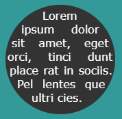
  • Now that we know that our radial-gradients are on the right spots, we can use them as shapes to push the text away from these areas. The gradients will not be drawn, only the shape will be used.

div:not([class]) {
/* em is to manage the text length and so is the font-sfamily and line-height */

  font-family:verdana;
  font-size:16px;
  line-height:1.25em;
  text-align:justify;
  width: 10em;
  height: 10em;
  border-radius: 50%;
  background: #333;
  color:#fff;
}

div[class]:before {
  content: '';
  float: left;
  clear: left;
  height: 5em;
  width: 5em;
  /*background*/ shape-outside: radial-gradient( circle at bottom right, transparent 69%, red 69%);
}

div[class][id]:before {
 /*background*/ shape-outside: radial-gradient( circle at top right, transparent 69%, red 69%);
}

div[class]:after {
  content: '';
  float: right;
  clear: right;
  height: 5em;
  width: 5em;
 /*background*/ shape-outside: radial-gradient( circle at bottom left, transparent 69%, red 69%);
}

div[class][id]:after {
 /*background*/ shape-outside: radial-gradient( circle at top left, transparent 69%, red 69%);
}


/* extra */

html {
  display: flex;
  height: 100%;
}

body {
  background: #399;
  margin: auto;
}
<div>
  <div class=shape></div>
  <div class=shape id=idAttribute></div>
  Lorem ipsum dolor sit amet, eget orci, tinci dunt place rat in sociis. Pel lentes que ultri cies. 
</div>

enter image description here

Here is your fiddle revisited to play with https://codepen.io/gc-nomade/pen/zQVoWO


We can also consider CSS variables to make the code easy to adjust depending on the text content:

div:not([class]) {
/* em is to manage the text length and so is the font-sfamily and line-height */
  
  --s:10em; /*Size of the circle */

  font-family:verdana;
  font-size:16px;
  line-height:1.25em;
  text-align:justify;
  width: var(--s);
  height: var(--s);
  border-radius: 50%;
  background: #333;
  color:#fff;
  display:inline-block;
  vertical-align:middle;
  margin:5px;
}

div[class]:before {
  content: '';
  float: left;
  clear: left;
  height: calc(var(--s)/2);
  width: calc(var(--s)/2);
  /*background*/ shape-outside: radial-gradient( circle at bottom right, transparent 69%, red 69%);
}

div[class][id]:before {
 /*background*/ shape-outside: radial-gradient( circle at top right, transparent 69%, red 69%);
}

div[class]:after {
  content: '';
  float: right;
  clear: right;
  height: calc(var(--s)/2);
  width: calc(var(--s)/2);
 /*background*/ shape-outside: radial-gradient( circle at bottom left, transparent 69%, red 69%);
}

div[class][id]:after {
 /*background*/ shape-outside: radial-gradient( circle at top left, transparent 69%, red 69%);
}


/* extra */
body {
  background: #399;
  margin: 0;
}
<div>
  <div class=shape></div>
  <div class=shape id=idAttribute></div>
  Lorem ipsum dolor sit amet, eget orci, tinci dunt place rat in sociis. Pel lentes que ultri cies. 
</div>

<div style="--s:20em">
  <div class=shape></div>
  <div class=shape id=idAttribute></div>
  Lorem ipsum dolor sit amet, eget orci, tinci dunt place rat in sociis. Pel lentes que ultri cies. Lorem ipsum dolor sit amet, eget orci, tinci dunt place rat in sociis. Pel lentes que ultri cies. Lorem ipsum dolor sit amet, eget orci, tinci dunt place rat in sociis. Pel lentes que ultri cies. Lorem ipsum dolor sit amet, eget orci, tinci dunt place rat in sociis. Pel lentes que ultri cies. Lorem ipsum dolor sit amet, eget orci. orci. rat
</div>

enter image description here

Here is also another syntax for the radial-gradient:

div:not([class]) {
/* em is to manage the text length and so is the font-sfamily and line-height */
  
  --s:10em; /*Size of the circle */

  font-family:verdana;
  font-size:16px;
  line-height:1.25em;
  text-align:justify;
  width: var(--s);
  height: var(--s);
  border-radius: 50%;
  background: #333;
  color:#fff;
  display:inline-block;
  vertical-align:middle;
  margin:5px;
}

div[class]:before {
  content: '';
  float: left;
  clear: left;
  height: calc(var(--s)/2);
  width: calc(var(--s)/2);
  /*background*/ shape-outside: radial-gradient(farthest-side at bottom right, transparent 100%, red 0);
}

div[class][id]:before {
 /*background*/ shape-outside: radial-gradient(farthest-side at top right, transparent 100%, red 0);
}

div[class]:after {
  content: '';
  float: right;
  clear: right;
  height: calc(var(--s)/2);
  width: calc(var(--s)/2);
 /*background*/ shape-outside: radial-gradient(farthest-side at bottom left, transparent 100%, red 0);
}

div[class][id]:after {
 /*background*/ shape-outside: radial-gradient(farthest-side at top left, transparent 100%, red 0);
}


/* extra */
body {
  background: #399;
  margin: 0;
}
<div>
  <div class=shape></div>
  <div class=shape id=idAttribute></div>
  Lorem ipsum dolor sit amet, eget orci, tinci dunt place rat in sociis. Pel lentes que ultri cies. 
</div>

<div style="--s:20em">
  <div class=shape></div>
  <div class=shape id=idAttribute></div>
  Lorem ipsum dolor sit amet, eget orci, tinci dunt place rat in sociis. Pel lentes que ultri cies. Lorem ipsum dolor sit amet, eget orci, tinci dunt place rat in sociis. Pel lentes que ultri cies. Lorem ipsum dolor sit amet, eget orci, tinci dunt place rat in sociis. Pel lentes que ultri cies. Lorem ipsum dolor sit amet, eget orci, tinci dunt place rat in sociis. Pel lentes que ultri cies. Lorem ipsum dolor sit amet, eget orci. orci. rat ultri cies Pel lentes
</div>

We can then add an extra variable to simulate padding:

div:not([class]) {
/* em is to manage the text length and so is the font-sfamily and line-height */
  
  --s:10em; /*Size of the circle */
  --p:0px;  /*padding*/

  font-family:verdana;
  font-size:16px;
  line-height:1.25em;
  text-align:justify;
  width: var(--s);
  height: var(--s);
  border-radius: 50%;
  background: #333;
  color:#fff;
  display:inline-block;
  vertical-align:middle;
  margin:5px;
}

div[class]:before {
  content: '';
  float: left;
  clear: left;
  height: calc(var(--s)/2);
  width: calc(var(--s)/2);
  /*background*/ shape-outside: radial-gradient(farthest-side at bottom right, transparent calc(100% - var(--p)), red 0);
}

div[class][id]:before {
 /*background*/ shape-outside: radial-gradient(farthest-side at top right, transparent calc(100% - var(--p)), red 0);
}

div[class]:after {
  content: '';
  float: right;
  clear: right;
  height: calc(var(--s)/2);
  width: calc(var(--s)/2);
 /*background*/ shape-outside: radial-gradient(farthest-side at bottom left, transparent calc(100% - var(--p)), red 0);
}

div[class][id]:after {
 /*background*/ shape-outside: radial-gradient(farthest-side at top left, transparent calc(100% - var(--p)), red 0);
}


/* extra */
body {
  background: #399;
  margin: 0;
}
<div >
  <div class=shape></div>
  <div class=shape id=idAttribute></div>
  Lorem ipsum dolor sit amet, eget orci, tinci dunt place rat in sociis. Pel lentes que ultri cies. 
</div>

<div style="--s:20em;--p:15px">
  <div class=shape></div>
  <div class=shape id=idAttribute></div>
  Lorem ipsum dolor sit amet, eget orci, tinci dunt place rat in sociis. Pel lentes que ultri cies. Lorem ipsum dolor sit amet, eget orci, tinci dunt place rat in sociis. Pel lentes que ultri cies. Lorem ipsum dolor sit amet, eget orci, tinci dunt place rat in sociis. Pel lentes que ultri cies. Lorem ipsum dolor sit amet, eget orci, tinci dunt place rat in sociis. 
</div>

enter image description here

Community
  • 1
  • 1
G-Cyrillus
  • 101,410
  • 14
  • 105
  • 129
5

I've created an example of how you can achieve this. There is not an easy way yet, but it's coming in the near future as Spudley mentioned. http://jsfiddle.net/kUJq8/5/

This example is based on the same concept used by http://www.csstextwrap.com but I created this example to explain what's going on and how to achieve this effect.

Basically, you need to create your circle first and some sample text, then create a set of "imaginary" floating div's to give your text guidelines to not exceed and automatically wrap to the next line. Feel free to play around with the widths of the div's so you can achieve the desired effect. Also, if you remove the border, you can see what the text actually looks like. The border helps when setting the widths of the div's.

<div style="float:left;clear:left;height:15px;width:130px"></div>
<div style="float:right;clear:right;height:15px;width:130px"></div>

In my example, I didn't create the whole circle, but it should be enough to get you going on the right track. Please let me know if you need any further assistance with this idea. Thanks.

Howard Renollet
  • 4,609
  • 1
  • 24
  • 31
  • Thats a lot of divs, but it looks like it is the only solution that works right now. So thank you! – mschadegg Nov 11 '13 at 15:53
  • Yep, that's pretty much what I was trying to describe in the last couple of paragraphs of my answer. It's not ideal, but it's the closest you'll get until CSS Shapes gets decent cross-browser support. – Spudley Nov 11 '13 at 15:57
4

There is a CSS feature currently being standardised called "CSS Shapes".

(NB: "CSS Shapes" is the name of the CSS feature spec; not to be confused with the act of simply creating a non-rectangular shape in CSS, which you've already done)

The CSS Shapes feature will do exactly what you're asking for -- ie allow you to specify the shape of an element, with regards to how the text inside it (and/or outside it) should wrap.

You can learn more about it in various articles around the web. Here are a few you may want to read:

You can also read the W3C spec document for it here: http://dev.w3.org/csswg/css-shapes/

However (and this is is a big "however"), this feature is not widely available in browsers yet. It is still in the process of going through the specification process, and has very limited browser support.

In the meanwhile, what you're asking for is actually very difficult to achieve. You may be forced to resort to sticking a bunch of spacer elements around the area you want to force the text to flow around them. Not ideal, but until this new spec starts being widely supported in browsers, it's probably about as good as it's going to get for you.

Spudley
  • 166,037
  • 39
  • 233
  • 307
  • CSS Shape is a great thing! `+1` for this correct answer! But the browser support is really weak. To test your browser, go on this site http://html.adobe.com/webplatform/layout/shapes/browser-support/. – Michael Schmidt Nov 11 '13 at 15:23
  • Nice feature, but it is a little bit useless, when the browser support is weak. But thanks for the answar, and I am looking forward to, when the support is strong! – mschadegg Nov 11 '13 at 15:54
2

This is an extension of @G-Cyr answer where I will consider a different syntax and less code. I will also rely on shape-margin to define the padding of the text instead of using complex calculation inside the gradient.

div.box {
  --p: 0px; /*padding*/
  
  text-align: justify;
  width: 9em; /*Size of the circle */
  aspect-ratio: 1;
  border-radius: 50%;
}

.box > div {
  height: 100%;
}

.box:before,
.box > div:before {
  content: '';
  float: left;
  height: 100%;
  width: 50%;
  shape-outside: radial-gradient(farthest-side at var(--d, right), #0000 100%, #000 0);
  shape-margin: var(--p);
}

.box>div:before {
  float: right;
  --d: left;
}


/* Irrelevant styles*/
body {
  background: #399;
  margin: 0;
}

div.box {
  background: #333;
  color: #fff;
  display: inline-block;
  vertical-align: middle;
  margin: 5px;
  font-size: 20px;
}
<div class="box">
  <div> Lorem ipsum dolor sit amet, eget orci, tinci dunt place rat in sociis. Pel lentes que ultri cies. cies. dolor ipsum</div>
</div>

<div class="box" style="width: 17em;--p:15px">
  <div> Lorem ipsum dolor sit amet, eget orci, tinci dunt place rat in sociis. Pel lentes que ultri cies. Lorem ipsum dolor sit amet, eget orci, tinci dunt place rat in sociis. Pel lentes que ultri cies. Lorem ipsum dolor sit amet, eget orci, tinci dunt place
    rat in sociis. Pel lentes que ultri cies. Lorem ipsum dolor sit amet, eget orci, tinci dunt place rat in sociis. Lorem ipsum</div>
</div>
Temani Afif
  • 245,468
  • 26
  • 309
  • 415
  • This is great. Do you have an idea how to vertically center the text inside the circle? Imagine a circle that is bigger than the text. Currently the text would start at the beginning of the circle. All methods I know fall short since they break the shape-outside functionality. – florian norbert bepunkt Apr 05 '20 at 12:03
  • @floriannorbertbepunkt the only way is to set a padding to an extra div wrapper inside: https://jsfiddle.net/mp6qj93n/ but you have to manually find the value, you can use JS – Temani Afif Apr 05 '20 at 12:12
1

I'm not sure how robust this solution is, but it's easy to implement and they have a proven example of the text in a circle. Check: CSS Text wrap

ShaunYearStrong
  • 230
  • 2
  • 9
0

A version with own classes and IDs that also works with Safari:

#container {
  --s: 400px;
  --p: 10px;
  font-family: verdana;
  font-size: 16px;
  line-height: 1.25em;
  text-align: justify;
  width: var(--s);
  height: var(--s);
  border-radius: 50%;
  background: #333;
  color: #fff;
  display: inline-block;
  vertical-align: middle;
  margin: 5px
}

.circle:after,
.circle:before {
  content: '';
  height: calc(var(--s)/2);
  width: calc(var(--s)/2)
}

.circle:before {
  float: left;
  clear: left;
  shape-outside: radial-gradient(farthest-side at bottom right, transparent calc(100% - var(--p)), red 0)
}

#shape:before {
  shape-outside: radial-gradient(farthest-side at top right, transparent calc(100% - var(--p)), red 0)
}

.circle:after {
  float: right;
  clear: right;
  shape-outside: radial-gradient(farthest-side at bottom left, transparent calc(100% - var(--p)), red 0)
}

#shape:after {
  shape-outside: radial-gradient(farthest-side at top left, transparent calc(100% - var(--p)), red 0)
}
<div id="container" style="--s:20em;--p:15px">
  <div class="circle"></div>
  <div class="circle" id="shape"></div>
  Lorem ipsum dolor sit amet, eget orci, tinci dunt place rat in sociis. Pel lentes que ultri cies. Lorem ipsum dolor sit amet, eget orci, tinci dunt place rat in sociis. Pel lentes que ultri cies. Lorem ipsum dolor sit amet, eget orci, tinci dunt place rat in sociis. Pel lentes que ultri cies. Lorem ipsum dolor sit amet, eget orci, tinci dunt place rat in sociis.
</div>
Anna_B
  • 820
  • 1
  • 4
  • 23
-1

you could also add a <span>-Element bevor the respective line with different indents; this is how i did (had a div with a rounded bottom left corner and text was overflowing on that side)

css in head or stylesheet:
#indent5 {padding: 0 0 0 5px;}
#indent20 {padding: 0 0 0 20px;}

html in body:
<div style="text-align: justify;">
<p> f&uuml;hrte und ihren ungl&uuml;ckseligen Sohn Ignatius, der schnell wieder wegen seines Dementoren&#8211;Zuchtprogramms<br>
<span id="indent5">seinen Posten verlassen musste. Besonders Wilhelmina</span><br>
<span id="indent20">Tuft war oft hier und brachte die Leute in </span><br>
</p>
</div>

in general the text is a block but the last two lines got an indent of 5 and 20 px respectively; you would still have to do it for every single line, but i would expect it being easier than placing div-elements

julia
  • 1
  • 1