I'm trying to create a Navbar with Bootstrap 3 that doesn't collapse or wrap the text. I'd like the text to simply be cut off (or ellipses) instead of wrapping - so the Navbar remains on a single line without expanding vertically. (this Navbar will be used to display the current view location with a single right-aligned menu)
Something like this:
<div class="navbar navbar-fixed-top navbar-inverse">
<div class="navbar-header pull-left">
<p class="navbar-text" style="overflow: hidden; white-space: nowrap;">
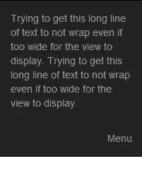
Trying to get this long line of text to not wrap even if too wide for the view to display. Trying to get this long line of text to not wrap even if too wide for the view to display.
</p>
</div>
<div class="navbar-header pull-right">
<p class="navbar-text">Menu</p>
</div>
</div>
As shown, I've been fooling with CSS float, overflow, whitespace settings and can't seem to get the right combination. Also, I'm using two navbar-header elements to avoid collapsing, but I'm open to other options if there is a better way.
Thanks for the help.