1

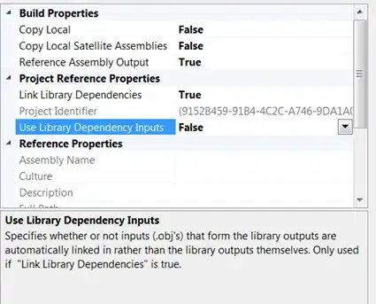
I'm trying to set up a page that looks good in Chrome for Android as well as in desktop Chrome.

I've got it working well in desktop Chrome, as per this screen shot: Imgur.

The two "Answer Choice" lines, including the red "X" buttons, are in a div (called answers). The green "+" button is in the layout after the answers div. I've applied display: inline-block to the answers div, and as you can see, it's working as expected.

However, when I try to do this in Chrome for Android, the inline-block style doesn't seem to be working properly:

Imgur

I can confirm that the style is being applied (I can use the remote inspector). If I remove the style, the green "+" button moves up a few pixels, showing that it is doing something, just not what I want.

How can I force Chrome on Android to respect the inline-block style?

EDIT: Here's the CSS applicable to the div containing all the answer choices:

.answers {
    display: inline-block;
    margin-bottom: 5px
}
Isaac Dontje Lindell
  • 3,246
  • 6
  • 24
  • 35
  • how could we know without seeing any code? – Aaron Dec 07 '13 at 23:57
  • Because there's very little other CSS affecting this element. I don't think posting my entire stylesheet will help much. (Plus, it's working fine in desktop Chrome and Firefox...) I will edit the question to show what little CSS I have applied to these elements. – Isaac Dontje Lindell Dec 08 '13 at 02:24
  • Maybe there's a min-width on something? – Aaron Dec 08 '13 at 17:38

3 Answers3

1

I had the same issue, and found the solution on another question about div's and inline-block style. It's because of the way white-space collapses in html. You need to change your html so that the first button's close tag has no space between the second button's open tag.

<button class="button1">1
</button><button class="button2">2
</button>

See inline-block elements are line breaking for seemingly no reason?

Community
  • 1
  • 1
ARO
  • 239
  • 2
  • 5
0

I've experienced inline-block behaving inconsistently on Android as well. While I haven't been able to track down exactly what's going on, in many cases you can get away with using display: inline, which renders consistently.

Of course, you cannot use margin on inline elements. To address the vertical positioning, you can use vertical-align: middle.

Stan
  • 85
  • 8
-3

Try to add "!important" to the "display: inline-block;"-attribute. Then it should look like this:

display: inline-block !important;
Leonard
  • 49
  • 11