1

I have a blog with responsive design. In this blog's article page, I have a block of "Related Posts" divs at the end of each article.

The height of these divs sometimes change depending of the content, and then it breaks the layout. Hopefully the following image will explain the problem more clearly:

Layout break

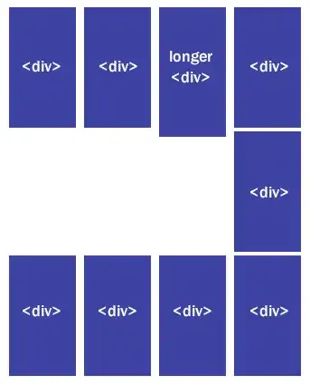
I was able to fix the problem by wrapping each row of divs inside a parent container, but this solution is not suitable since there are a different number of related posts by row depending on the window's resolution.

I know some people fix that issue with Javascript by comparing the height of each div to find the tallest one, but I'd rather have a pure css solution.

Any ideas?

Francis
  • 45
  • 1
  • 5
  • 1
    You could just use `overflow-y: hidden;` - you could then truncate the body of each to make sure it's not being cut off in an ugly manner. – brandonscript Dec 17 '13 at 17:51
  • If you change your mind and go for javascript, the Masonry jquery plugin is very nice for this. – James Montagne Dec 17 '13 at 17:56
  • You could use something as 'faux columns' http://codethatworks.blogspot.be/2012/05/responsive-full-height-columns-using.html – Filip Huysmans Dec 17 '13 at 17:58
  • 1
    Repeat: http://stackoverflow.com/questions/6378524/float-variable-height-containers -- not possible with CSS unless you fix a height on those and overflow:hidden – Christina Dec 17 '13 at 18:02
  • 1
    However, in your loop, you may be able to stick a clear:both br just outside the count and put a class on each one to show or hide based on the media breakpoint. After three
    Afer four
    after 6
    and hide and show with media queries.
    – Christina Dec 17 '13 at 18:08

4 Answers4

1

I know you are asking for CSS solution, and since am not able to comment, if you would like a jQuery solution than you can use masonary plugin which will fulfill your needs.

Blowfish
  • 130
  • 6
1

Have you considered using http://www.getbootstrap.com ? This can help you to have responsive layouts, and it's pure css. Hope this helps you

joseramonc
  • 1,811
  • 2
  • 21
  • 40
0

This is a bit of a "wild" solution, but I've used it in the past where I wanted a CSS-only solution for same-height columns. Enjoy: http://matthewjamestaylor.com/blog/equal-height-columns-cross-browser-css-no-hacks

JonathanR
  • 48
  • 1
  • 4
0

A nice tutorial for Pure CSS Masonry Layout can be found here. Also, you can check my answer here.

Sotiris
  • 81
  • 4