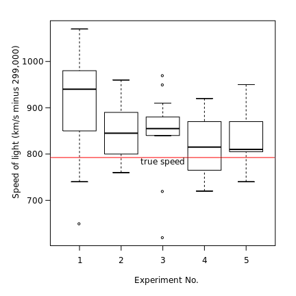
I saw a plot generated in excel and I was wondering if R could also do it.
This picture is essentially a visualization of a crosstab table comparing the days of the week to preferred meals on that day and counting the number of people that fall within those categories.
I've read up on some R bubble charts but I have yet to see one like this. Can someone point me to a package or a website that explains how I can make a plot like this one?


