9

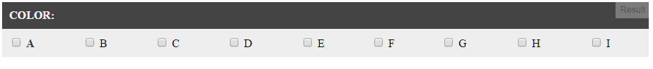
In my code there is a table in which I have divisions which has table row consisting checkboxes horizontally. Here is my sample code, full code is in fiddle Here

HTML:

<table cellpadding="0" border="0" width="100%" cellspacing="0">
    <tr>
        <td style="text-align:left" width="65px"><strong> Color: </strong>
        </td>
        <td style="float:left; text-align:left; width:100%">
            <div style="display:table; width:100%">
                <div style="width:100%;display:table-row">
                    <input type="checkbox" />
                    <label class="btn"> <span>A</span> 
                    </label>
                    <input type="checkbox" />
                    <label class="btn"> <span>B</span> 
                    </label>
                    <input type="checkbox" />
                    <label class="btn"> <span>C</span> 
                    </label>
                    <input type="checkbox" />
                    <label class="btn"> <span>D</span> 
                    </label>
                    <input type="checkbox" />
                    <label class="btn"> <span>E</span> 
                    </label>
                    <input type="checkbox" />
                    <label class="btn"> <span>F</span> 
                    </label>
                    <input type="checkbox" />
                    <label class="btn"> <span>G</span> 
                    </label>
                    <input type="checkbox" />
                    <label class="btn"> <span>H</span> 
                    </label>
                    <input type="checkbox" />
                    <label class="btn"> <span>I</span> 
                    </label>
                </div>
            </div>
    </tr>
</table>

CSS:

.btn {
    display: table - cell;
}

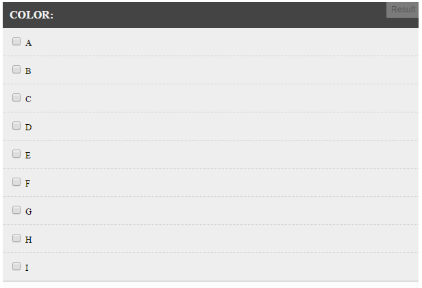
In pc and tablet view it looks perfect as i want, justified from both left and right side, but in mobile view is it possible to break it into two lines for making it responsive? Please look at fiddle.

Brian Tompsett - 汤莱恩
  • 5,753
  • 72
  • 57
  • 129
8bitrebellion
  • 180
  • 1
  • 2
  • 12

2 Answers2

15

You can use a media-query to set the divs as display: block;. Demo

Leave the css you have for the larger displays, then use the media-query to target the smaller ones. I would recommend wrapping the label and checkbox together also to keep them from breaking apart:

HTML

<div class="table-cell">
    <input type="checkbox" class="checkbox" />
    <label class="btn"> <span>A</span> 
    </label>
</div>

CSS

.table {
    display: table;
    width: 100%;
}

.table-row {
    display: table-row;
    width: 100%;
}

.table-cell {
    display: table-cell;
}

@media screen and (max-width: 479px) {
    .table, .table-row {
        display: block;
    }
    .table-cell {
        display:inline-block;
    }
}

You may need to change the alignment of the labels to your liking.

brouxhaha
  • 4,003
  • 1
  • 19
  • 22
  • see if this helps [**Responsive Tables Demo**](http://elvery.net/demo/responsive-tables/) – San Dec 25 '13 at 16:57
  • @brouxhaha thanks man..it works as i want..just need little bit modification as per requirement..Thanks again. – 8bitrebellion Dec 26 '13 at 06:41
  • @San thanks for suggestion. I have already checked it, but couldn't implement it for above problem. Anyway the answer above worked. – 8bitrebellion Dec 26 '13 at 06:44
5

Here is what you want:

HTML

<table class="table" cellpadding="0" border="0" width="100%" cellspacing="0">
    <thead>
        <tr>
            <th style="text-align:left" colspan="9"><strong> Color: </strong>

            </th>
        </tr>
    </thead>
    <tbody>
        <tr>
            <td>
                <input type="checkbox" />
                <label class="btn"> <span>A</span> 
                </label>
            </td>
            <td>
                <input type="checkbox" />
                <label class="btn"> <span>B</span> 
                </label>
            </td>
            <td>
                <input type="checkbox" />
                <label class="btn"> <span>C</span> 
                </label>
            </td>
            <td>
                <input type="checkbox" />
                <label class="btn"> <span>D</span> 
                </label>
            </td>
            <td>
                <input type="checkbox" />
                <label class="btn"> <span>E</span> 
                </label>
            </td>
            <td>
                <input type="checkbox" />
                <label class="btn"> <span>F</span> 
                </label>
            </td>
            <td>
                <input type="checkbox" />
                <label class="btn"> <span>G</span> 
                </label>
            </td>
            <td>
                <input type="checkbox" />
                <label class="btn"> <span>H</span> 
                </label>
            </td>
            <td>
                <input type="checkbox" />
                <label class="btn"> <span>I</span> 
                </label>
            </td>
        </tr>
    </tbody>
</table>

CSS

.table {
    width: 100%;
}
.table caption {
    font-size: 15px;
    font-weight: 700;
    text-align: left;
    margin-bottom: 20px;
    color: #333;
    text-transform: uppercase;
}
.table thead {
    background-color: #444;
}
.table thead tr th {
    padding: 10px;
    font-weight: 700;
    color: #f2f2f2;
    text-transform: uppercase;
}
.table thead tr th:first-child {
    text-align: left;
}
.table tbody {
    background-color: #fcfcfc;
}
.table tbody tr td {
    padding: 10px;
    text-align: left;
}
.table tbody tr td:first-child {
    text-align: left;
    color: #333;
    font-weight: 700;
}
.table tbody tr:nth-of-type(odd) {
    background: #eee;
}

@media only screen and (min-width: 320px) and (max-width: 767px) {
    .table tbody {
        border: 0;
    }
    .table tbody tr {
        margin-bottom: 10px;
        display: block;
        border-bottom: 2px solid #ddd;
    }
    .table tbody td {
        display: block;
        text-align: right;
        font-size: 13px;
        border-bottom: 1px dotted #ccc;
    }
    .table tbody td:last-child {
        border-bottom: 0;
    }
    .table tbody td:before {
        content: attr(data-label);
        float: left;
        text-transform: uppercase;
        font-weight: bold;
    }
}

As you can see there is a media query for phones and tablets min-width 320 to max width 767

Basically, turn the table from desktop viewing

enter image description here

to phone/tablet viewing

enter image description here

JSFiddle: http://jsfiddle.net/loginet/nctzk4f3/3/

Resource: https://css-tricks.com/accessible-simple-responsive-tables/?utm_source=dlvr.it&utm_medium=facebook

Adrian P.
  • 5,060
  • 2
  • 46
  • 47
  • Thank you for the answer. It's a better approach. It will help someone in need, as I've left the IT field itself. Thanks again Adrian. – 8bitrebellion Oct 04 '15 at 17:24