27

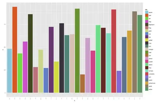
If you're mapping qualitatively to colour for a large number of groups, ggplot's automatic colour assignment plots very similar colours adjacently, making it hard to see which refer to which key etc. To illustrate:

require(ggplot2); require(stringr)
df = data.frame(x = letters, y = sample(20:100,26), lab=word("apple ball cat dog elephant frog goat hat ice jackal king lion mango nest owl parrot queen rabbit ship tomato umbrella van watch xylophone yatch zebra", 1:26))
p = ggplot(df, aes(x, y, fill=lab)) + geom_bar(stat="identity")
p + scale_fill_discrete()

enter image description here

Its possible to mix up some random colours manually:

cols = rainbow(26, s=.6, v=.9)[sample(1:26,26)]
p + scale_fill_manual(values=cols)

enter image description here

.. resulting in more useful breakup of the rainbow, but this seems clumsy, still leaves some colours clumped together and is generally not ideal. Does ggplot have a native method to achieve something like this (but hopefully better)?

Julius Vainora
  • 47,421
  • 9
  • 90
  • 102
geotheory
  • 22,624
  • 29
  • 119
  • 196
  • 2
    My advice, don't. It's far too much information in one plot and the colours are not significantly different enough to translate that information usefully for the viewer. Do your best to separate or group the results into meaningful or otherwise functional breaks - your readers will thank you. Notwithstanding the 10% that are colorblind anyways. – Brandon Bertelsen Jan 27 '14 at 06:32
  • Speaking directly from experience here: http://stackoverflow.com/questions/13616515/recommend-a-scale-colour-for-13-or-more-categories – Brandon Bertelsen Jan 27 '14 at 06:40
  • Brandon, I appreciate the perceptual issue you raise and normally I'd agree. My issue is I'm dealing with 30+ categories of non-groupable data with quite lengthy titles (too big for x axis), and I want to avoid a 90 degree rotation. – geotheory Jan 27 '14 at 12:33
  • 2
    @Brandon Bertelsen - I agree with your point. However, sometimes the reader is just - me! - and I want to pick out trends or do preliminary data exploration - something really simple, before dividing the data further into groups. I found this question helpful. – Nova Oct 05 '15 at 18:58
  • could you explain the syntax in `rainbow(26, s=.6, v=.9)[sample(1:26,26)]`? – Brenda Thompson Mar 29 '22 at 01:42

2 Answers2

22

Producing a good palette for that many colours is indeed a difficult task. However, there is one solution which may be helpful. Some time ago I forked this repo and found a reference to iWantHue. As far as I can see, the resulting palette is already mixed, so that neighbouring colours look distinguishable.

For instance, for your example I have enter image description here

Just in case, the palette is

"#89C5DA", "#DA5724", "#74D944", "#CE50CA", "#3F4921", "#C0717C", "#CBD588", "#5F7FC7", 
"#673770", "#D3D93E", "#38333E", "#508578", "#D7C1B1", "#689030", "#AD6F3B", "#CD9BCD", 
"#D14285", "#6DDE88", "#652926", "#7FDCC0", "#C84248", "#8569D5", "#5E738F", "#D1A33D", 
"#8A7C64", "#599861"
tonytonov
  • 25,060
  • 16
  • 82
  • 98
  • 1
    Thanks tonyronov this is useful, although I think in essence this variablisation of saturation and value is achievable with a tweek to my code: `col.par = function(n) sample(seq(0.3, 1, length.out=50),n); cols = rainbow(26, s=col.par(26), v=col.par(26))[sample(1:26,26)]`. – geotheory Jan 27 '14 at 12:42
  • It is. However, when you use `sample`, two or more close-looking colours may fall close to each other randomly. I think the proposed palette is already shuffled properly. – tonytonov Jan 27 '14 at 12:45
  • Fair point. What is the key R code you're referring to? I can see a reference to iWantHue in [ggplot.Rnw](https://github.com/karthik/ggplot-lecture/blob/master/ggplot.Rnw) but I don't recognise the code format. – geotheory Jan 27 '14 at 12:59
  • Well, seems iWantHue doest not provide any sort of API, so I just took a JSON from there. BTW, more ideas [here](http://stackoverflow.com/questions/15282580/how-to-generate-a-number-of-most-distinctive-colors-in-r). – tonytonov Jan 27 '14 at 13:04
  • If I understand the question correctly, the presentation is compiled by latex and [knitr](http://yihui.name/knitr/). – tonytonov Jan 27 '14 at 13:10
  • 1
    I like this answer... however I don't appreciate the time I foresee wasting on this website!! ;) – Nova Oct 05 '15 at 19:02
  • Note the R version of this - `rwantshue` https://stackoverflow.com/a/71660386/1156245 – geotheory Mar 29 '22 at 10:25
1

Should've added this years ago but better late than never. There's an R port of iwanthue - rwantshue. Documentation is here.

geotheory
  • 22,624
  • 29
  • 119
  • 196