0

I have designing a progress bar, around which I need to show a gradient glow. I am using linear gradient something like this:

<linearGradient id="settingsProgressBarInnerGlow" x1="50%" y1="0%" x2="50%" y2="100%">
<stop stop-color="#ffffff" offset="0" stop-opacity="0"/>
<stop stop-color="#ffffff" offset="0.2" stop-opacity="0.1"/>
<stop stop-color="#E6F7FC" offset="0.5" stop-opacity="0.4"/>
<stop stop-color="#ffffff" offset="0.8" stop-opacity="0.1"/>
<stop stop-color="#ffffff" offset="1" stop-opacity="0"/>
</linearGradient>

But this is giving me gradient something like this.(Linear gradient only on top and bottom)What I am getting using linear 
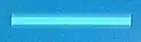
I want the gradient all round the bar like this.(Gradient all around)What I need actually

Can someone help me with best answers?

Archana
  • 99
  • 1
  • 1
  • 11
  • Have you considered using filters instead of gradients? See e.g http://stackoverflow.com/questions/9630008/how-can-i-create-a-glow-around-a-rectangle-with-svg – Erik Dahlström Jan 27 '14 at 12:10
  • I fail to see the gradient. This looks like a job for box shadow to me, from these images... – sheriffderek Apr 12 '14 at 18:52

1 Answers1

0

From your images, it looks like you can do what you want with box-shadow property. Svgs are in boxes sortof by default.

Here is a jsFiddle

HTML

<div class="bar">
    <div class="progress"></div>
</div>

CSS

.bar {
    position: relative;    
    width: 400px;
    height: 12px;
    background-color: #333;
}

.bar .progress {
    position: absolute;
    top: 0;
    left: 0;
    height: 100%;
    width: 80%;
    background-color: #559adb;
    box-shadow: 0 0 20px 0 #559adb;
}

You can have mulitple box-shadows too by putting a comma after the color and defining a second - which could be helpful in creating a gradient effect.

.bar .progress {
    box-shadow: 
        0 0 20px 0 #559adb,
        0 0 20px 0 red;  /* etc */
}
sheriffderek
  • 8,848
  • 6
  • 43
  • 70