16

I am trying to change the CSS on a bootstrap popover. I want to change the entire popover background, not just the text.

Any suggestions?

http://bootply.com/110002

$(document).ready(function() {
  $("[rel='android']").popover({
    html: 'true', 
    content: '<div id="popOverBox">Coming March 2014</div>'
   });
});

CSS

 #popOverBox {
     background: tomato;
     font-family: serif;
 }
Josh Crozier
  • 233,099
  • 56
  • 391
  • 304
Ryan Salmons
  • 1,429
  • 10
  • 21
  • 42

7 Answers7

35

You would target the .popover element as opposed to #popOverBox

EXAMPLE HERE

.popover {
    background: tomato;
}

And to change the background of the arrow (pseudo element), you would use:

.popover.bottom .arrow:after {
    border-bottom-color: tomato;
}
Josh Crozier
  • 233,099
  • 56
  • 391
  • 304
  • 1
    the above solution didn't work for me but the following did: .tooltip-inner { background-color: #D13127; color: #fff; } .tooltip.top .tooltip-arrow { border-top-color: #D13127; } – MCGRAW Oct 23 '14 at 18:04
  • 2
    For arrow try .popover.top > .arrow:after { border-top-color: #111; } – ymakux Apr 24 '15 at 23:52
  • 1
    Best to use dev tools in browser to inspect the element to see what the arrow class is being used. Depending on options and placement of you popover will determine the class used. For me I used this : .arrow::after, .bs-popover-top .arrow::after { bottom: 1px; border-top-color: #450909; } – Kyle Coots Jul 04 '18 at 19:11
  • the example is to an unsafe website – Lucas Mar 08 '19 at 13:29
4

Change popover background and text color in Bootstrap-4

while you are using sass-bootstrap-4 you can do easily by just changing some variables values.

These are the variables in _variables.scss file:

$popover-inner-padding: 1px !default;
$popover-bg: #fff !default;
$popover-max-width: 276px !default;
$popover-border-width: $border-width !default;
$popover-border-color: rgba(0, 0, 0, .2) !default;
$popover-box-shadow: 0 5px 10px rgba(0, 0, 0, .2) !default;

$popover-title-bg: darken($popover-bg, 3%) !default;
$popover-title-padding-x: 14px !default;
$popover-title-padding-y: 8px !default;

$popover-content-padding-x: 14px !default;
$popover-content-padding-y: 9px !default;

$popover-arrow-width: 10px !default;
$popover-arrow-color: $popover-bg !default;

$popover-arrow-outer-width: ($popover-arrow-width + 1px) !default;
$popover-arrow-outer-color: fade-in($popover-border-color, .05) !default;

I change them to light blue color using $brand-info variable:
Note: its better if you copy these variables into your own custom.scss file and then change them.

$popover-inner-padding: 1px !default;
$popover-bg: #fff !default;
$popover-max-width: 276px !default;
$popover-border-width: $border-width !default;
$popover-border-color: $brand-info;
$popover-box-shadow: 0 5px 10px rgba(0, 0, 0, .2) !default;

$popover-title-bg: $brand-info;
$popover-title-padding-x: 14px !default;
$popover-title-padding-y: 8px !default;

$popover-content-padding-x: 14px !default;
$popover-content-padding-y: 9px !default;

$popover-arrow-width: 10px !default;
$popover-arrow-color: $popover-bg !default;

$popover-arrow-outer-width: ($popover-arrow-width + 1px) !default;
$popover-arrow-outer-color:$brand-info;

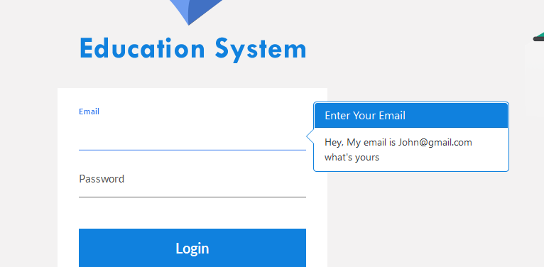
The output after change the variables:

enter image description here

Sabir Hussain
  • 2,802
  • 2
  • 14
  • 19
3

.popover {background-color: tomato;}
.popover.bottom .arrow::after {border-bottom-color: tomato; }
.popover-content {background-color: tomato;}
Dhia
  • 10,119
  • 11
  • 58
  • 69
amit bende
  • 264
  • 3
  • 4
3

Time is passed anyway I'd like to report my personal solution in LESS (indeed, fits my needs but I think can be useful to some folks over here). Add a class to class="popover", like class="popover popover-warning" and in less do something like this:

.popover-warning {
  background-color: #f0ad4e !important;
  & .arrow, .arrow:after {
    border-left-color: #f0ad4e !important;
    border-left-color: rgba(0, 0, 0, 0.25);
  }
  & .popover-content, .popover-title {
    background-color: #f0ad4e !important;
  }
}

Hope this helps.

Nineoclick
  • 804
  • 9
  • 17
0

Note that if you are using the less or sass files, you can do the following also:

@popover-bg: tomato;

This way, no need to worry about which side the arrow is on.

richinator38
  • 165
  • 1
  • 18
0

You can change the default template of the popover:

//Setup popover
node_el.popover(
    { title: 'Error',
        content: err_msg,
        trigger: 'focus',

        placement: 'top',
        template: '<div class="popover err" role="tooltip"><div class="arrow"></div><h3 class="popover-header text-danger"></h3><div class="popover-body text-danger"></div></div>'
    });

node_el.popover('show');

CSS classes 'err' and 'text-danger' were added in the example above. CSS classes for background color can be added too...

Leonid Minkov
  • 141
  • 1
  • 5
0

Since Bootstrap 5.2.0, popovers can be customized with CSS variables. For another example, see the Custom popovers section in the documentation.

new bootstrap.Popover(document.querySelector('[data-bs-toggle=popover]'));
<link href="https://cdn.jsdelivr.net/npm/bootstrap@5.3.0/dist/css/bootstrap.min.css" rel="stylesheet" integrity="sha384-9ndCyUaIbzAi2FUVXJi0CjmCapSmO7SnpJef0486qhLnuZ2cdeRhO02iuK6FUUVM" crossorigin="anonymous">
<script src="https://cdn.jsdelivr.net/npm/bootstrap@5.3.0/dist/js/bootstrap.bundle.min.js" integrity="sha384-geWF76RCwLtnZ8qwWowPQNguL3RmwHVBC9FhGdlKrxdiJJigb/j/68SIy3Te4Bkz" crossorigin="anonymous"></script>
<style>
.my-popover {
  --bs-popover-bg: dodgerblue;
  --bs-popover-body-color: #e7fc03;
  --bs-popover-header-bg: #fff;
}
</style>
<button class="btn btn-primary" 
  data-bs-toggle="popover" data-bs-custom-class="my-popover"
  data-bs-title="Popover Title"
  data-bs-content="This is the popover content.">
   Click for Popover
</button>
Unmitigated
  • 76,500
  • 11
  • 62
  • 80